Nerdbox is a tech repairs and installations platform. From phones to smart homes, TV’s to PC’s we offer support on all types of tech. Local techsperts come to your home or office for fast help.
The NerdBox platform allows customers to source an alternative way of servicing their technology which is speedy and inexpensive. All the user has to do is input their tech model details and the issue that they have with equipment. Not long after they post, they will have a selection of candidates that we like to call “Techsperts” to choose from. From this point they have the ability to compare the willing Techsperts offers and information by viewing the past jobs they have completed, reviews, the price they are offering to offer the service for, while also being able to speak to the Techspert directly through the private chat function to discuss the more intricate details further before committing to pay for the service. Once a customer has chosen the Techspert they would like to service their tech, they can then arrange for the techspert to meet them in a place of the customers choice. For example, you could plan to meet them during your lunch break in a coffee shop and have your tech up and running again in no time and without the hefty bill you would usually expect to pay if you were to go directly to your provider or a commercial chain. The purpose of the service platform is to bridge the gap between the many people with damages equipment and freelance tech experts.
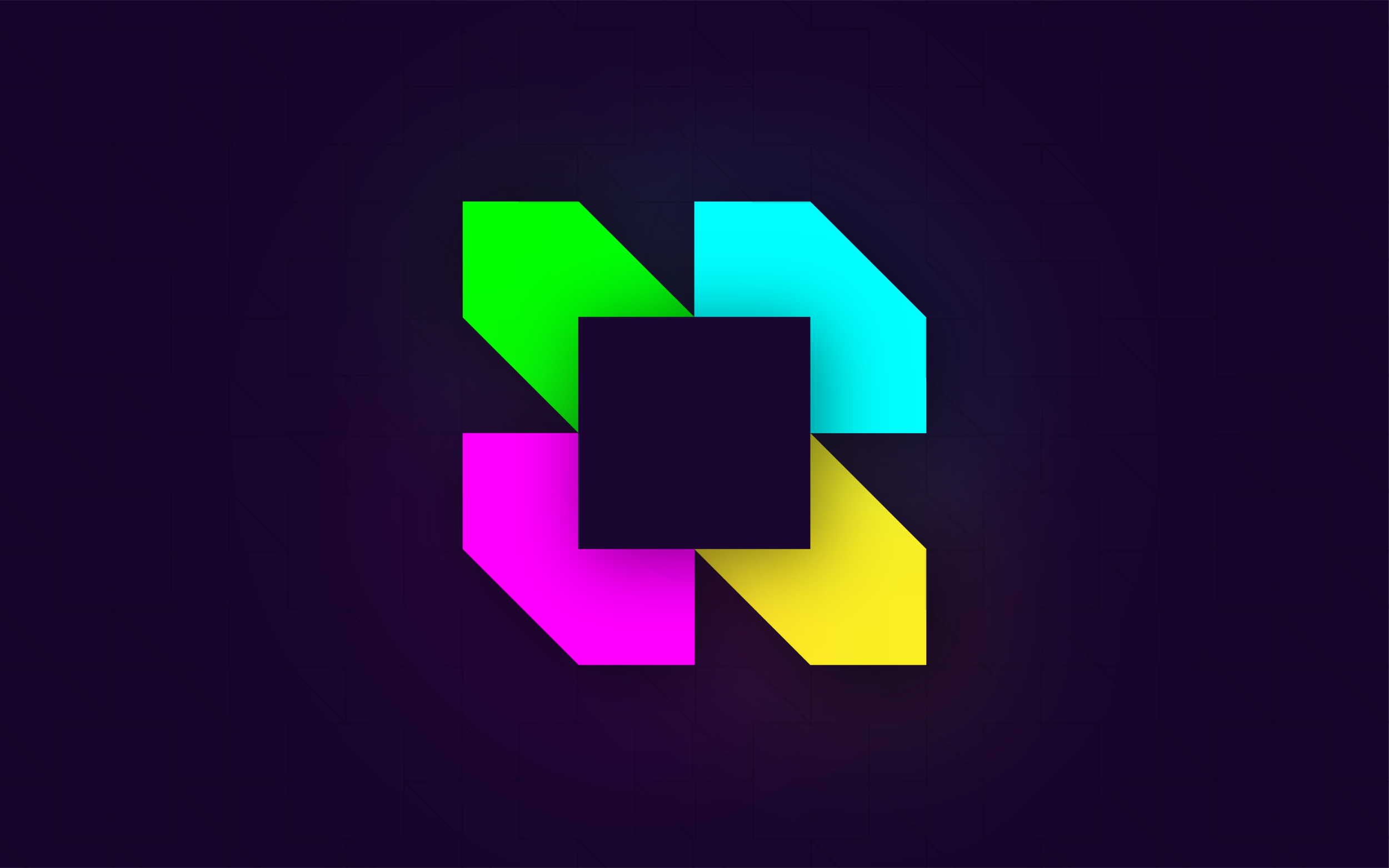
Creating the guidelines for a new brand strategy, visual identity and tone of voice that reinforces Nerdbox’s unique position within the busy FinTech environment, allowed the product design team to design the new digital applications aligned to the brand, ensuring consistency across all platforms (mobile, desktop, social, CRM and so on) delivering the optimum user experience for all customers that was trustworthy and unmistakable. The Nerdbox wordmark is a contemporary sans serif accompanied by the brand’s signature emblem.
The founder was not prepared to negotiate changing the name even though I raised possible issues with the businesses image and purpose being misunderstood. So I worked around that and pushed to rebrand the identity to appeal to a younger, tech-savvy audience by using bright RGB colours to contract a dark interface. Using a combination of squares and cubes to symbolise the box In addition,
I created a library of graphic assets using an isometric grid to highlight specific technology and equipment Nerdbox specialises in. I used the Poppins font family for all communications. The rigid geometric qualities of this typeface establish the sense of a digitally-led, modular aesthetic of the brand’s visual identity; while a vivid colour palette to communicate status and options.