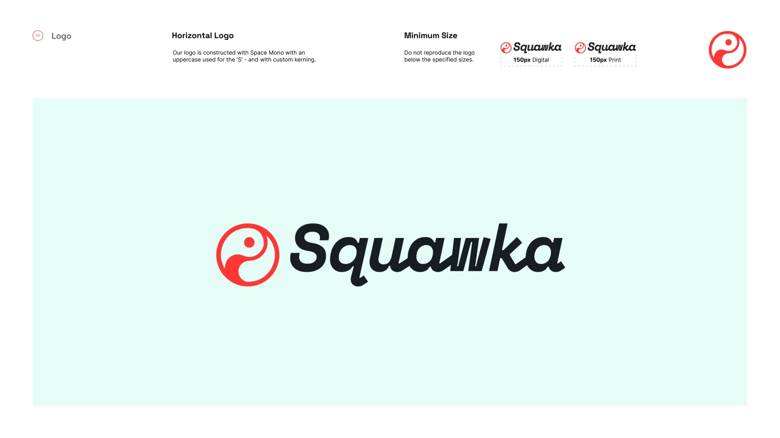
A logo rebuilt for legibility at the sizes it actually gets used.
PLACEHOLDER — this section needs your input. The old site described the guidelines in Squawka's own voice and never said what the brief was, who set it, or what problem the existing brand had.
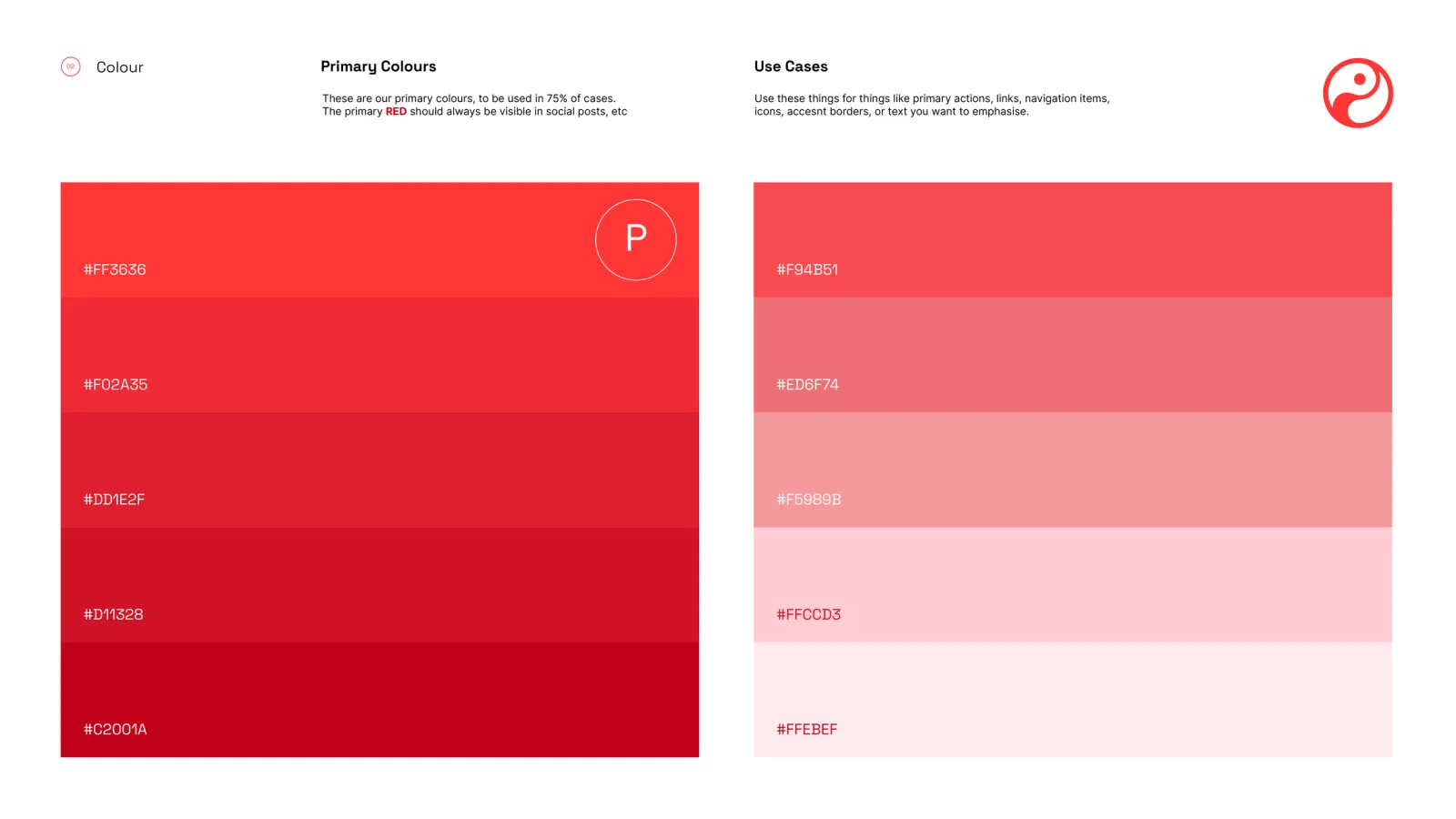
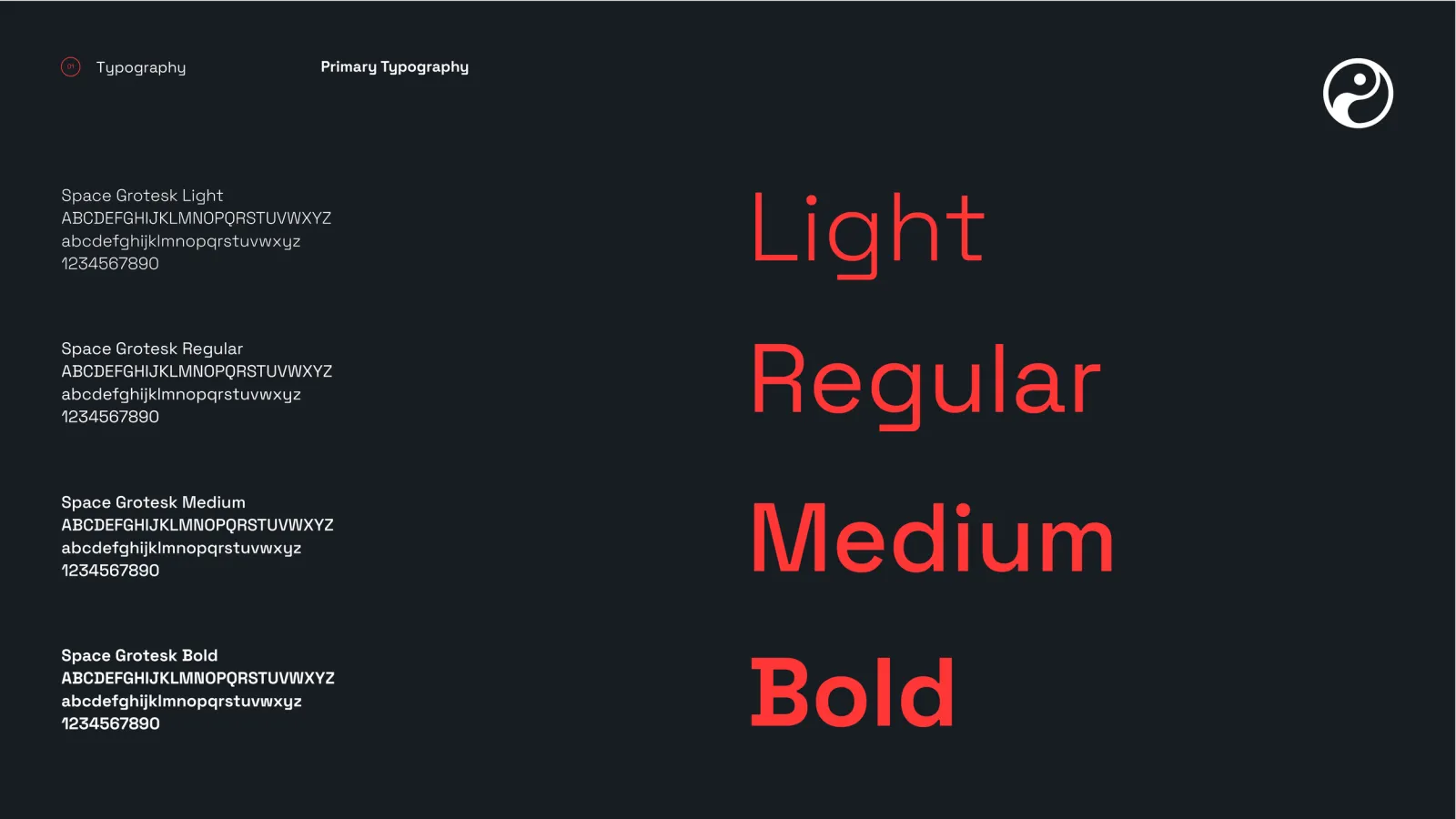
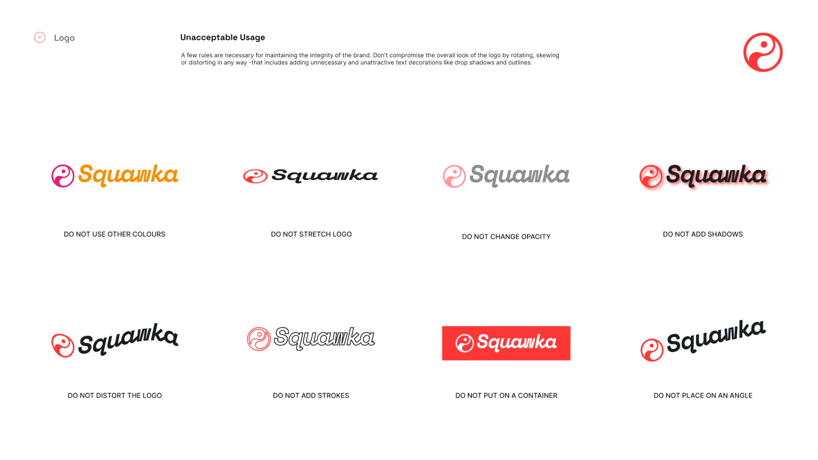
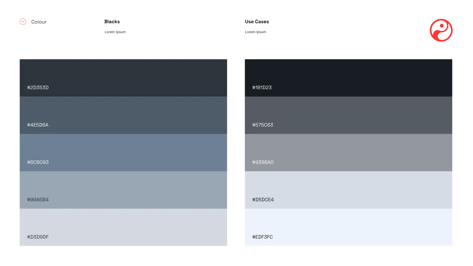
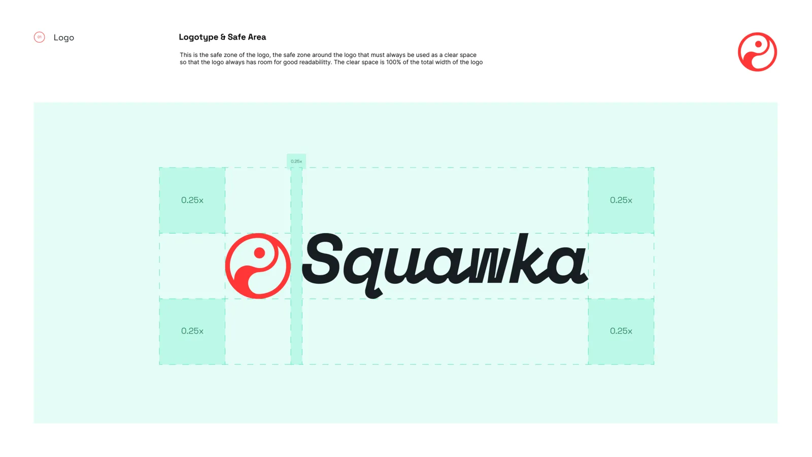
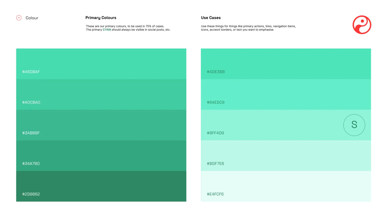
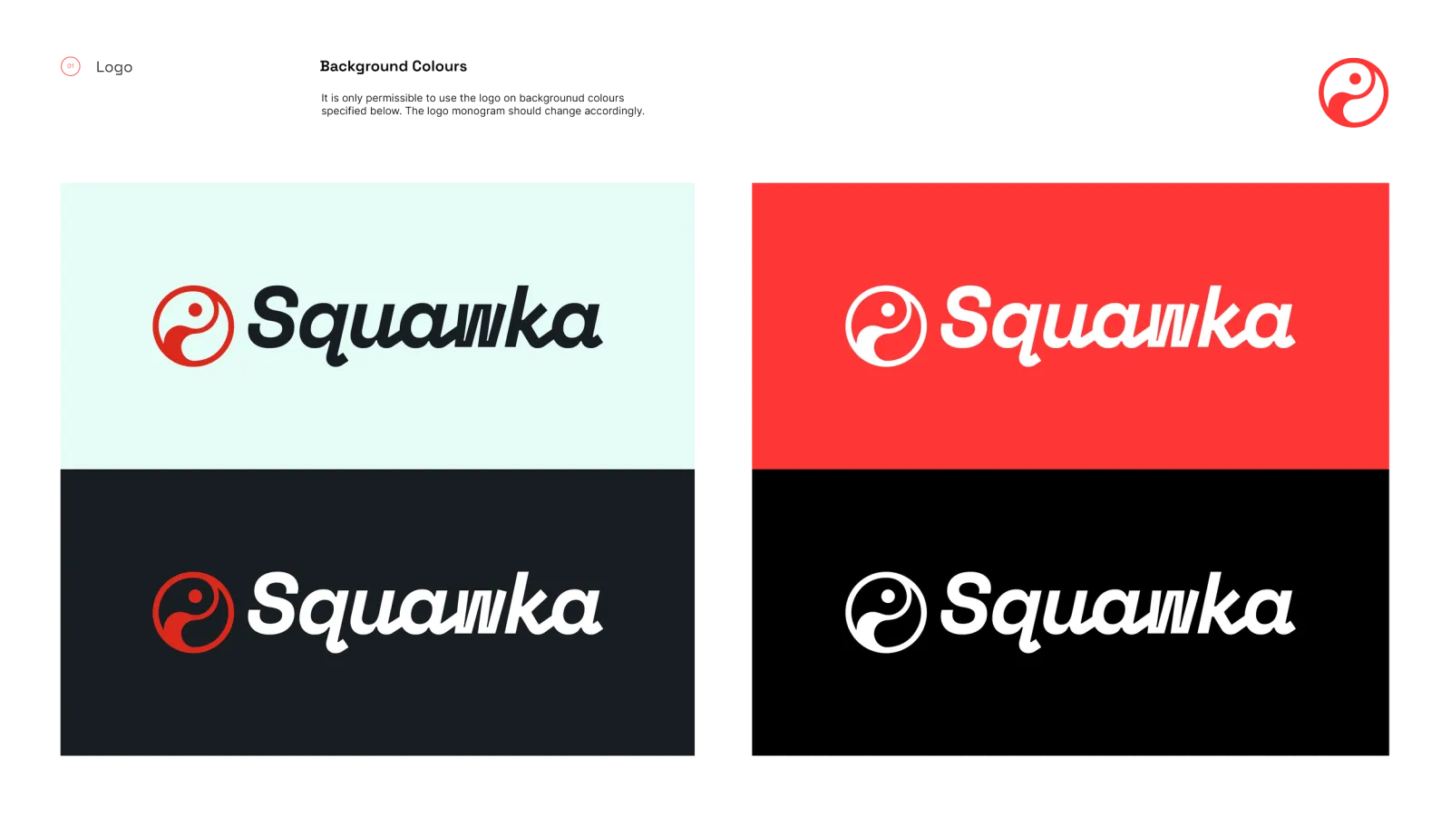
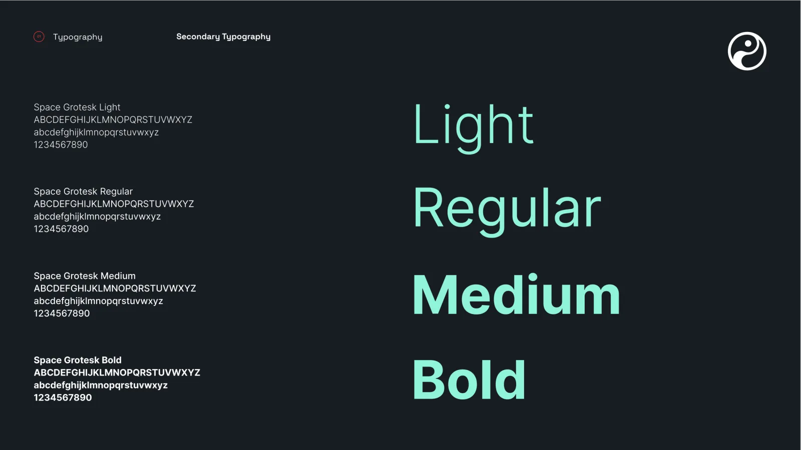
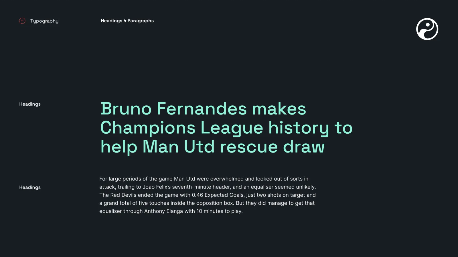
The logo was redrawn for legibility and visual impact, with curated colour palettes and typography selections underpinning the identity so it holds together across every touchpoint.
PLACEHOLDER — needs expanding once you've told me what the constraints were.
PLACEHOLDER — did the guidelines get adopted? What shipped?