A stats page can show you every number there is and still not tell you which player is better.

Challenge
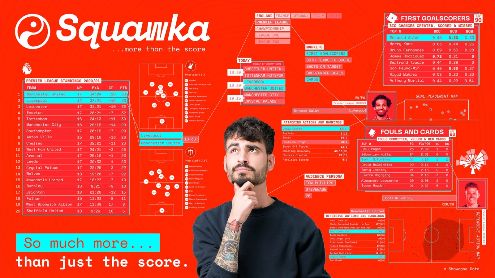
Squawka sells football data. The underlying numbers are Opta's, and there are a great many of them: passes, duels, take-ons, tackles, for every player in every match of a season. The business described itself as more than the score.
More than the score is a promise about answers, and a dataset is not an answer. Somebody arriving on a Friday night wants to know whether a game is worth their money, or which of two players is actually having the better season. A filterable table does not reply to that. It restates the question and attaches homework.
The difficulty is that you cannot fix it by asserting a verdict, because the data is the only reason anybody trusts the verdict. Take the numbers away and it is a man with an opinion. Leave all of them in and it is a spreadsheet. Every piece of work on this page is a version of that one problem.

Approach
Four engagements, and they read better as four moves at one problem than as a chronology.
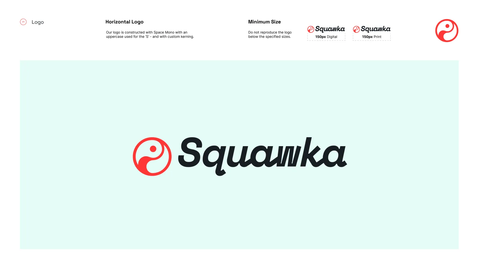
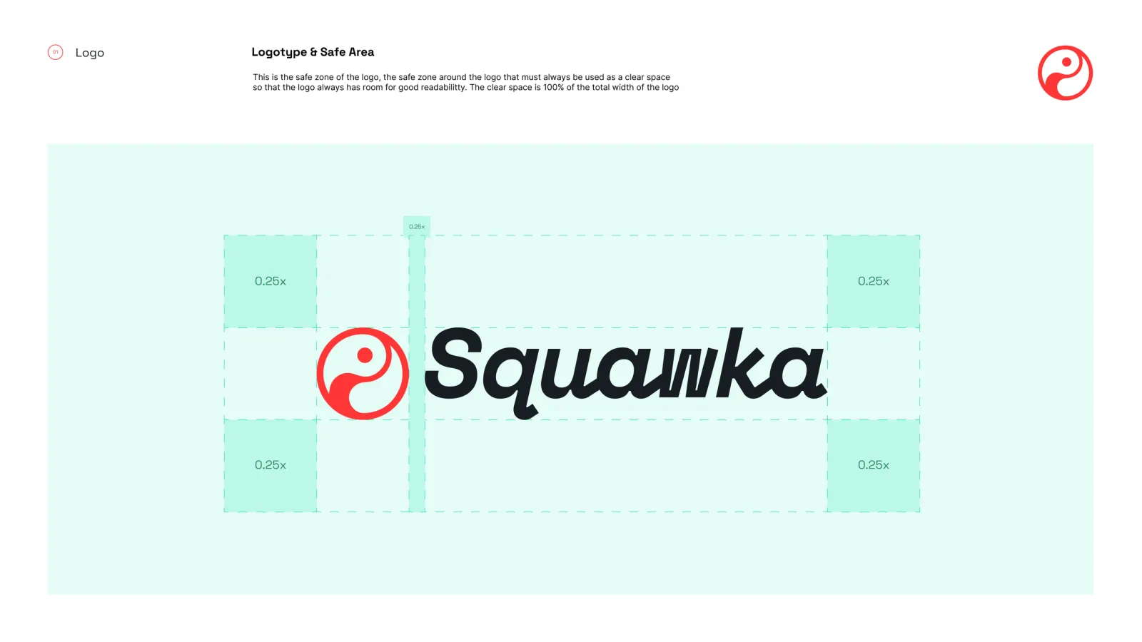
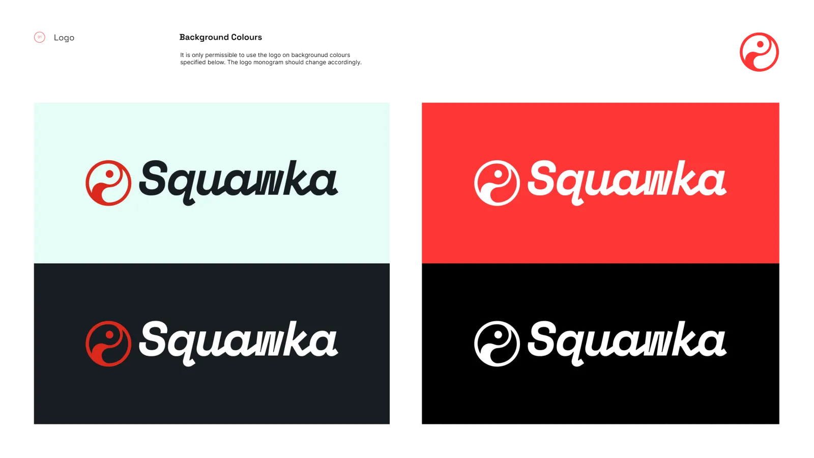
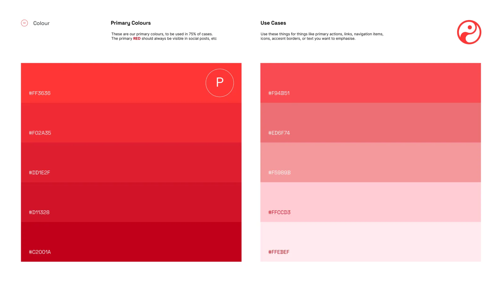
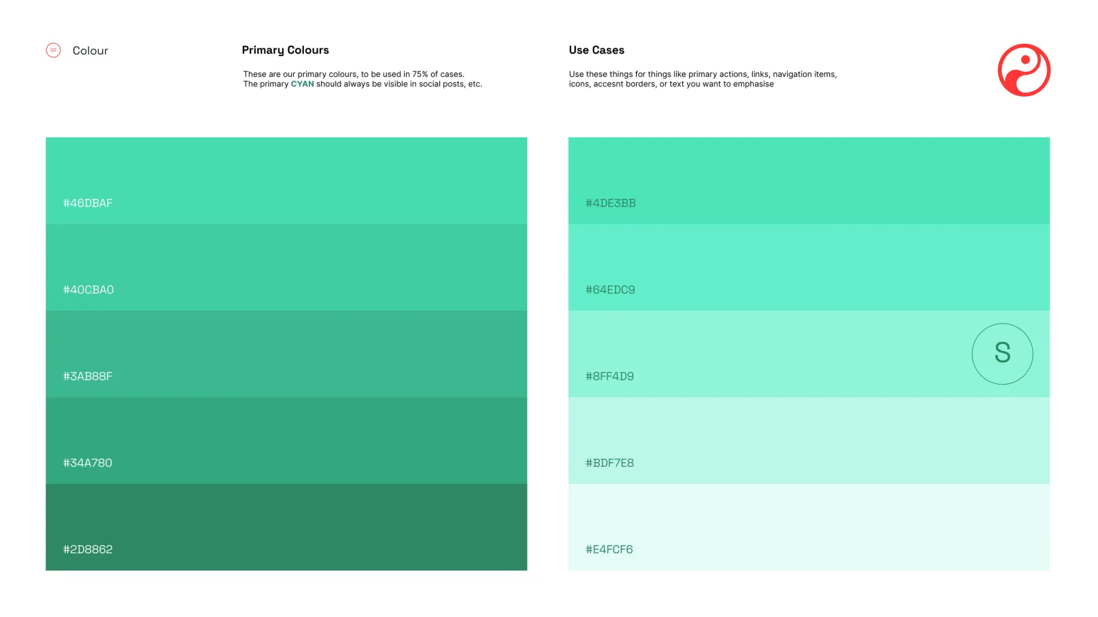
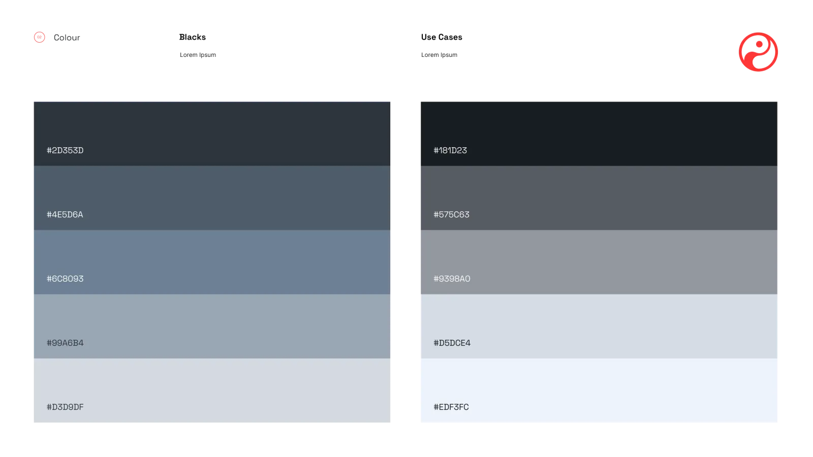
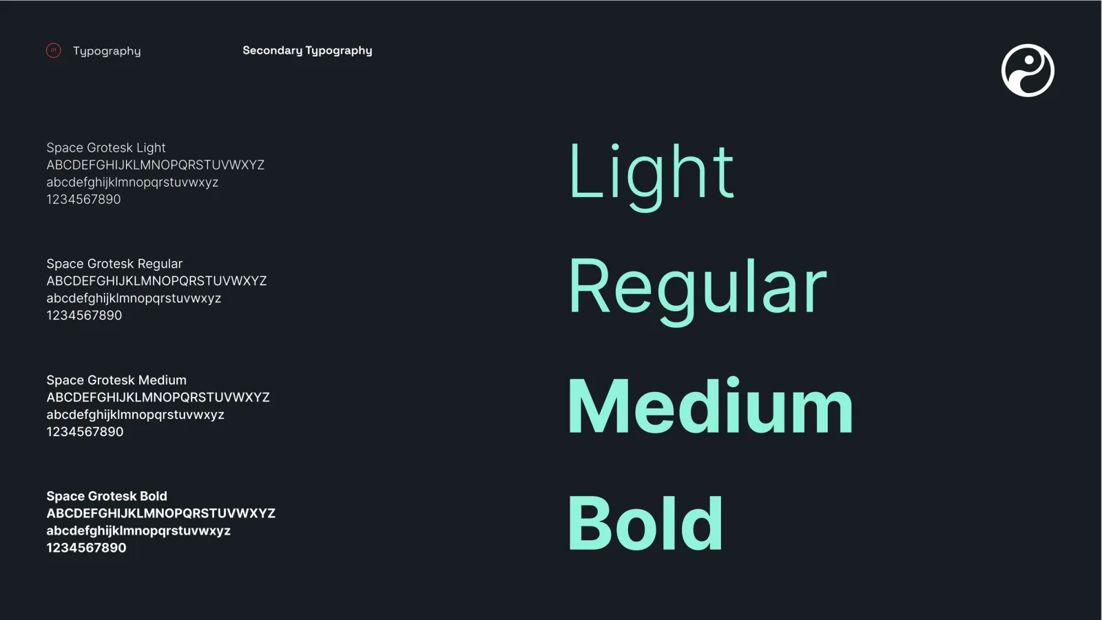
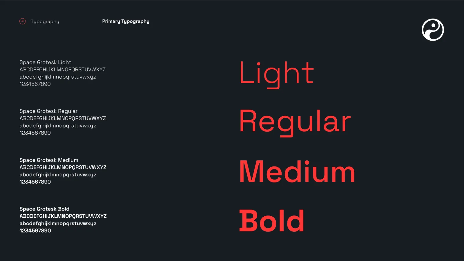
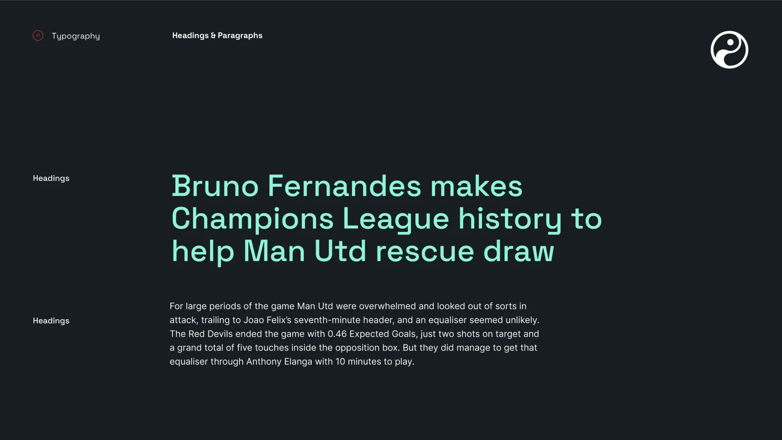
The first was a brand system, written down so other people could use it. Not a logo on its own: construction and clear space, four colourways for the grounds it would actually sit on, and a misuse grid, so a team shipping daily could apply it without asking. Space Grotesk carries the text in four weights. Three palettes sit underneath, and the third is the one that matters for a data business: a slate range for tables, panels and rules. Most of a stats product is grey. Red and mint are for pointing at things, and a system that documents only the brand colours leaves the other ninety percent of the surface undecided.
Read more — 3 more paragraphs Show less
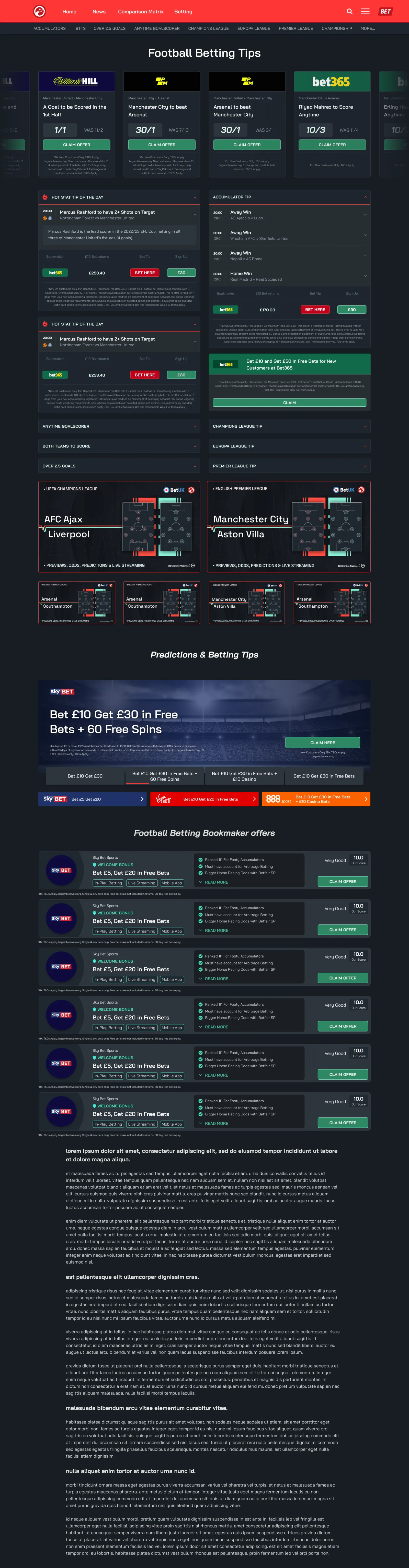
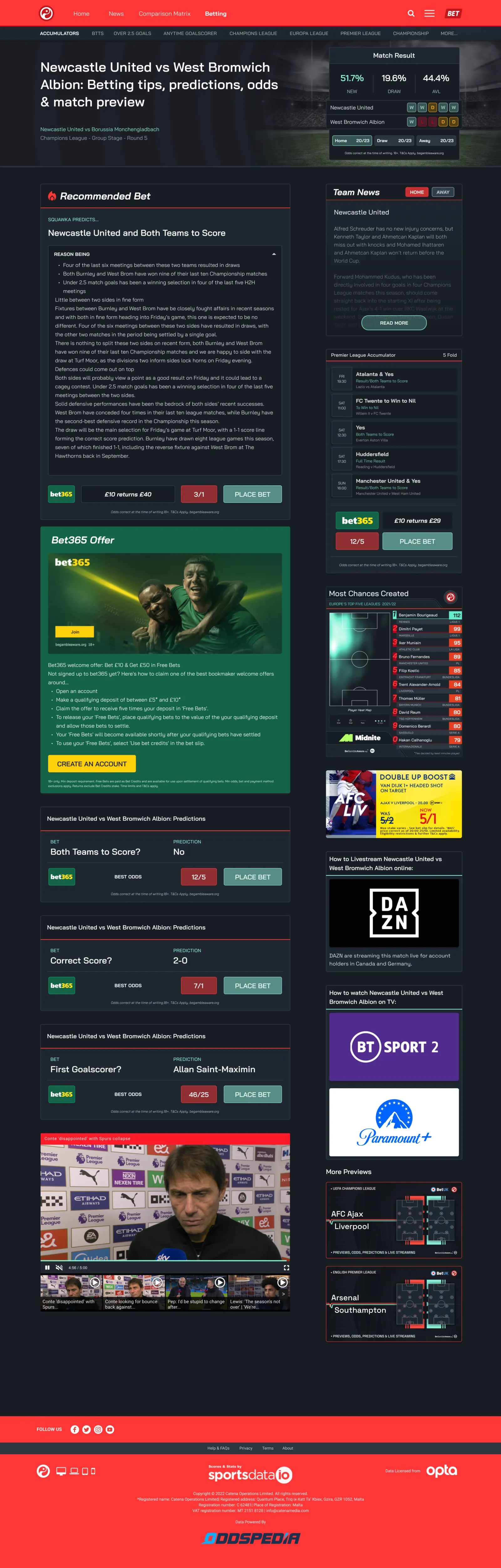
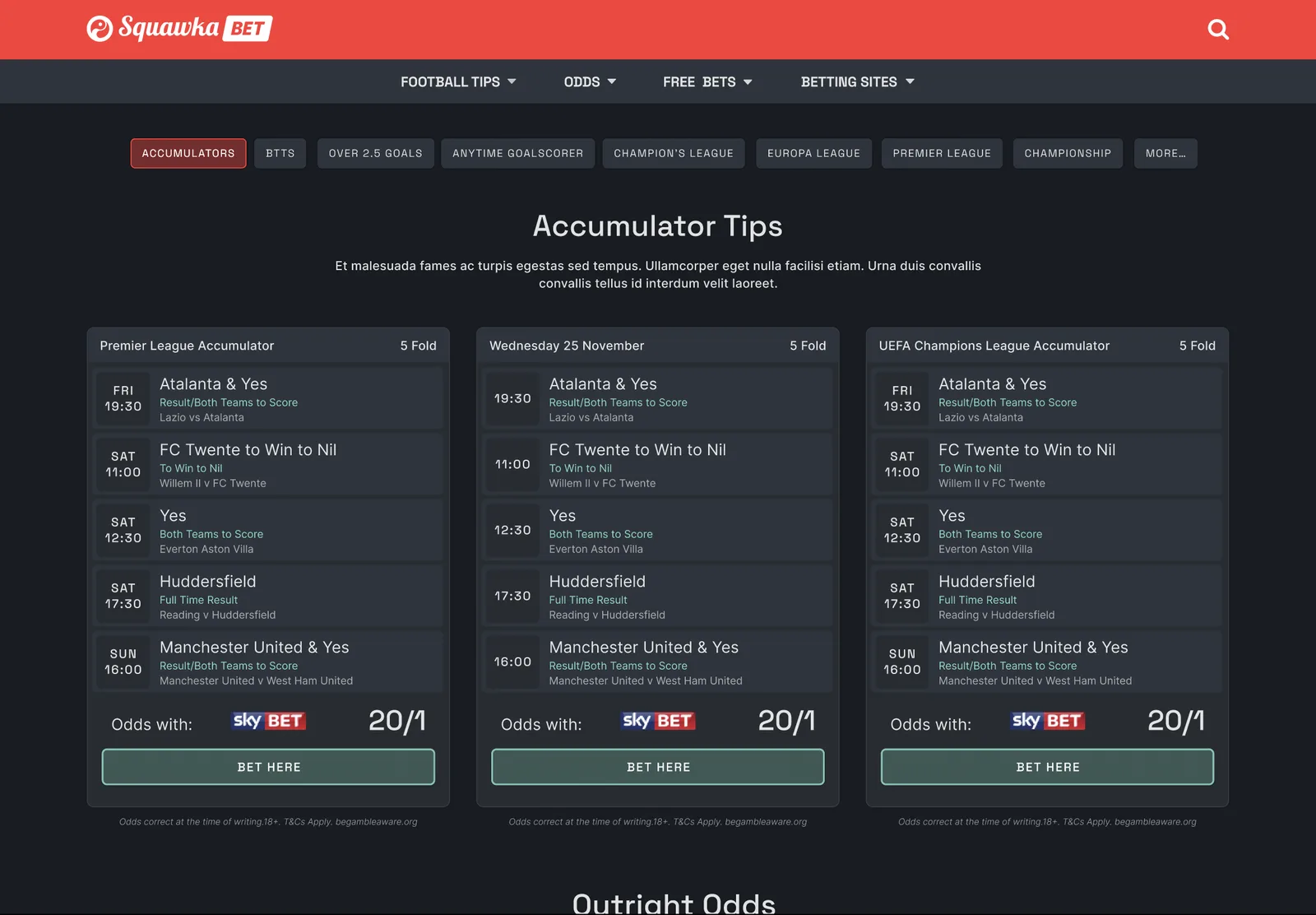
The second was the Squawka Bet redesign, and the rule it runs on is that nothing is recommended without its reason attached. A selection appears under Squawka Predicts, and directly beneath it a Reason panel opens onto the stats the pick came from: the head to head record, recent form, how often these two sides have gone over. Match pages carry result probabilities, five game form strips and the current prices in one view. Regulatory furniture is part of the layout rather than bolted to the bottom of it: prices carry the time they were correct at, and the age and awareness lines sit with the odds they belong to.
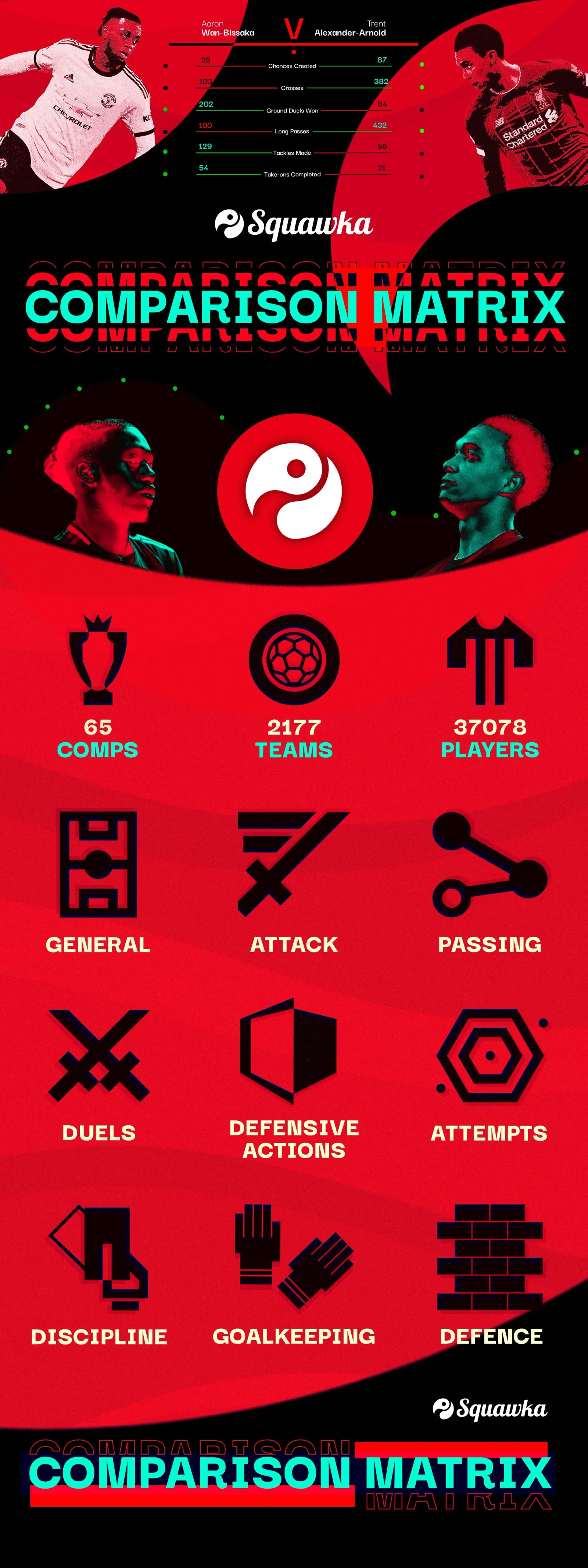
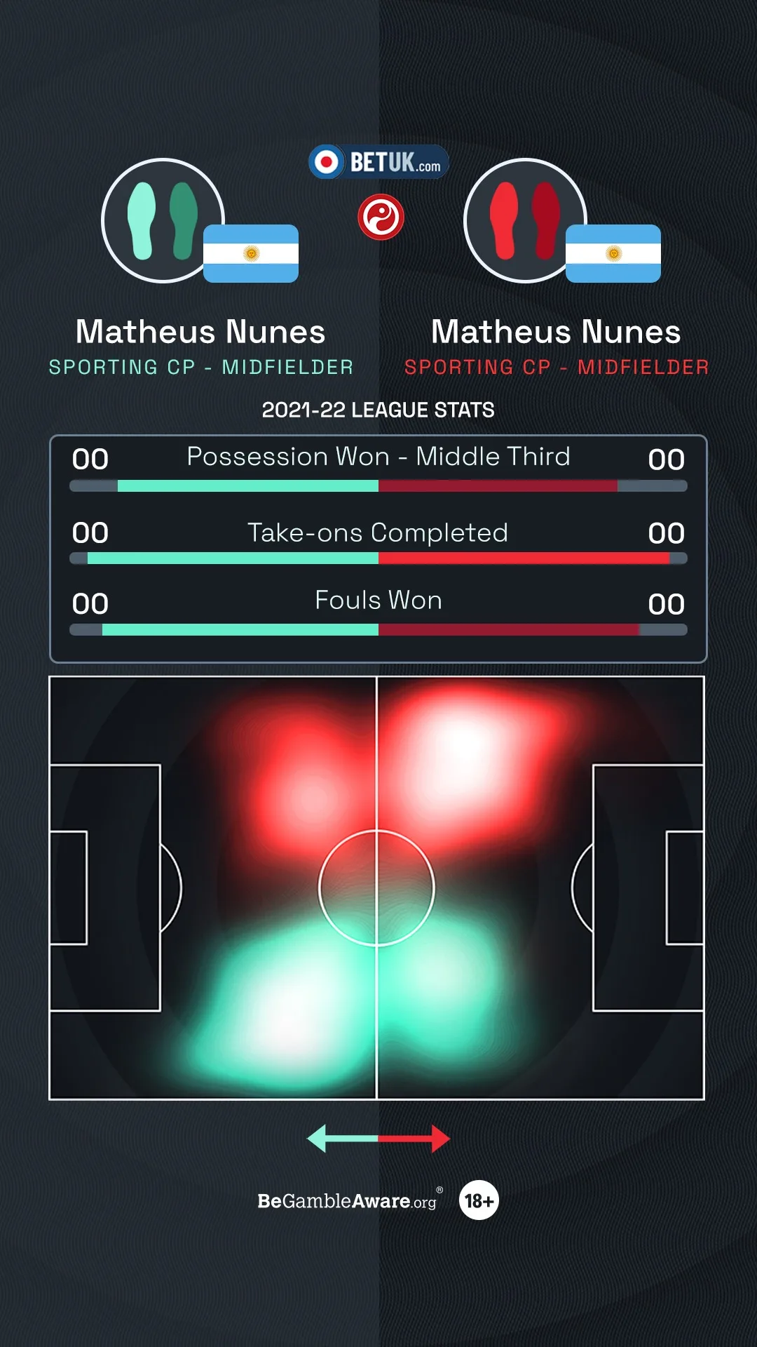
The third was the Comparison Matrix, which answers the question the other two only get near. Two players, the same metrics, read side by side, so that better than is a comparison the reader makes rather than a verdict handed to them. The launch creative sets Aaron Wan-Bissaka against Trent Alexander-Arnold on chances created, crosses, ground duels, long passes, tackles and take-ons, and lets the numbers do the arguing.
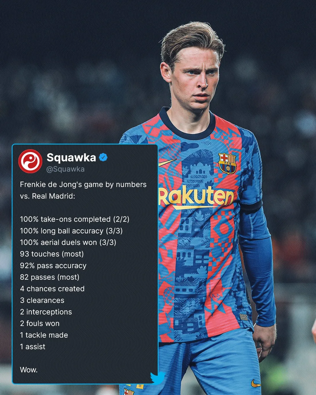
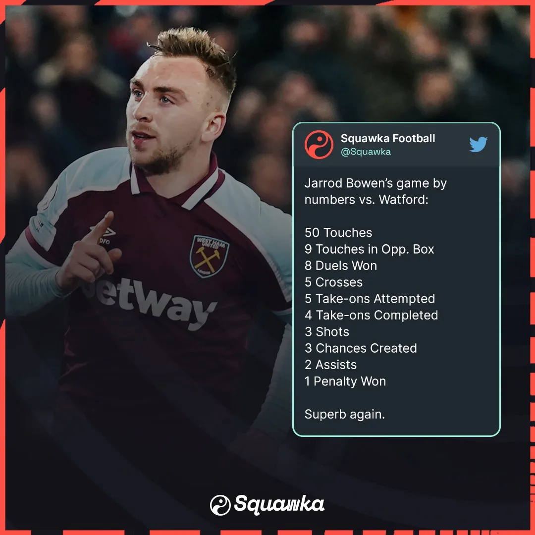
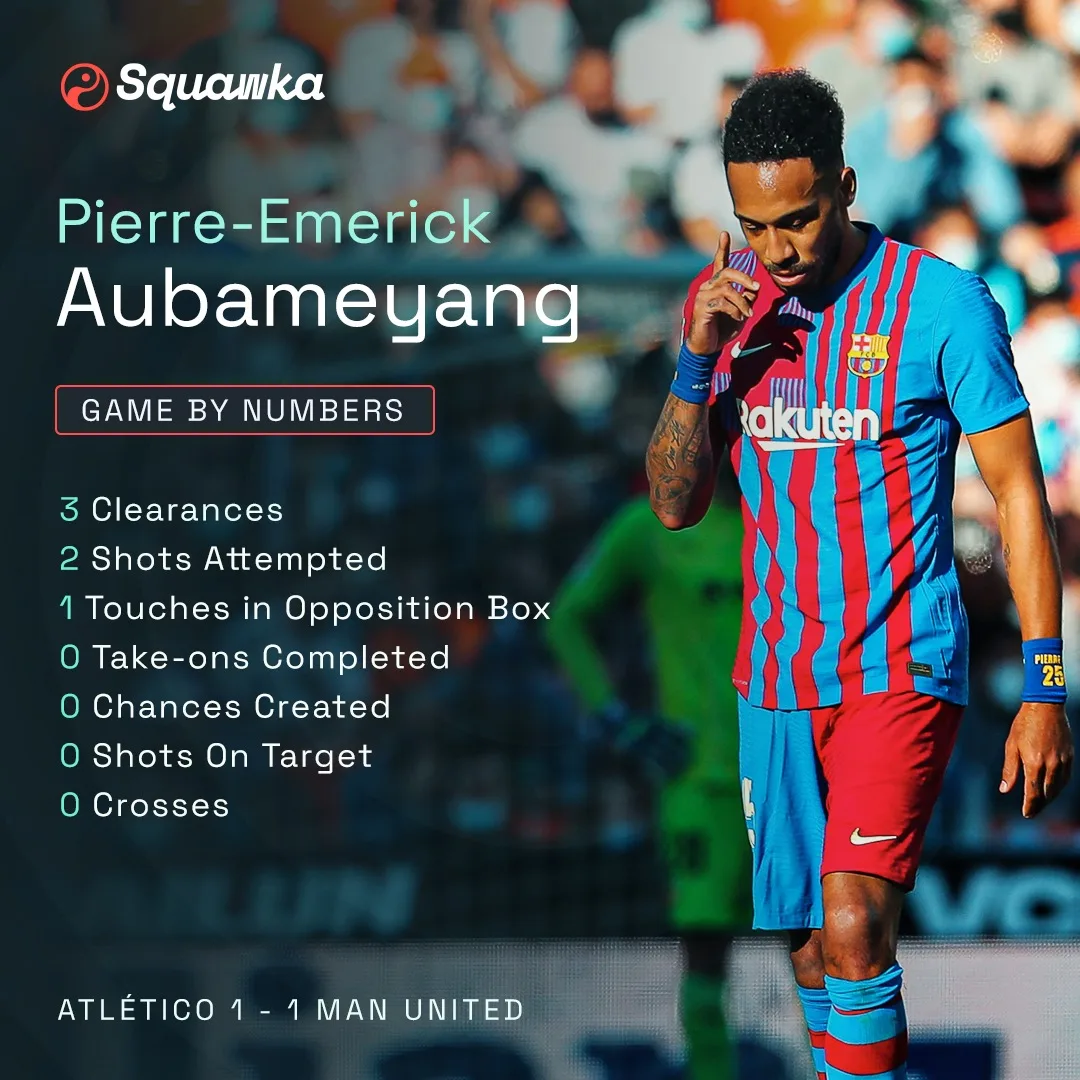
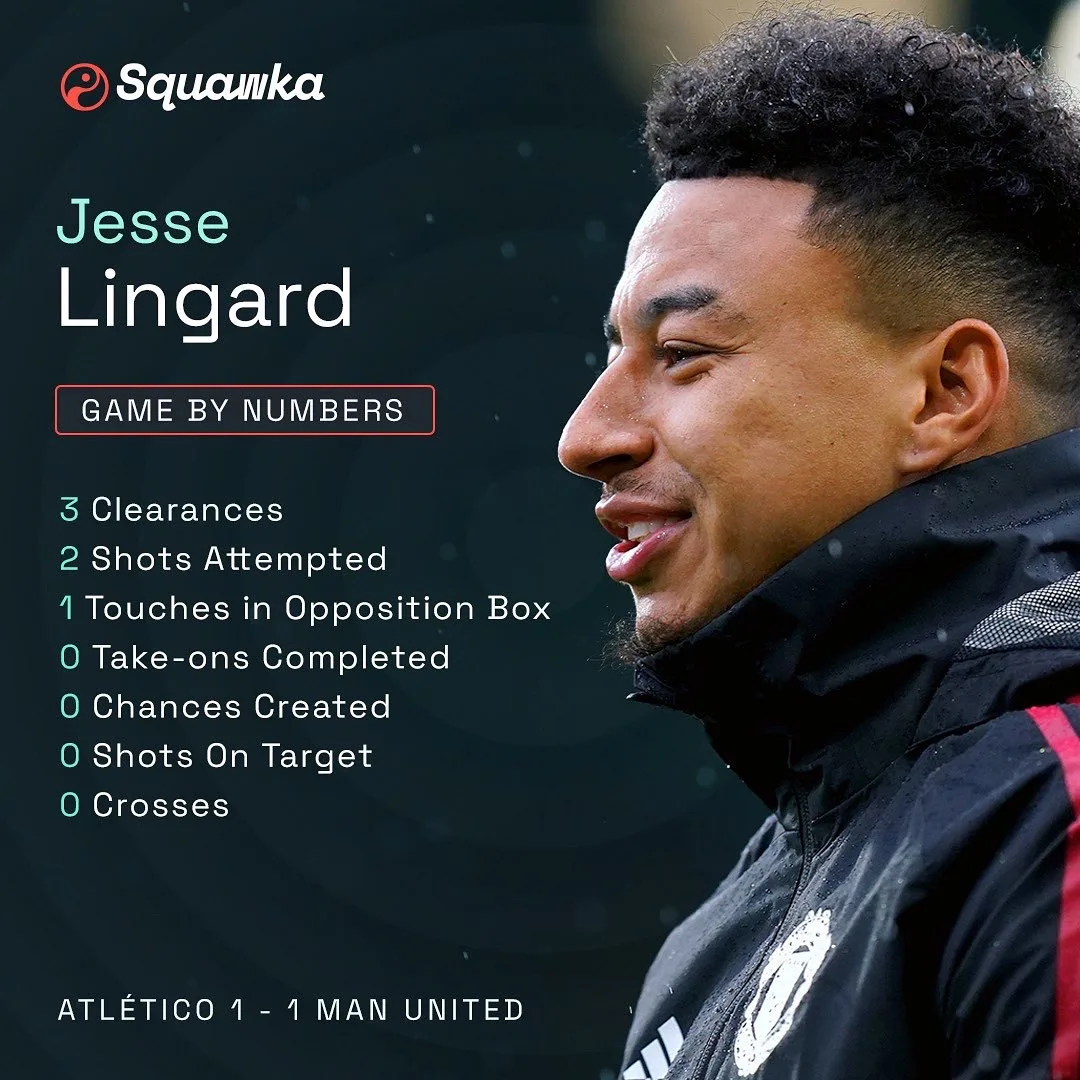
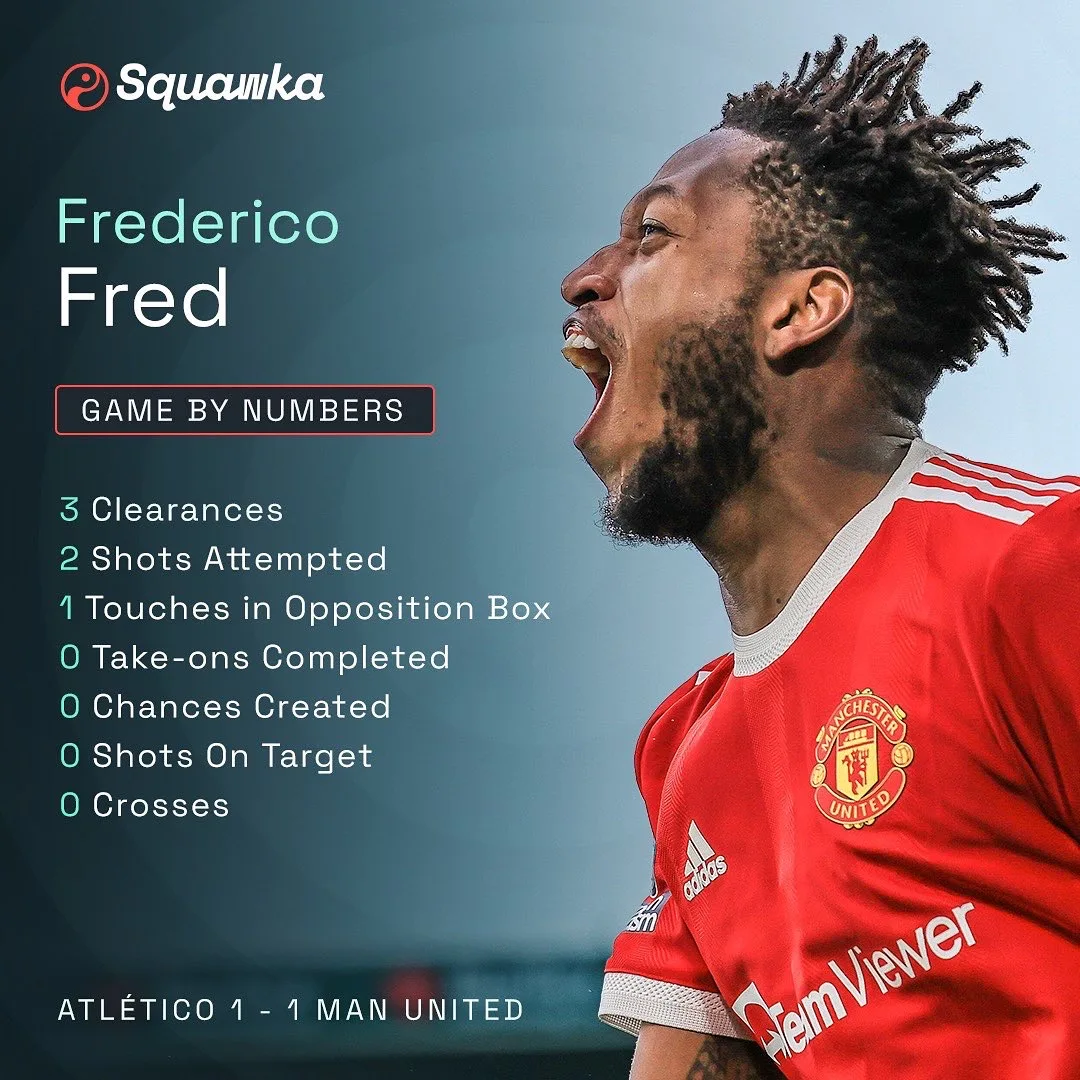
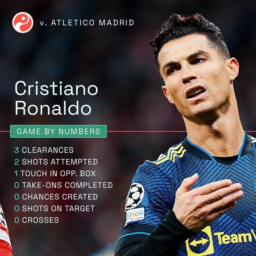
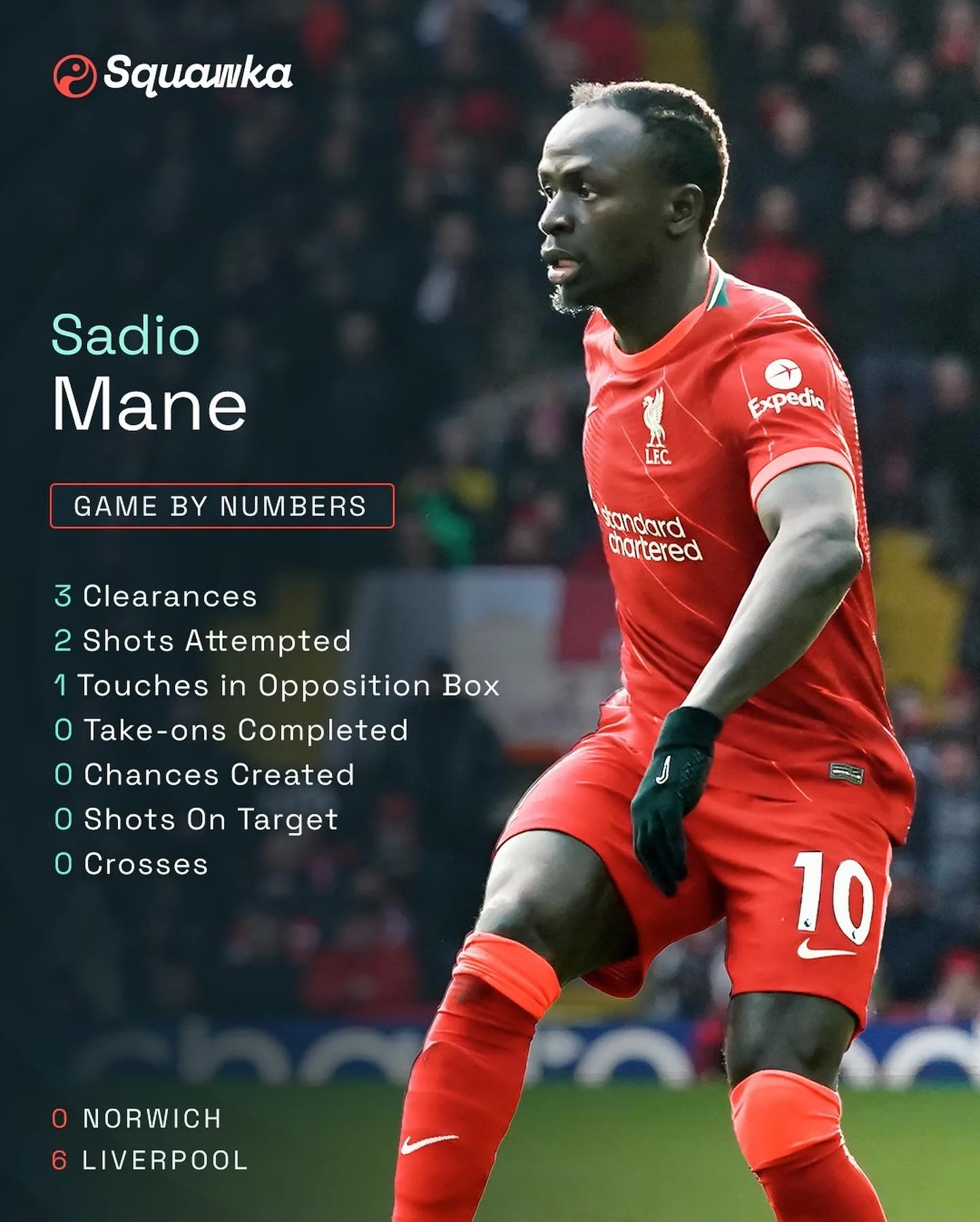
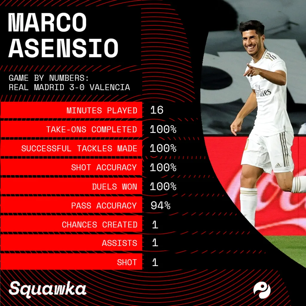
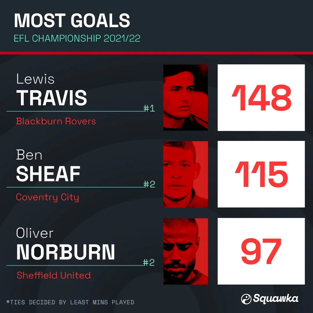
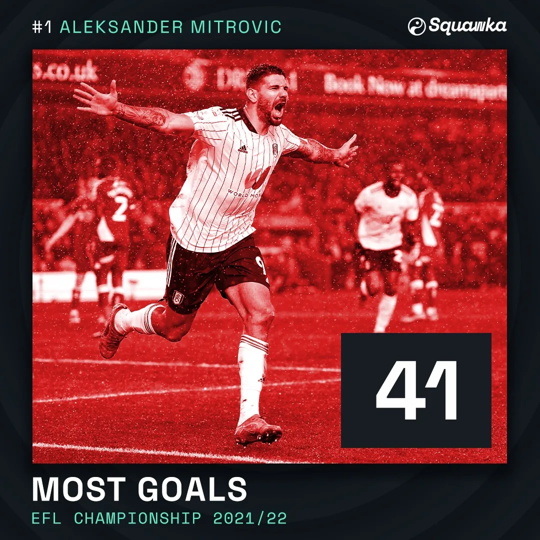
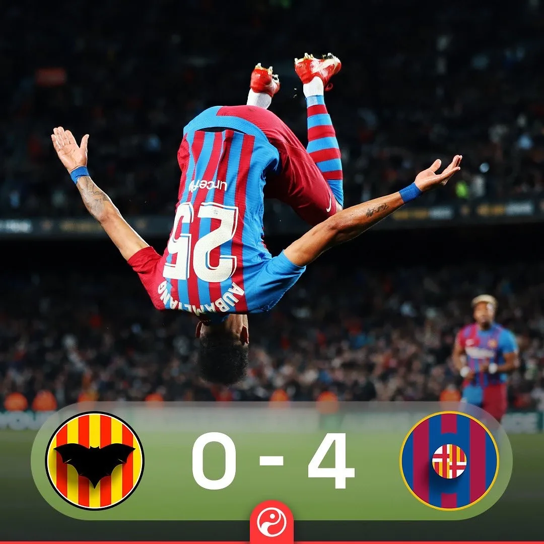
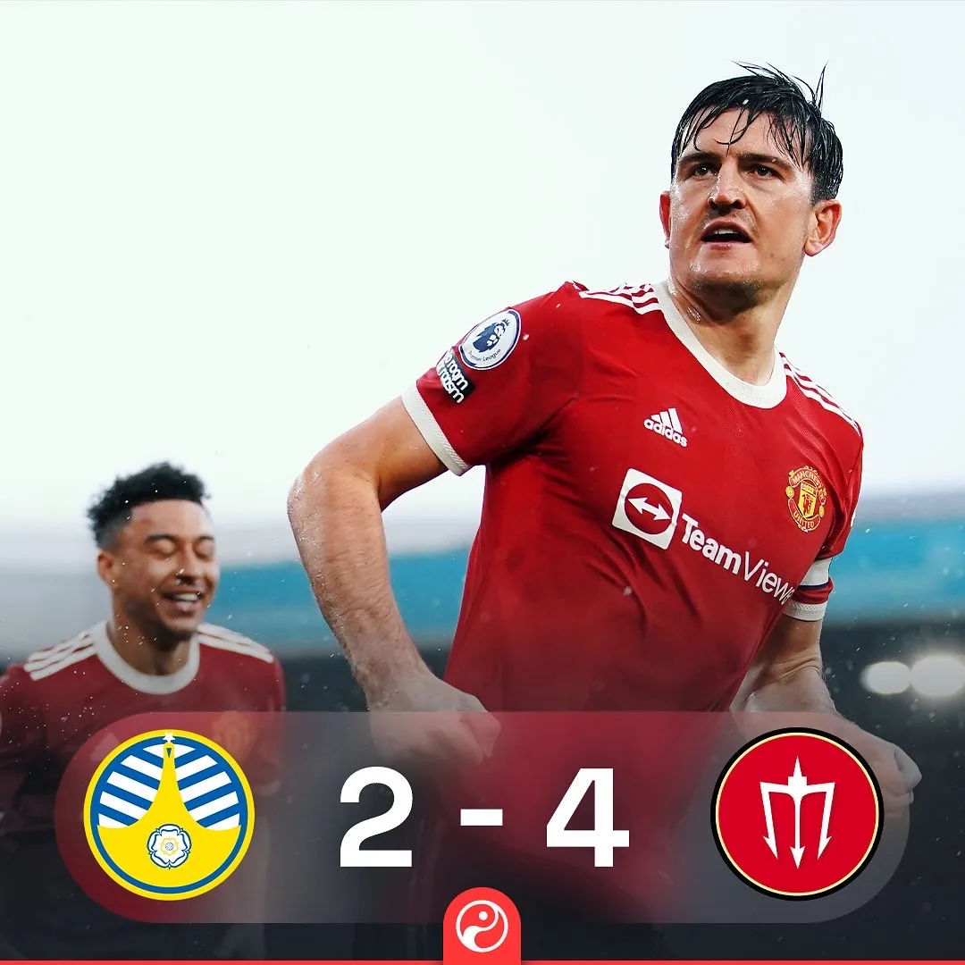
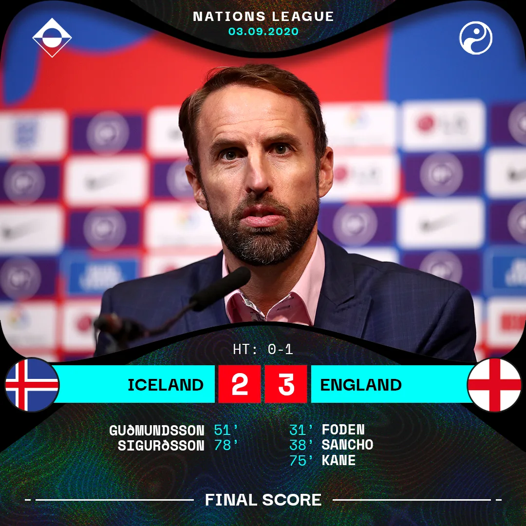
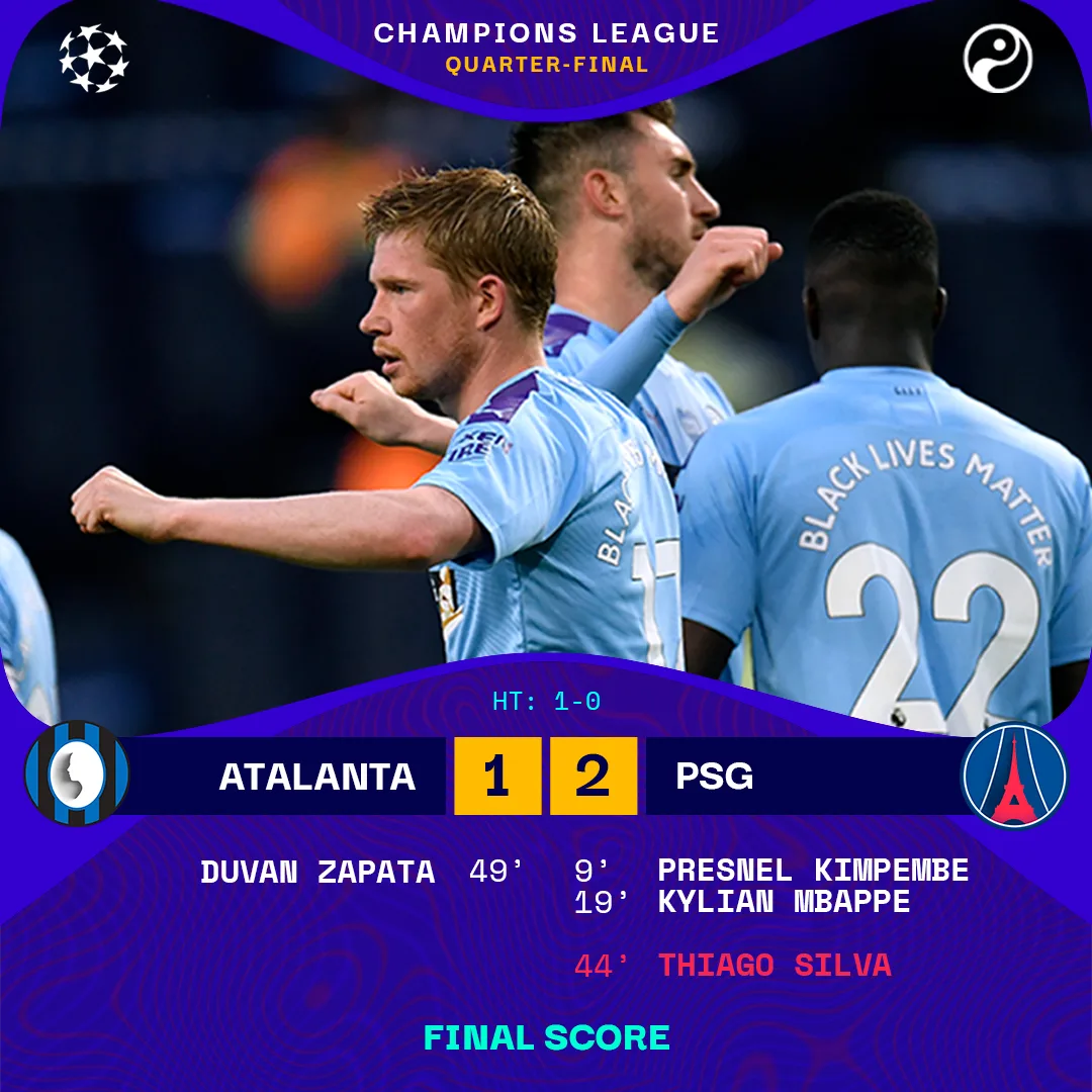
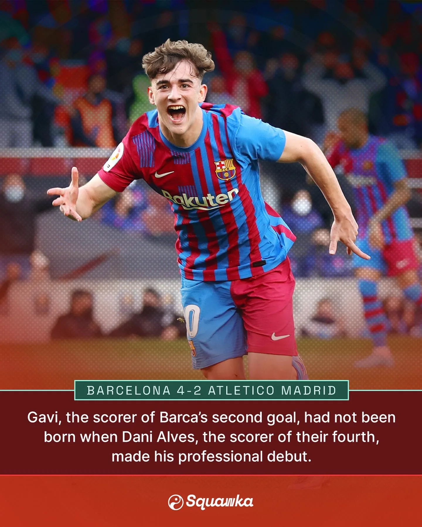
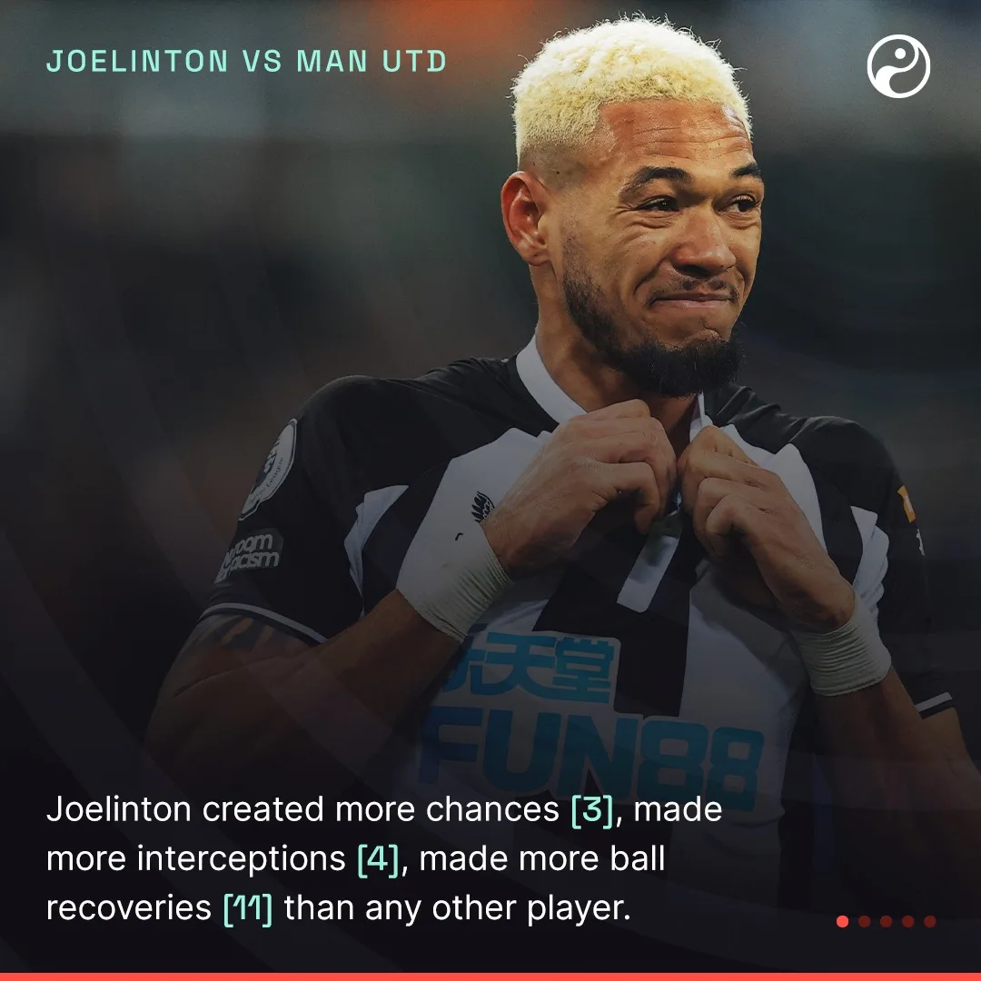
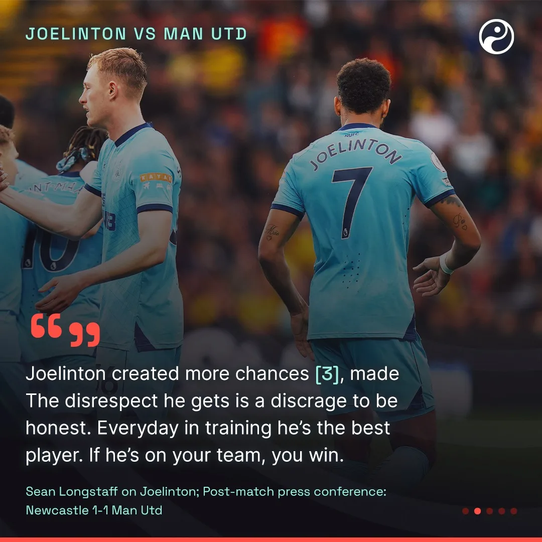
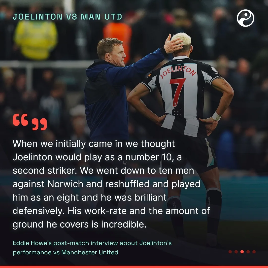
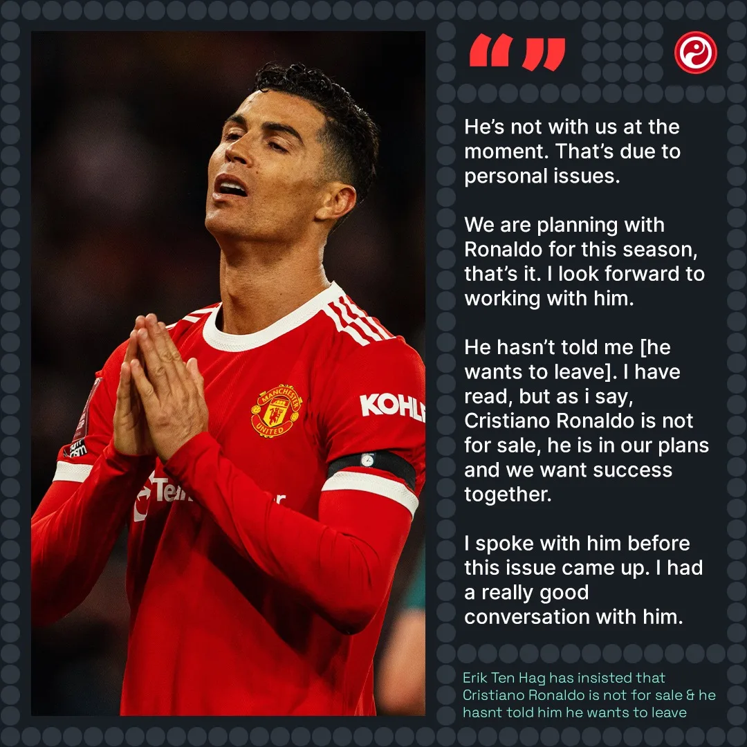
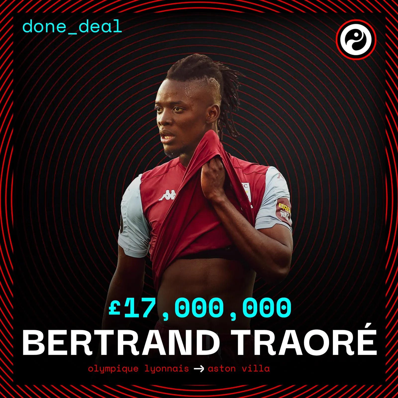
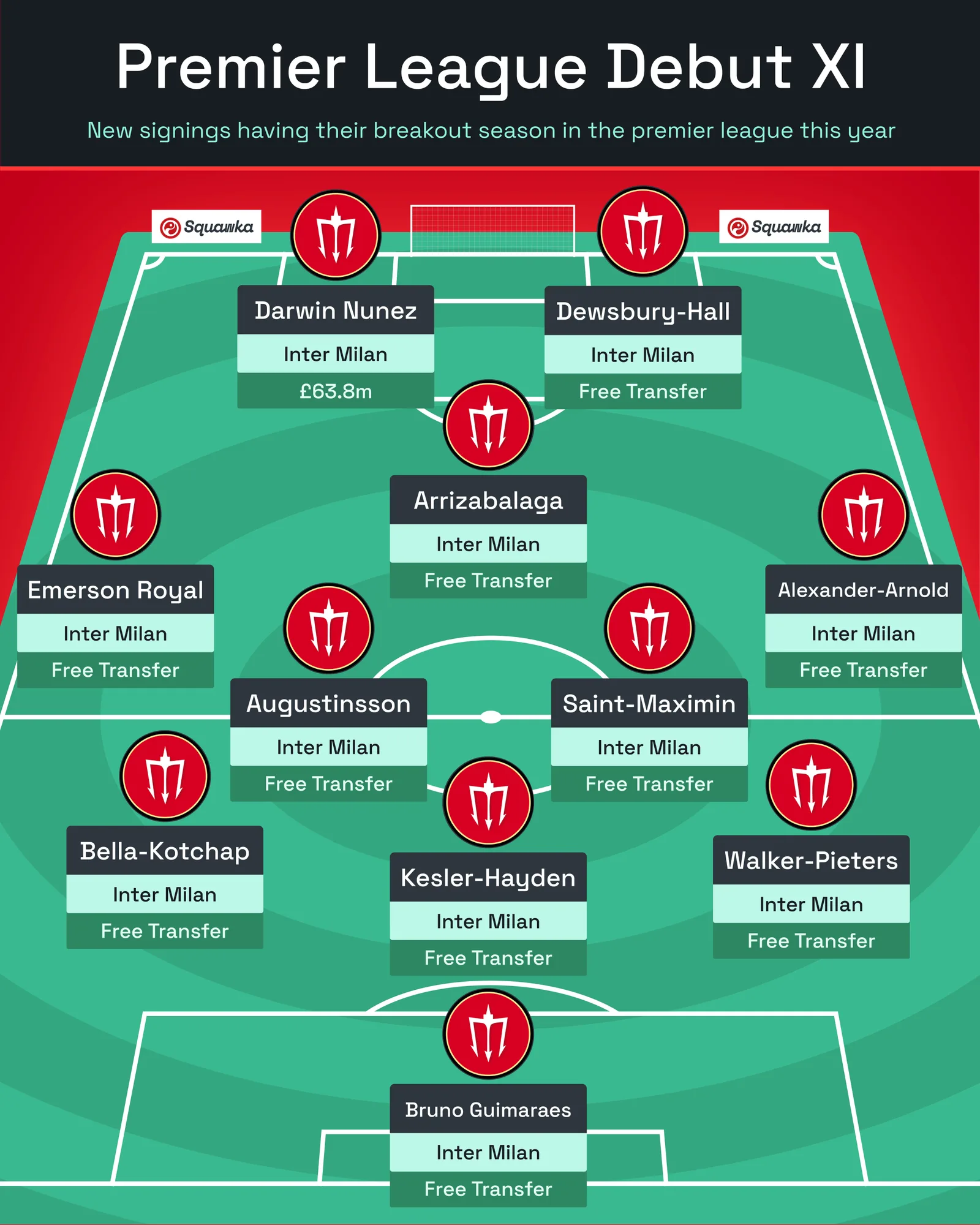
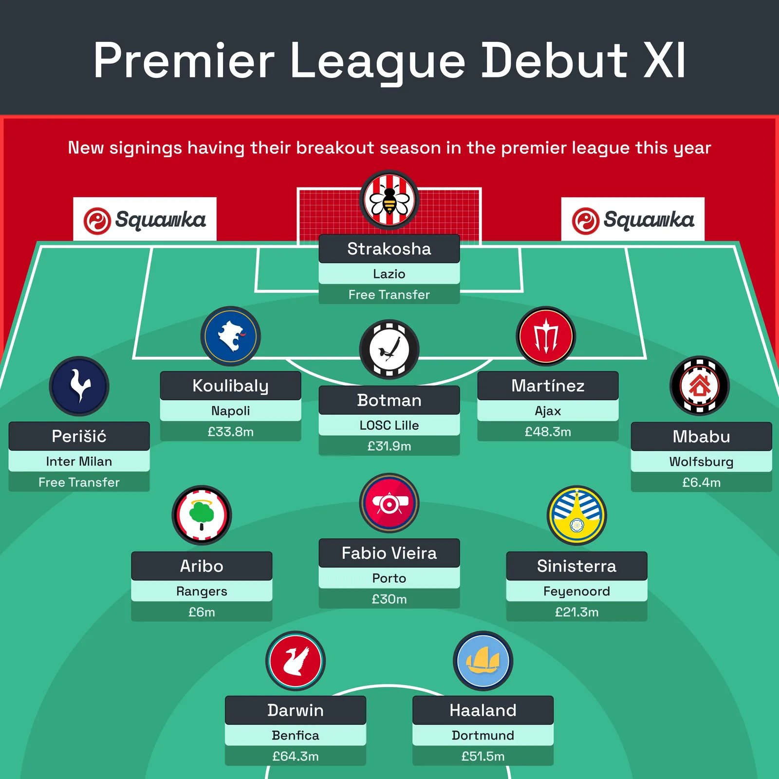
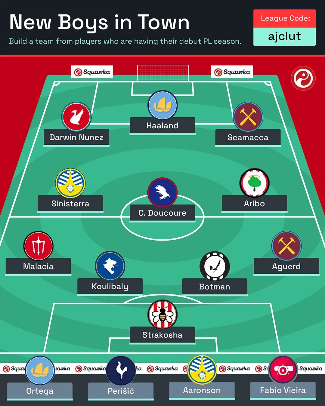
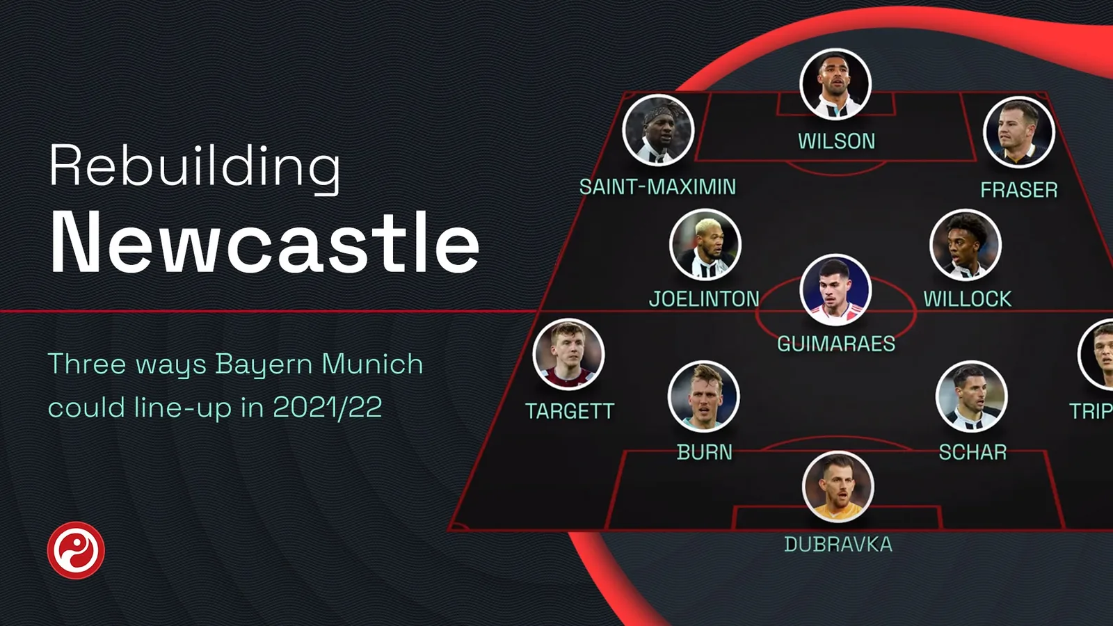
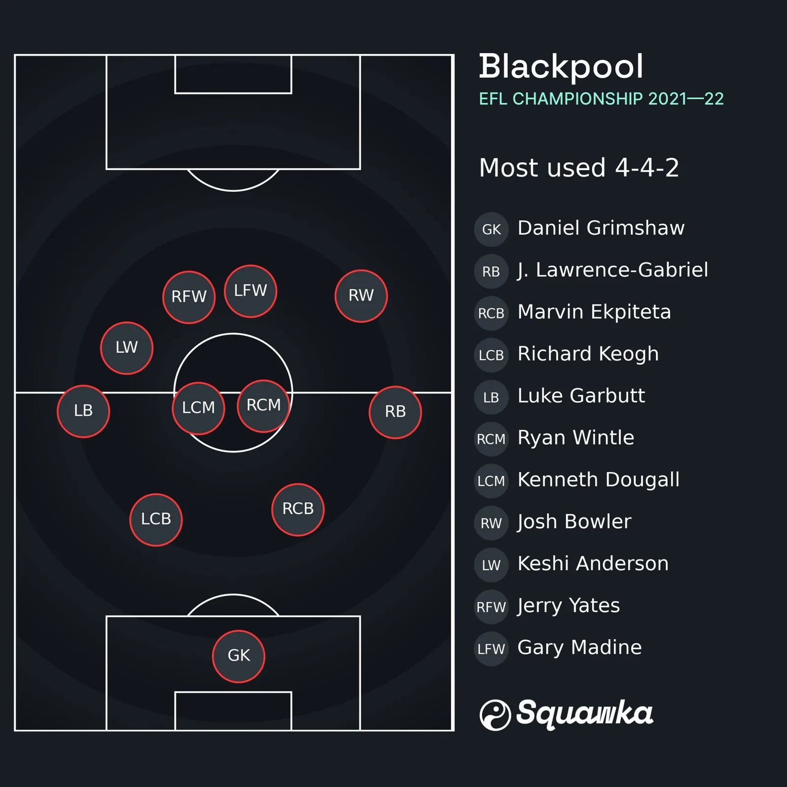
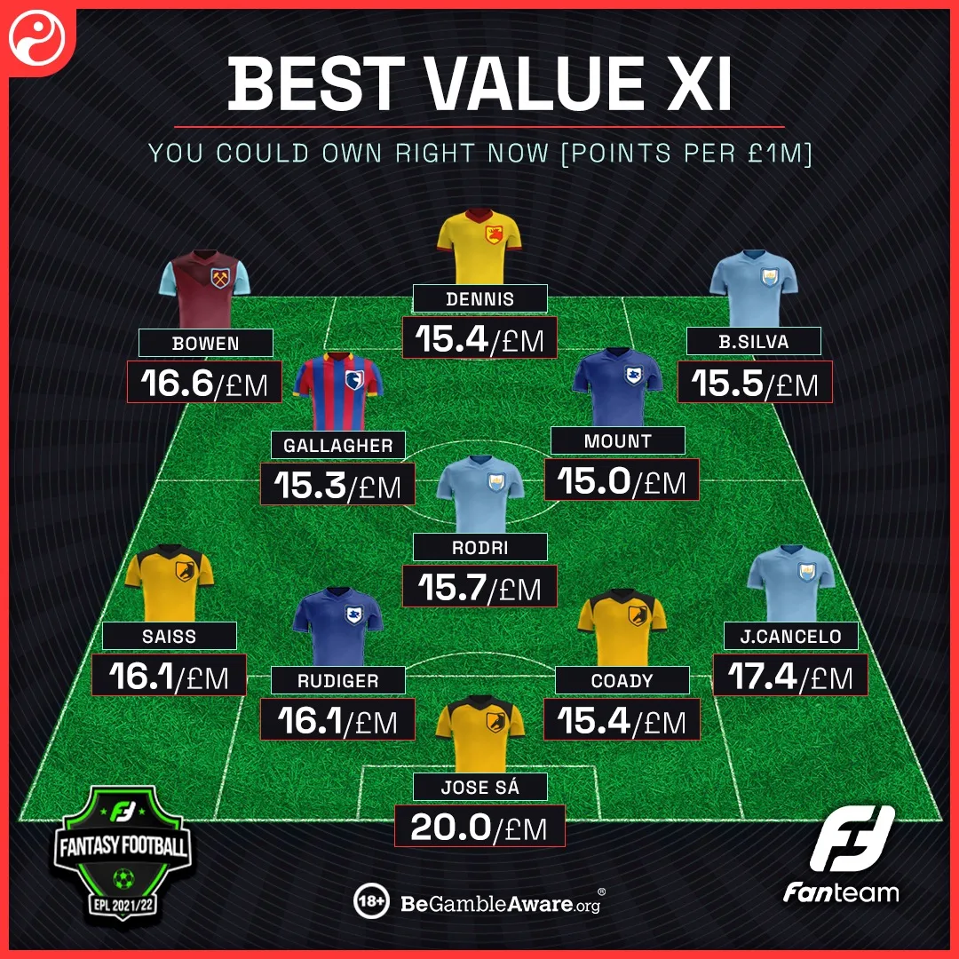
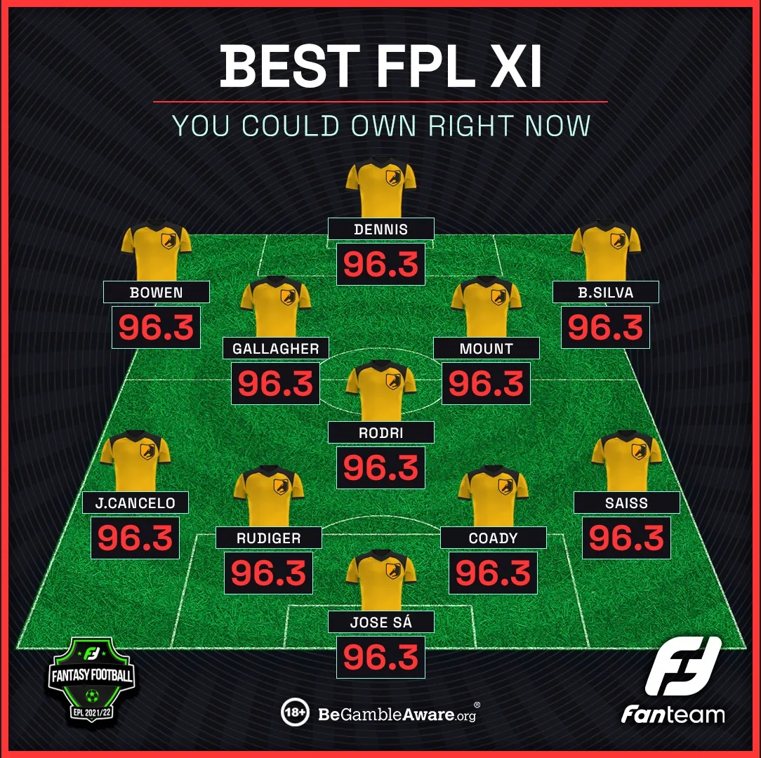
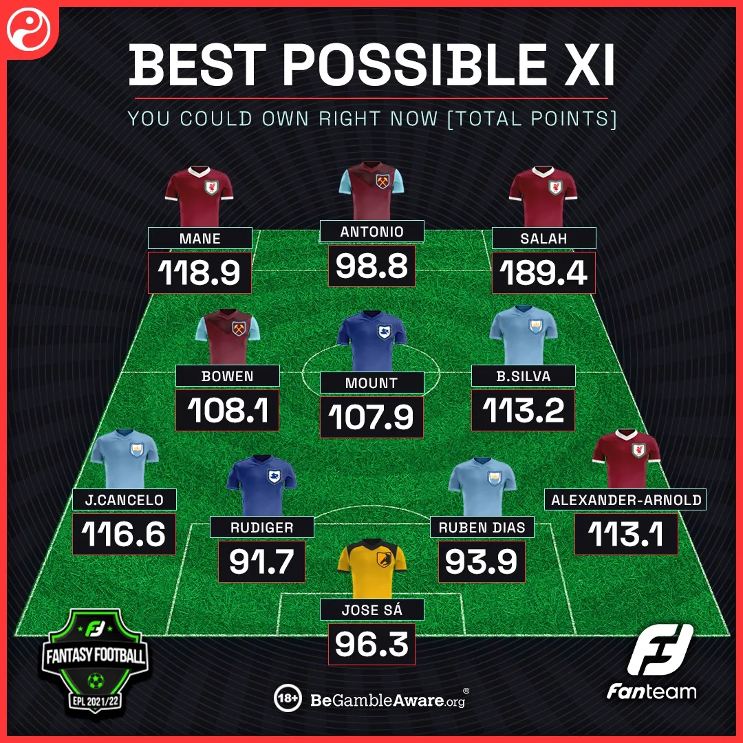
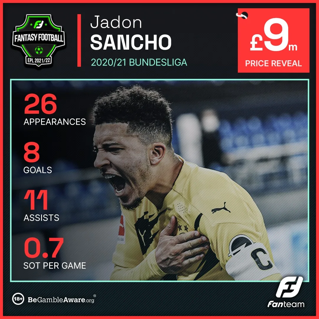
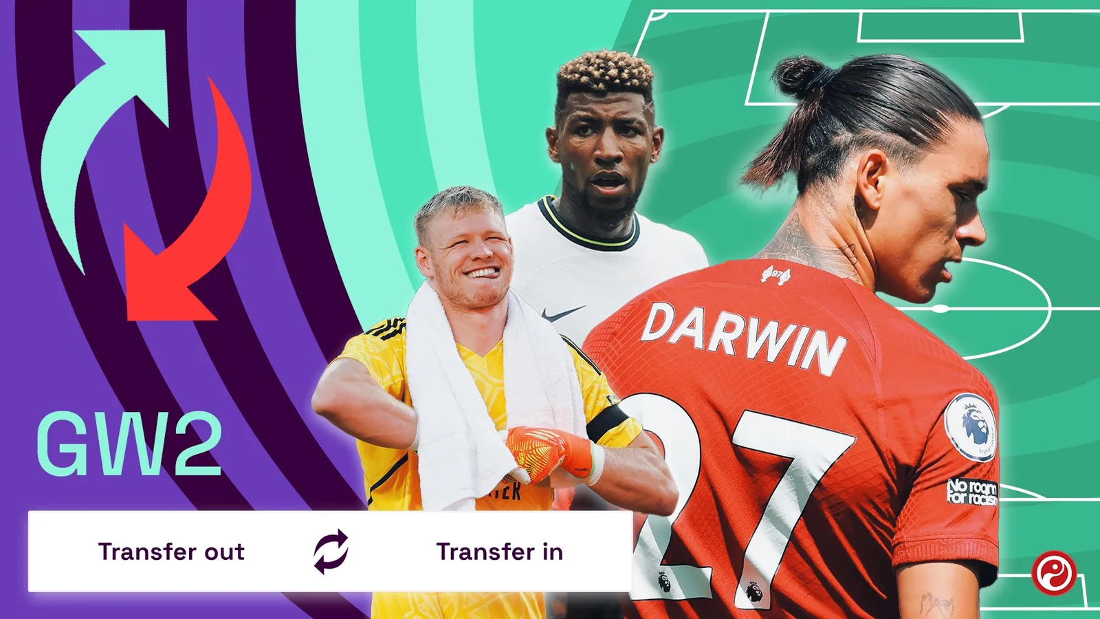
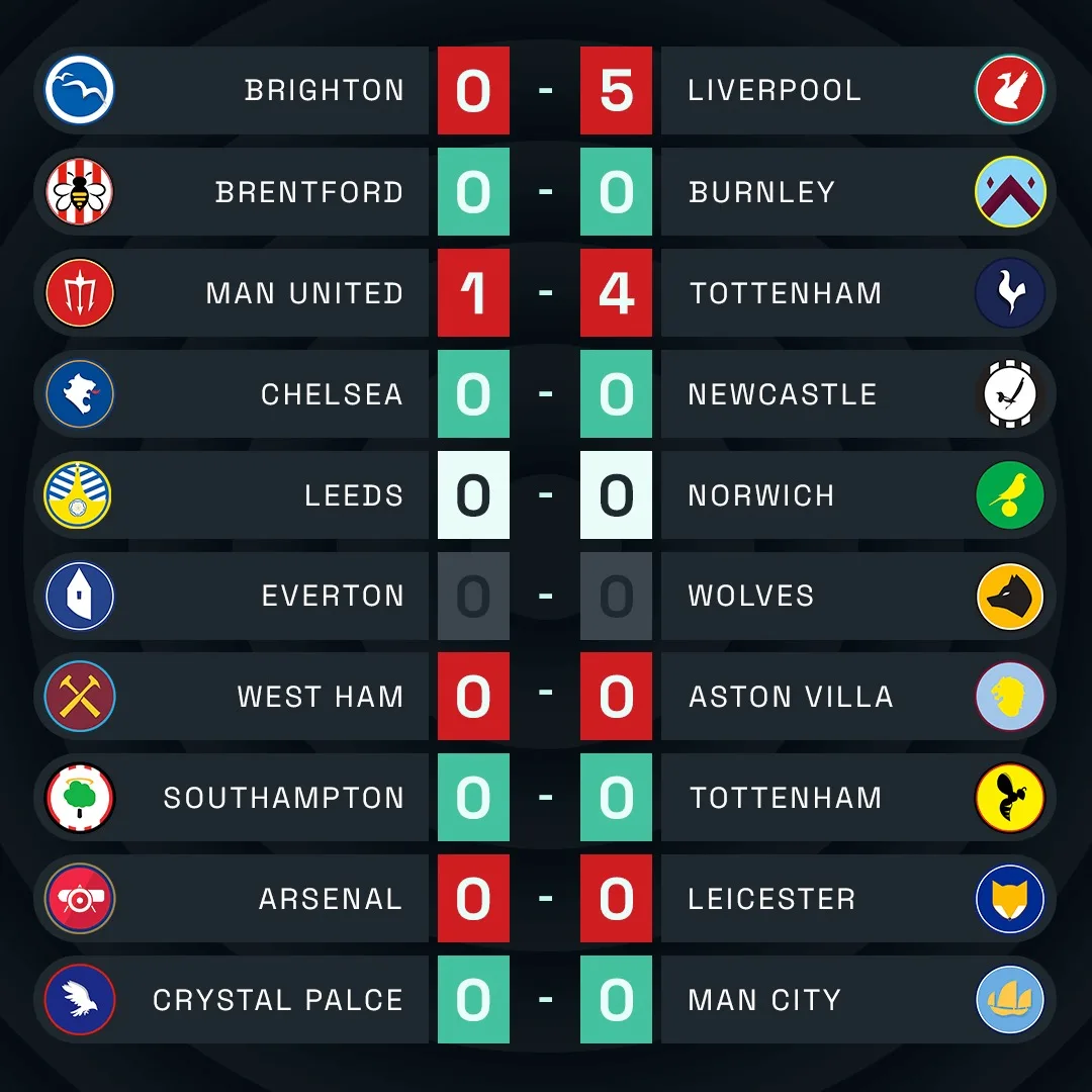
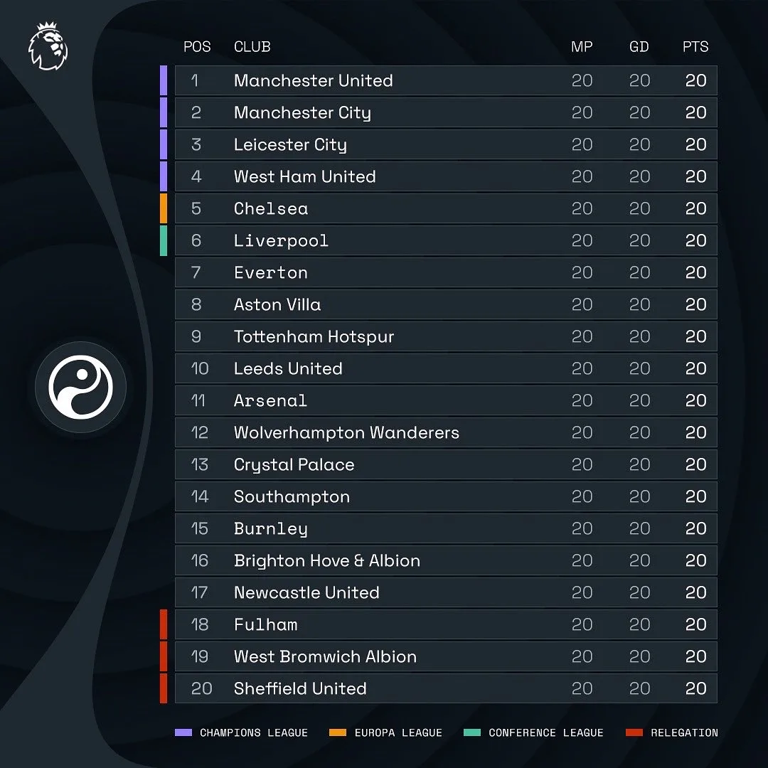
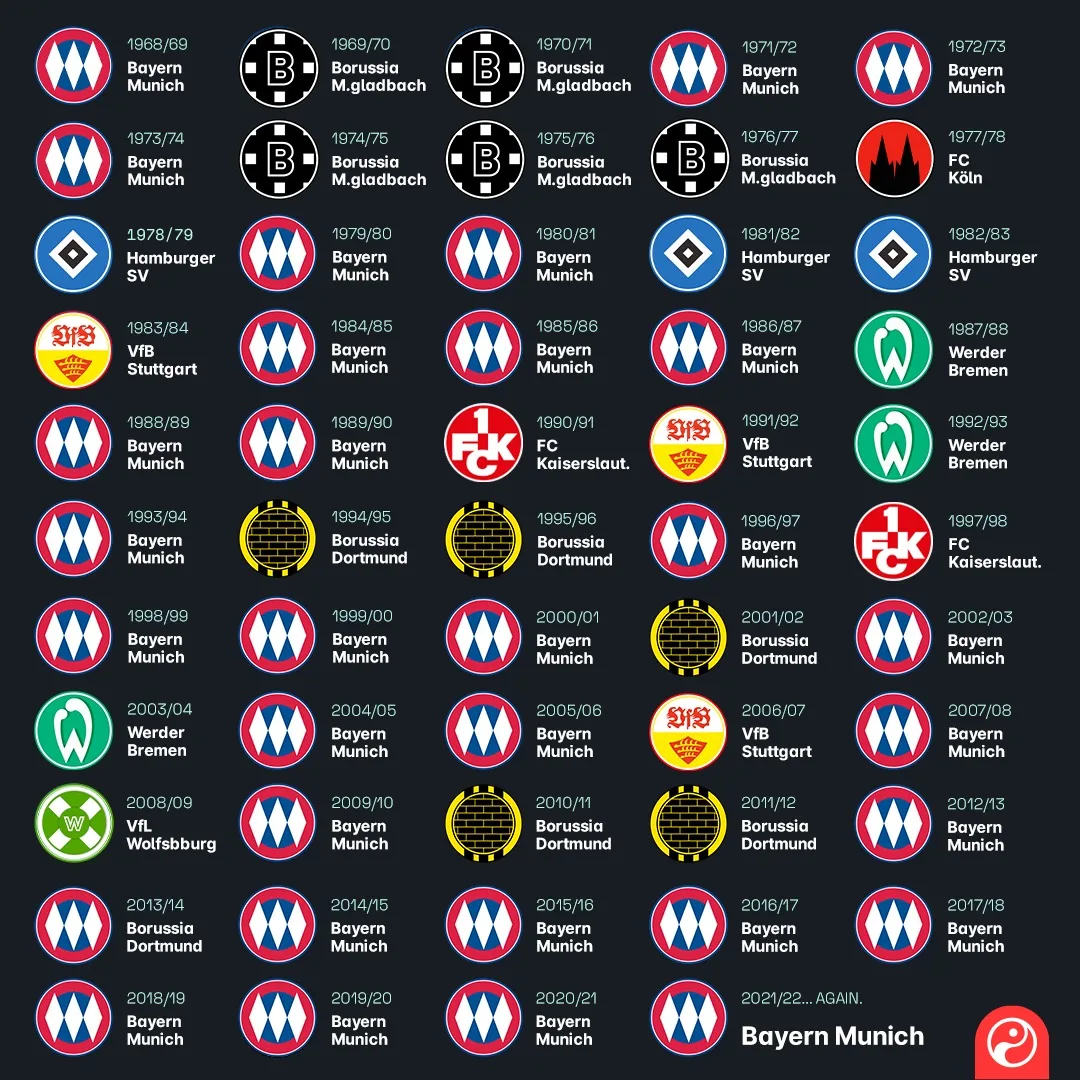
The fourth ran every day, and by volume it is the largest of the four. Game By Numbers for a player, done_deal for a signing, full time cards, leaderboards, quote graphics, Story polls, wall charts, pass maps and scout cards. The templates are the work rather than any single post: one frame takes any player and any fixture without being redrawn, the Stories run as a question slide and an answer slide because that is the mechanic the platform gives you, and the XI build got reused for a debut team, a squad rebuild, a club's most used shape and a fantasy side. The archive is thirteen formats deep and the formats are the argument.

Brand guidelines
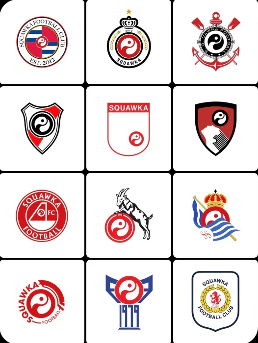
The whole document: the logo and how it is built, the three palettes, Space Grotesk in four weights, and the sub-brands the system had to carry.



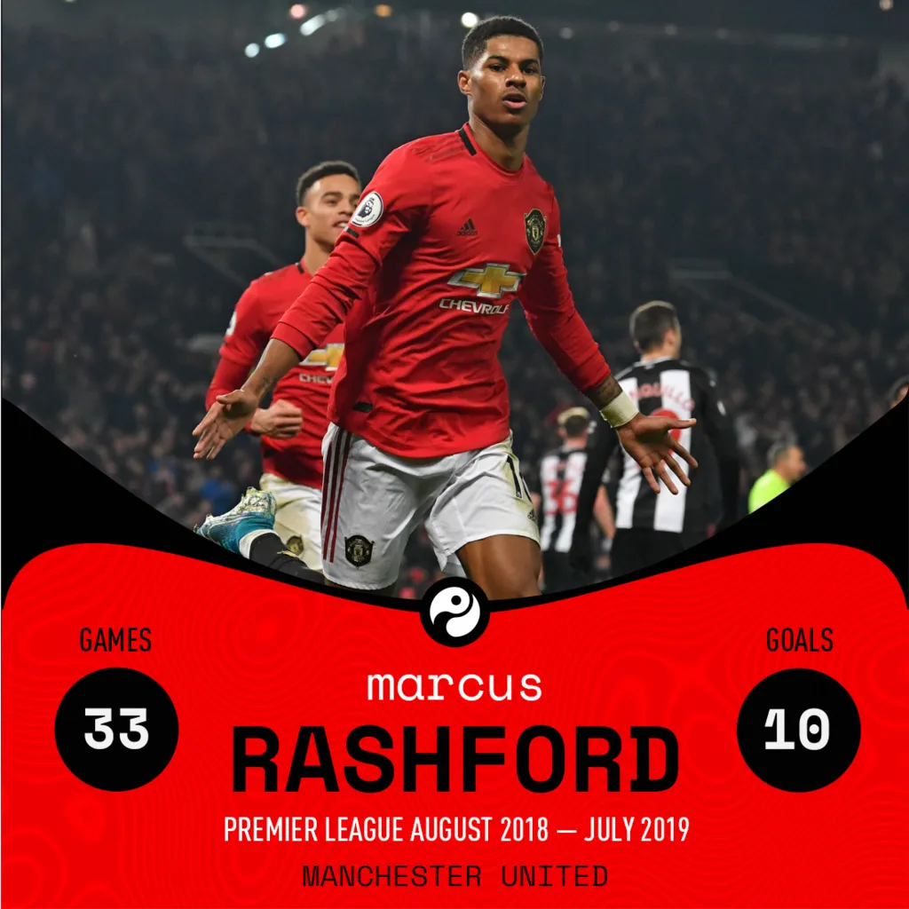
Game by numbers
One layout, any player, any fixture. The post Squawka became known for.
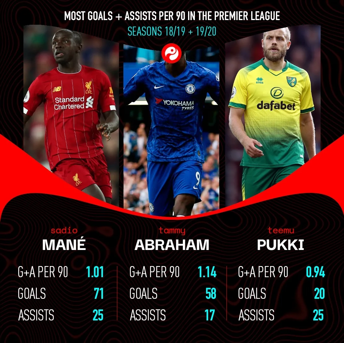
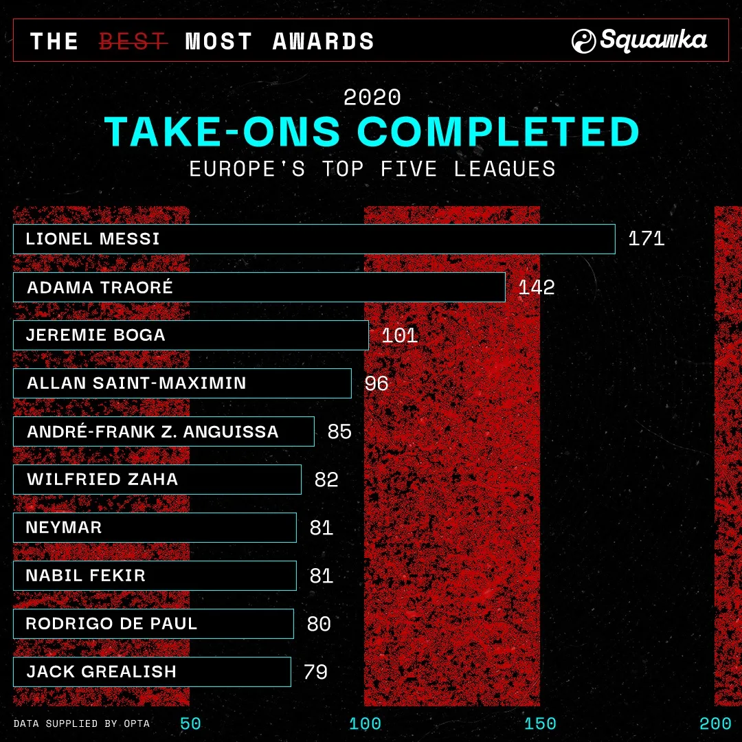
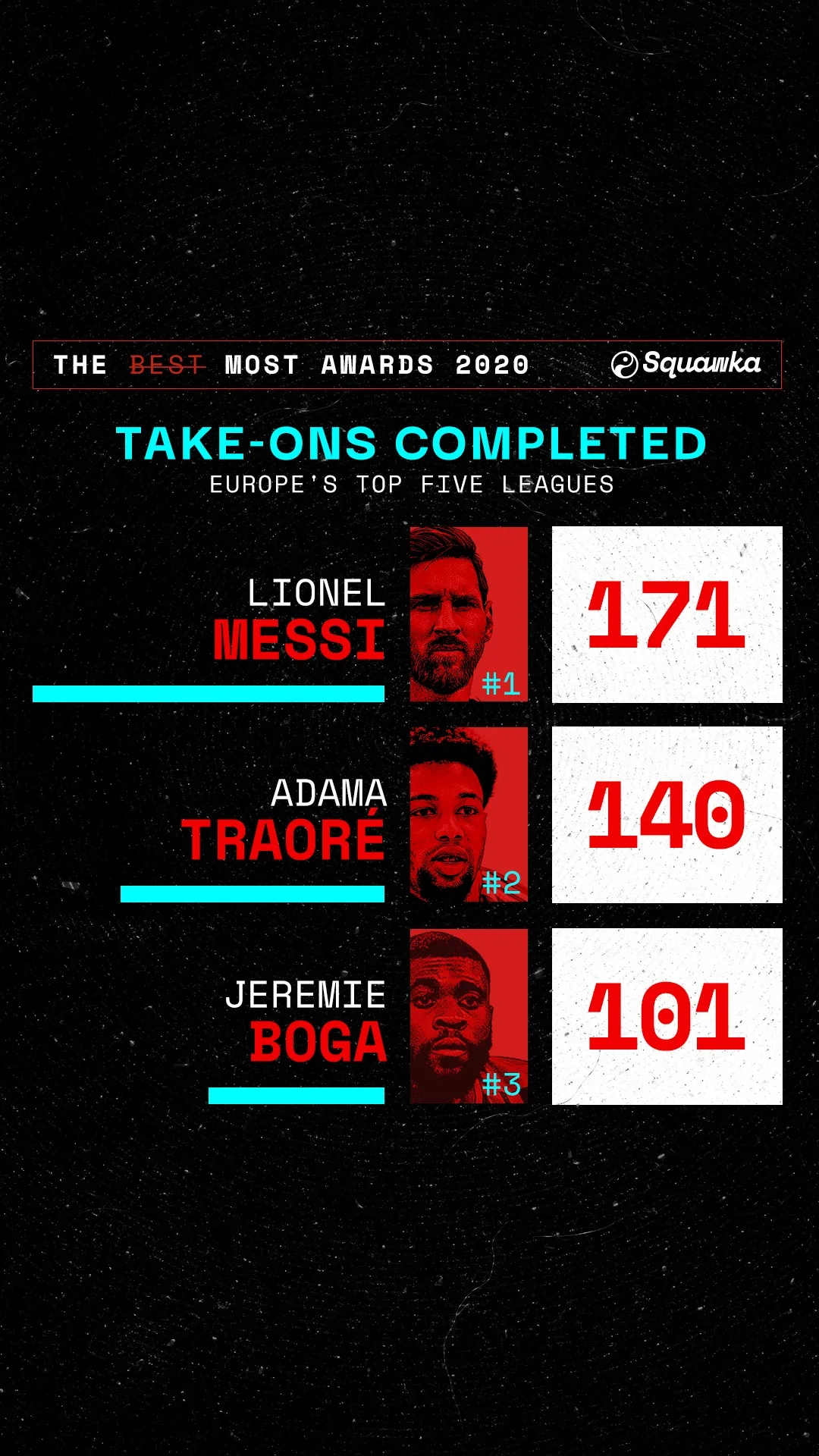
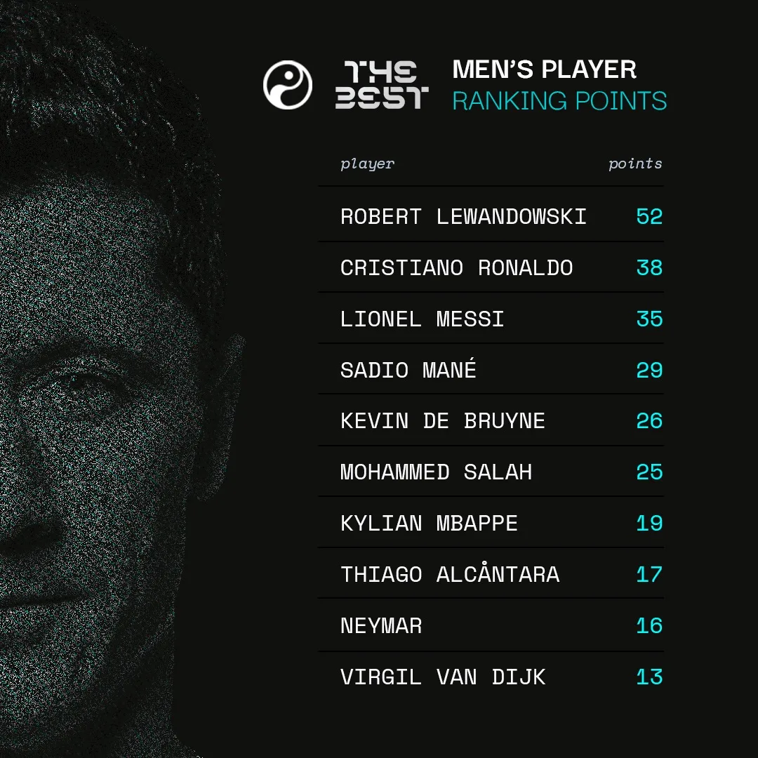
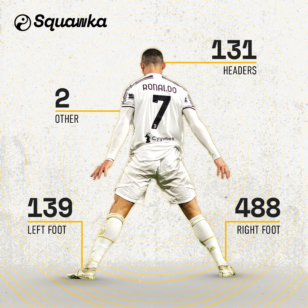
Leaderboards and rankings
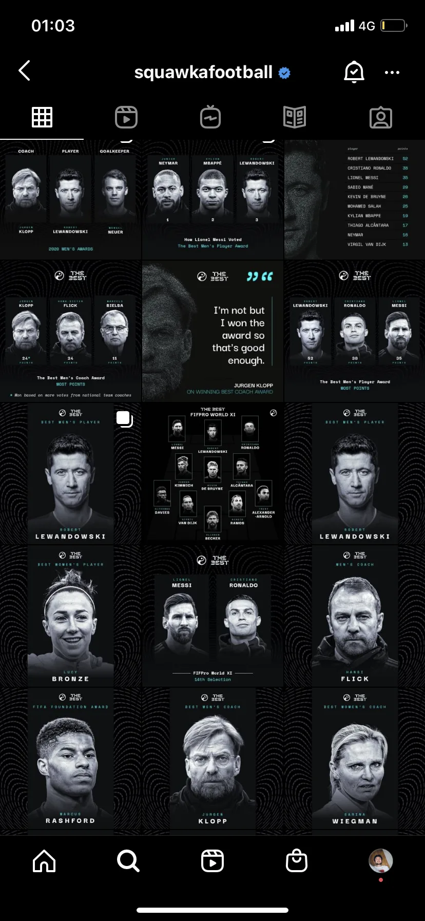
Trio and single formats, filled from the same data each week, plus the end-of-year awards run on the same frame.
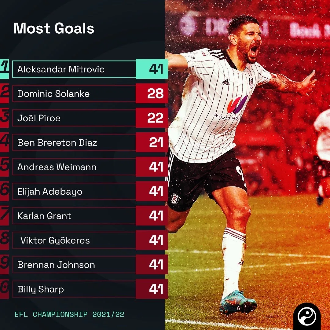
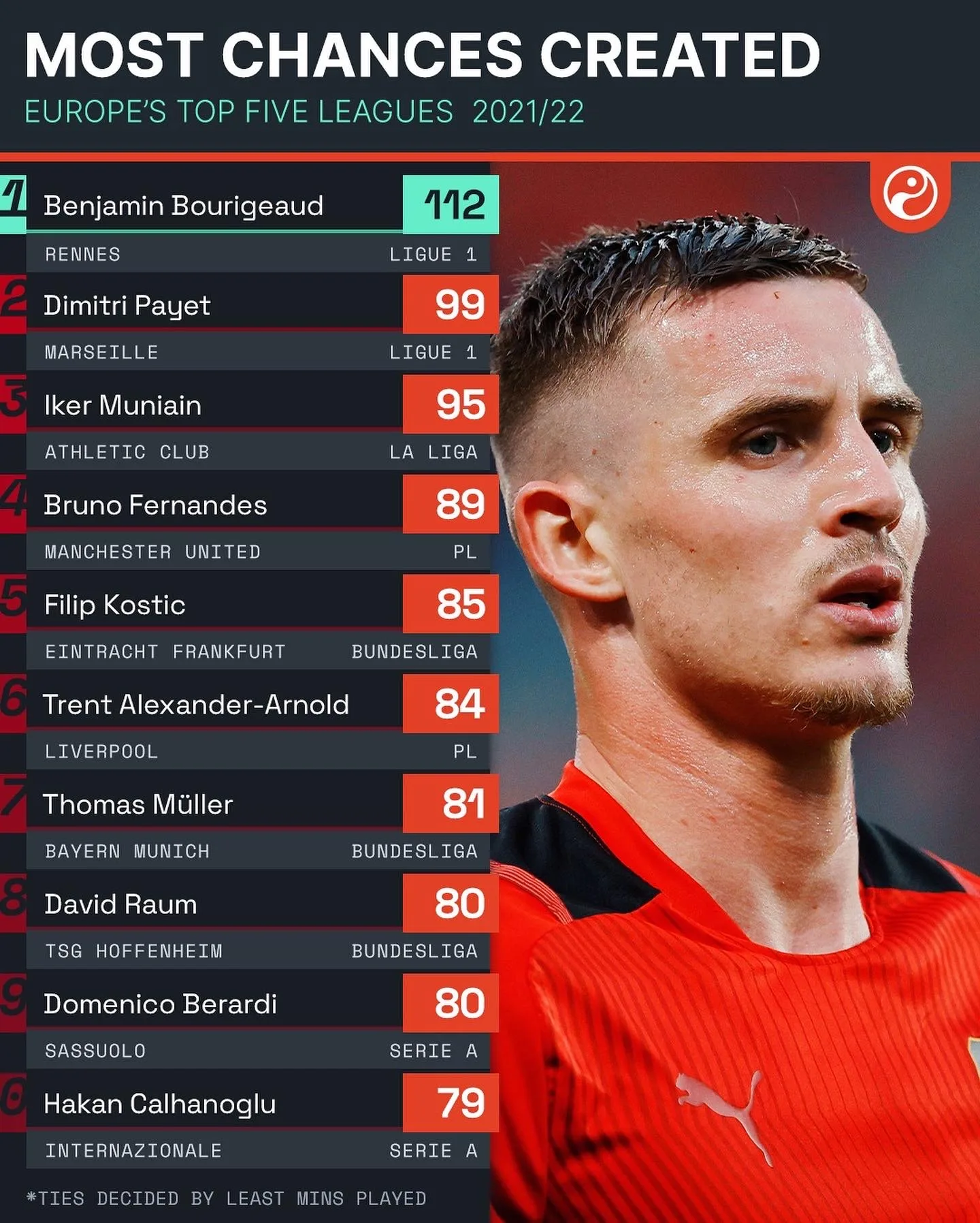
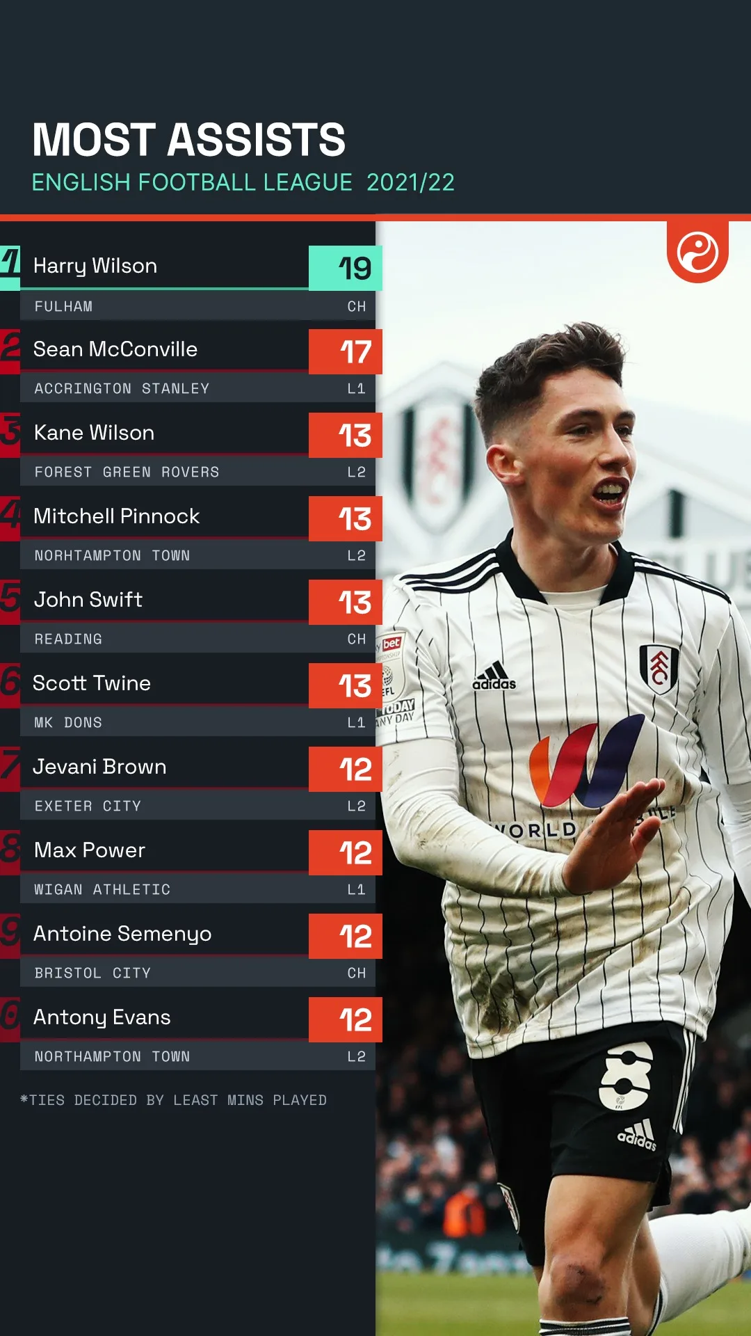
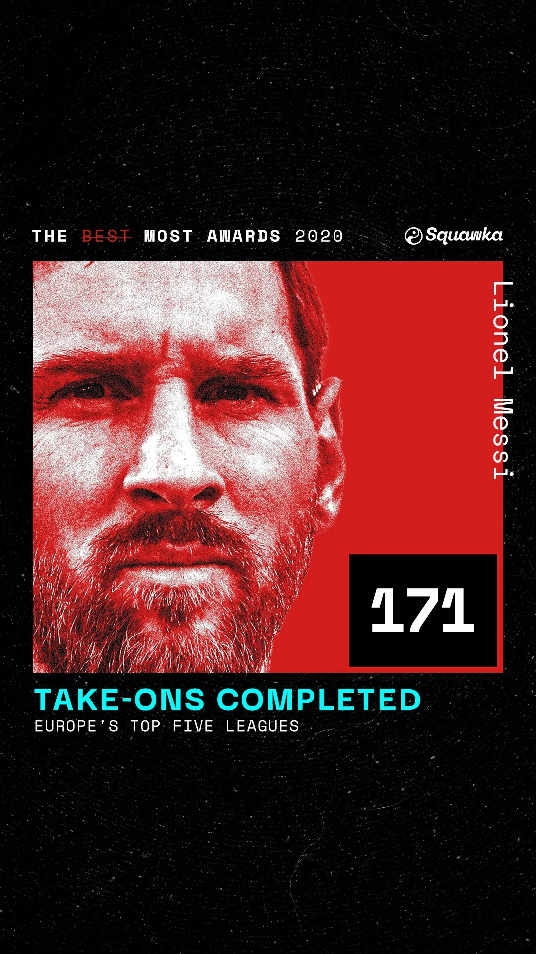

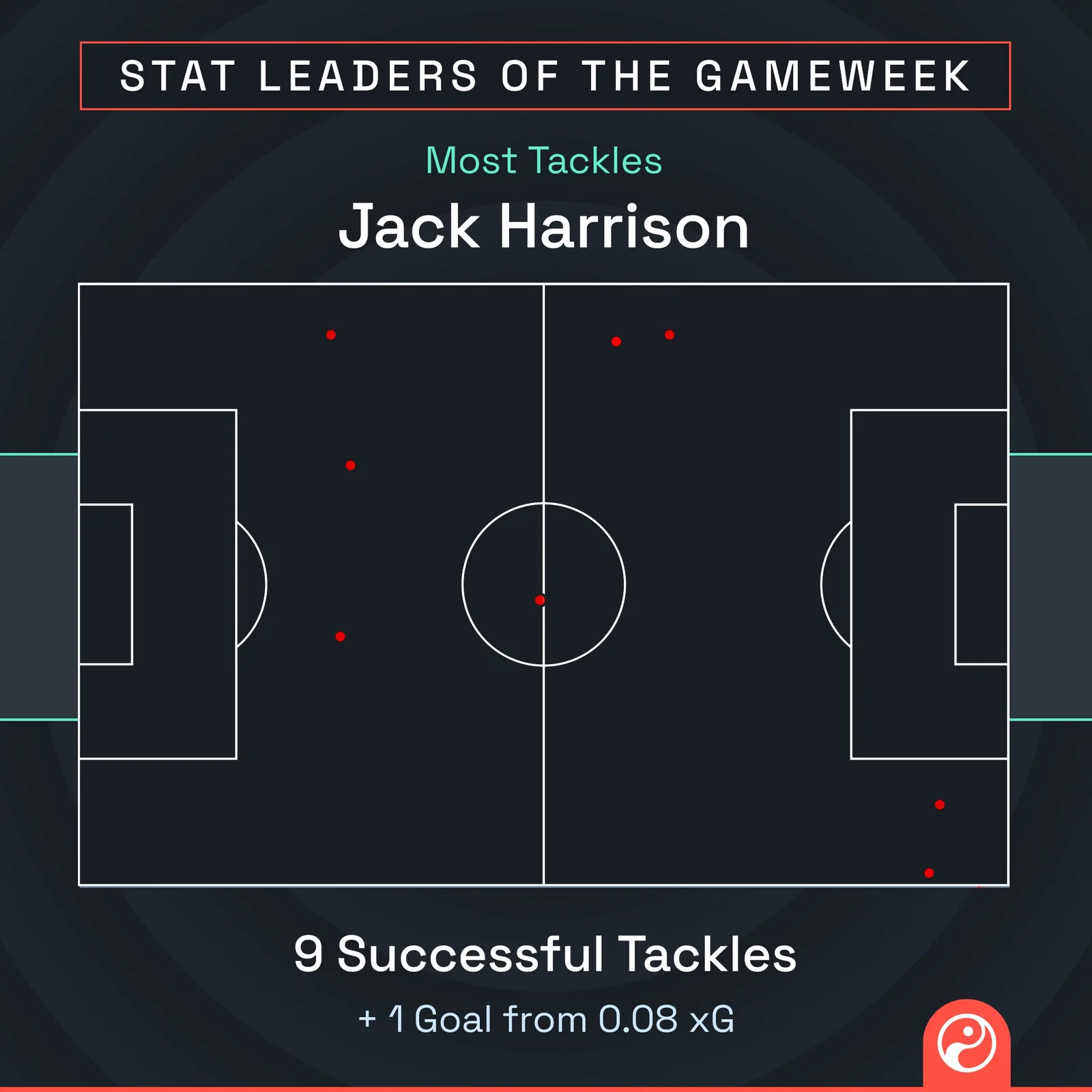
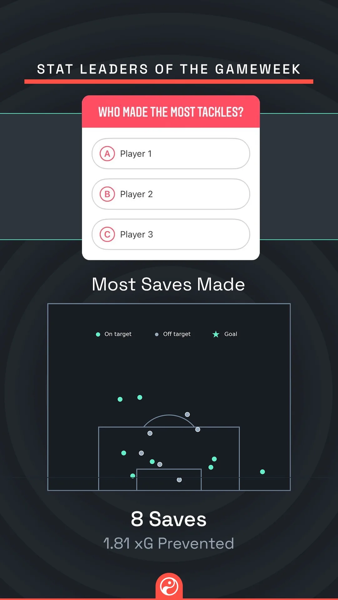
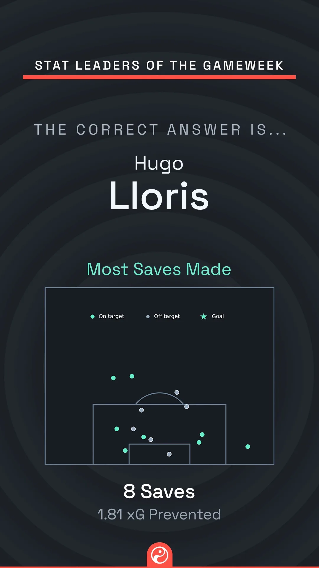
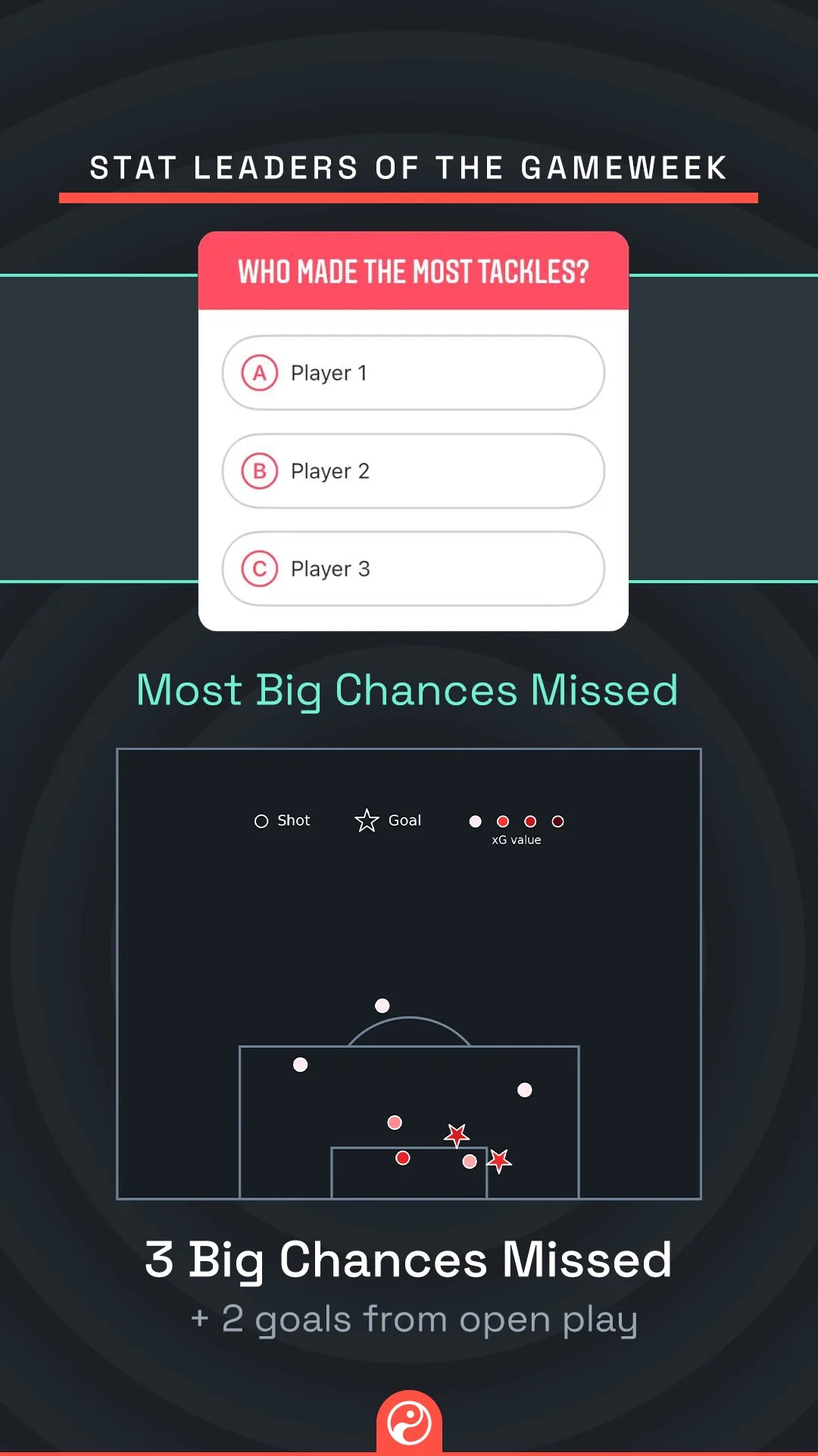
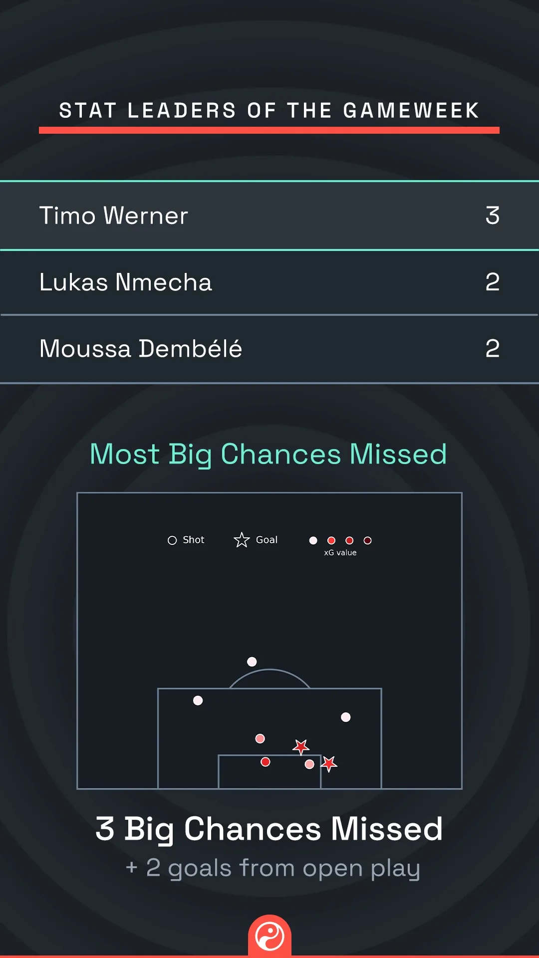
Stat leaders, as Stories
A question slide and an answer slide. An Instagram Stories mechanic, so the pair is the unit.
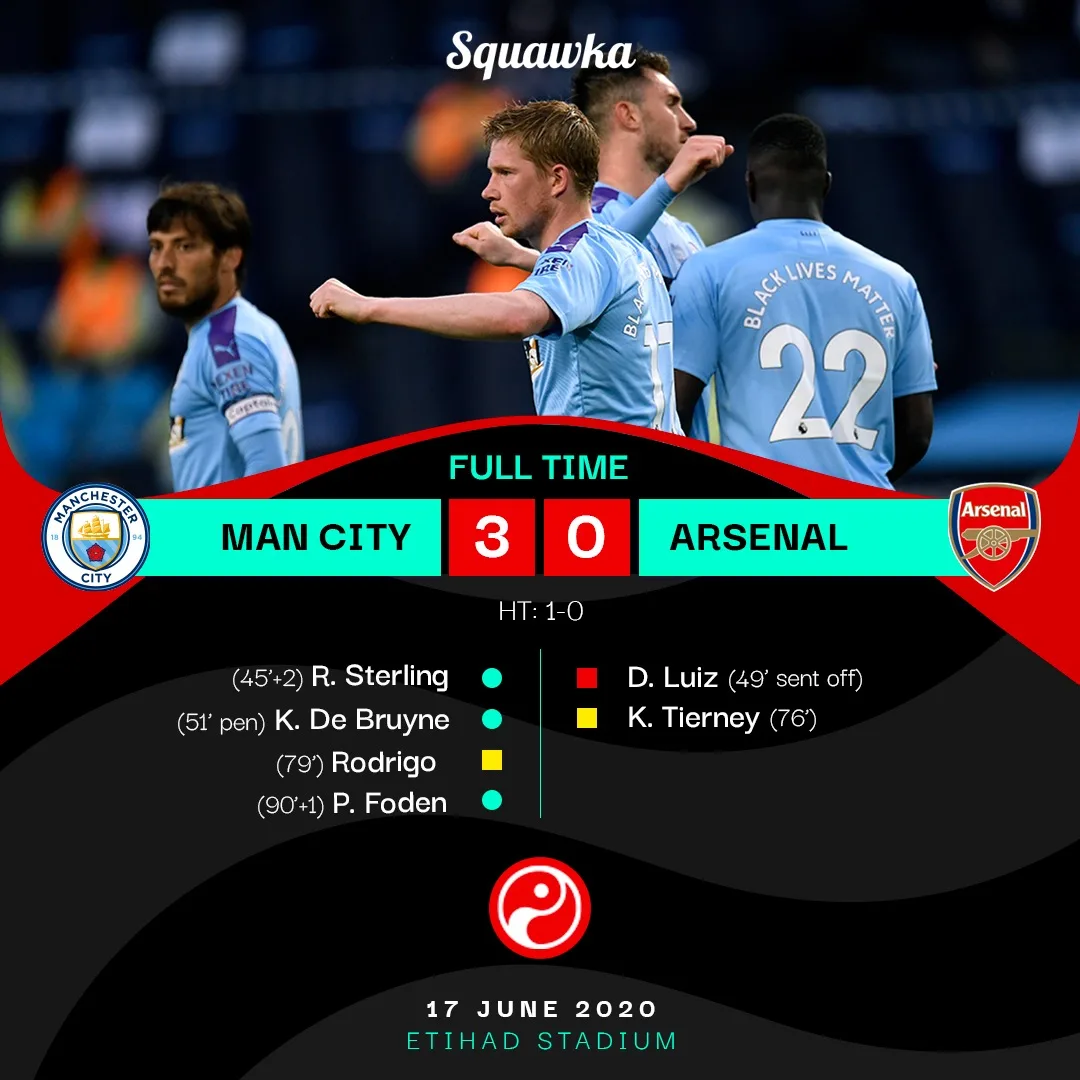
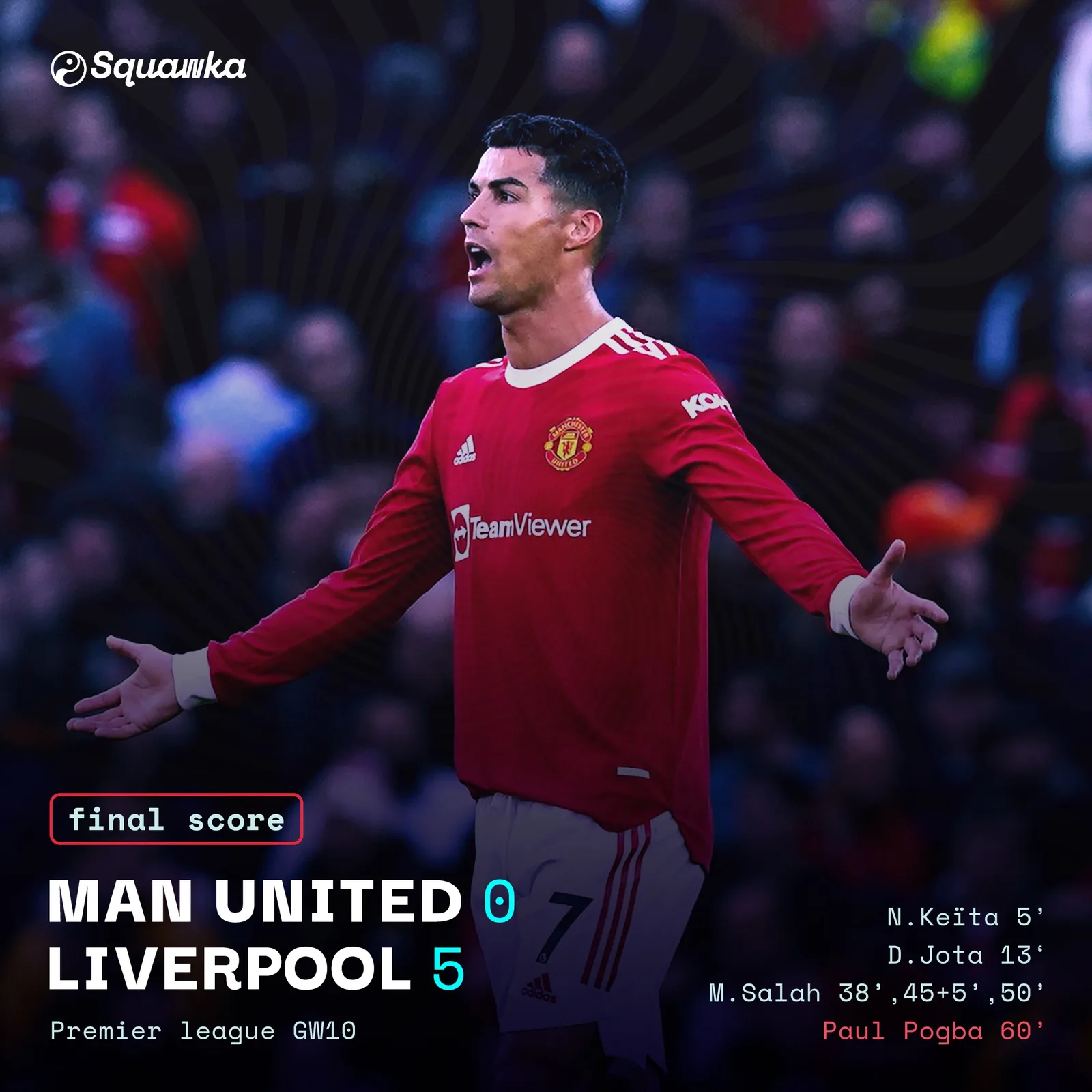
Match day
Full time, published while the result is still news.
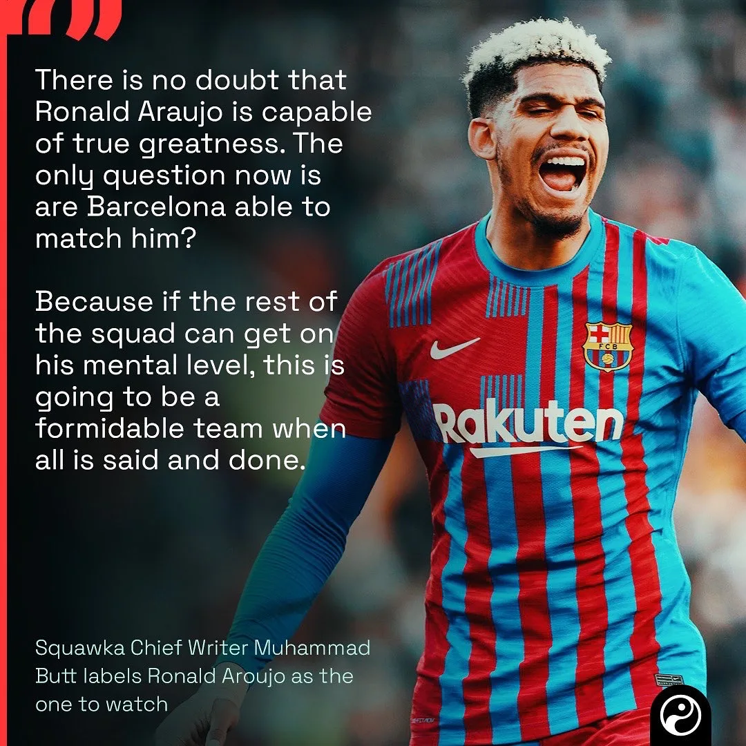
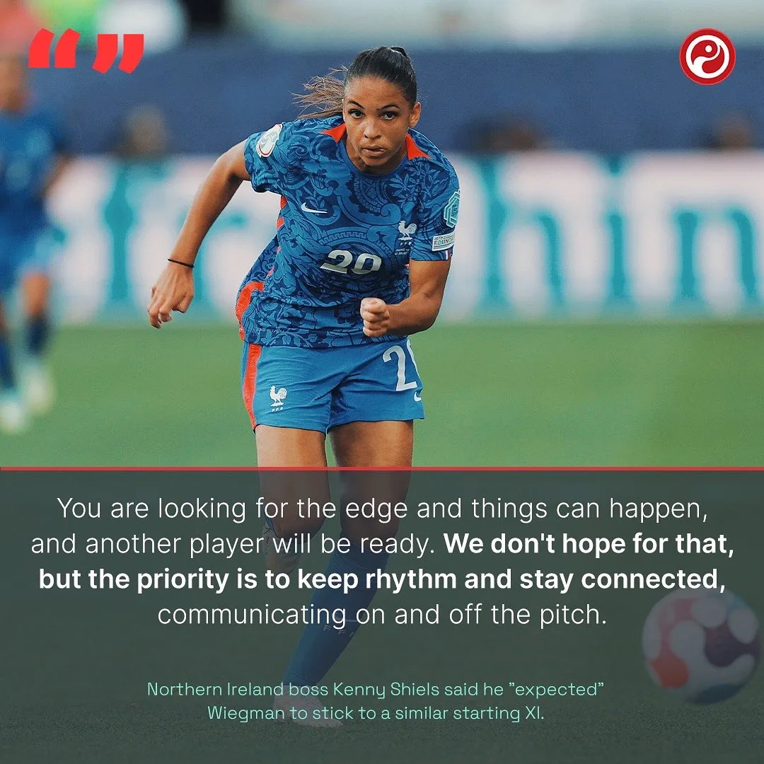
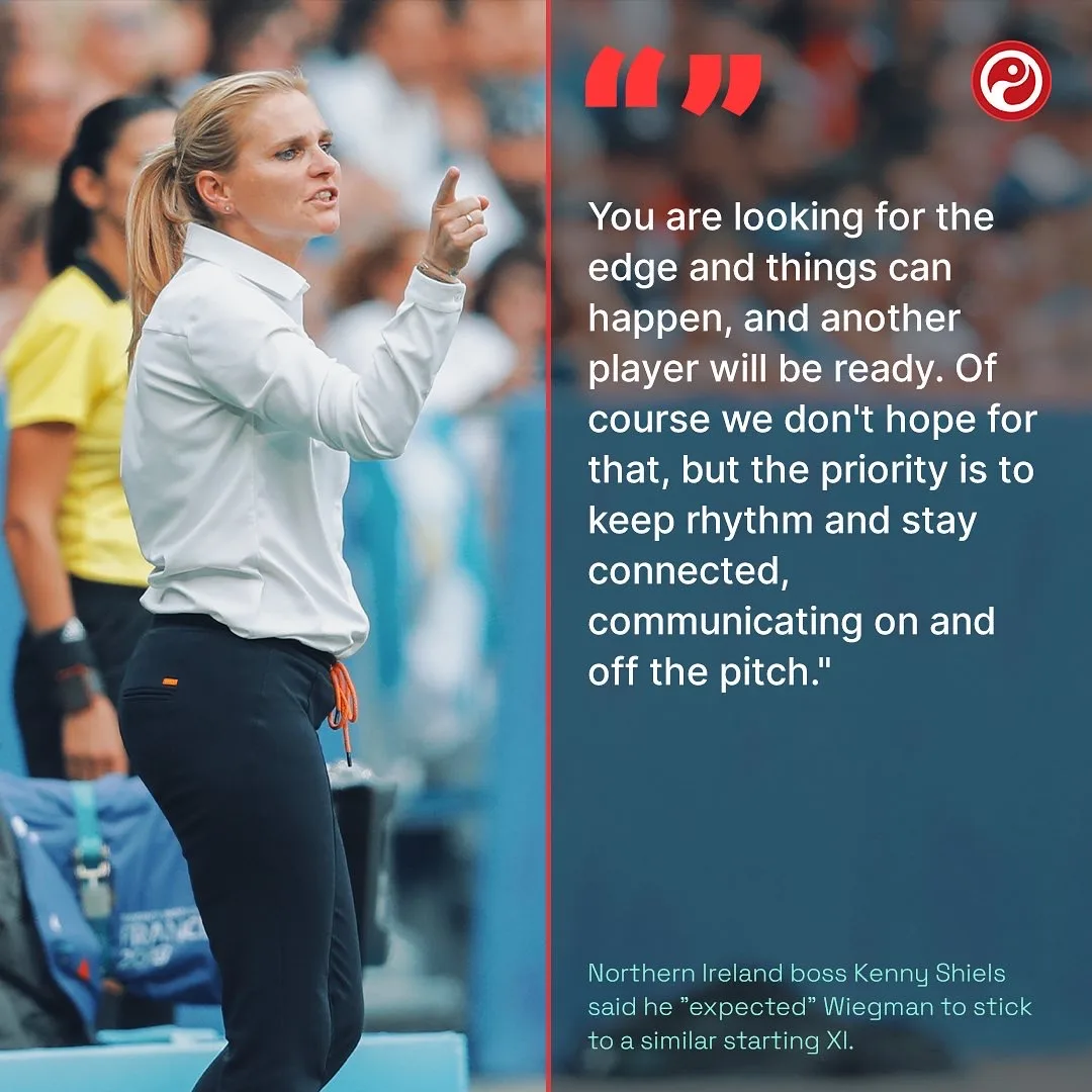
Quote graphics
A pull quote from a press conference, out the same evening.
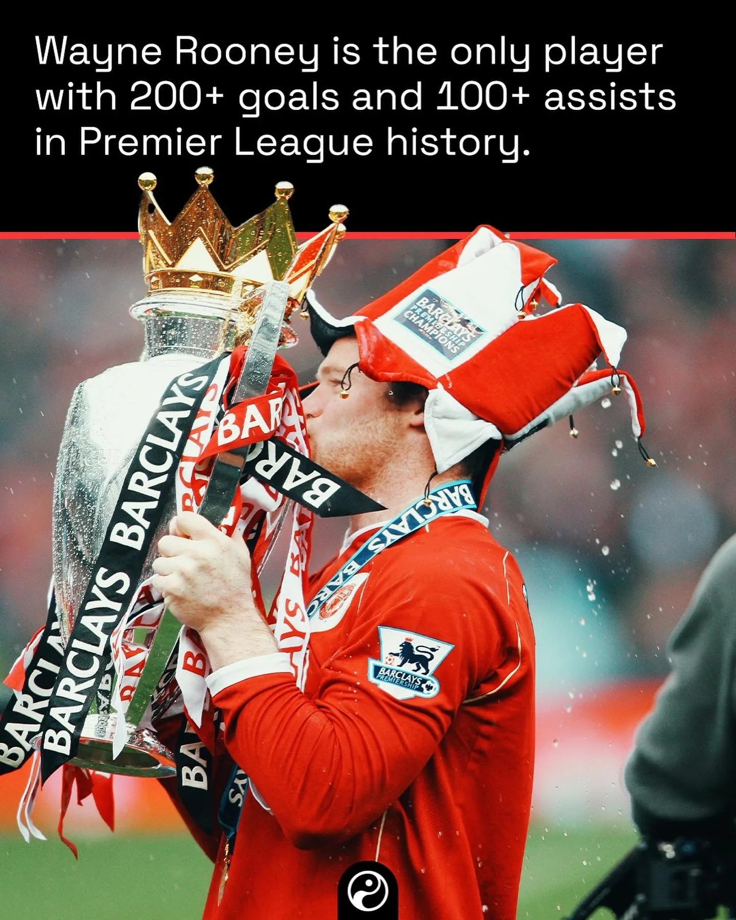
Records and milestones
One image, one fact. The format with the least room to hide.
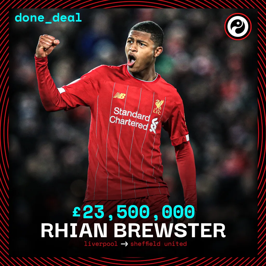
The transfer window
done_deal. One card, a fee, two club crests, repeated across a window.






Line-ups and XIs
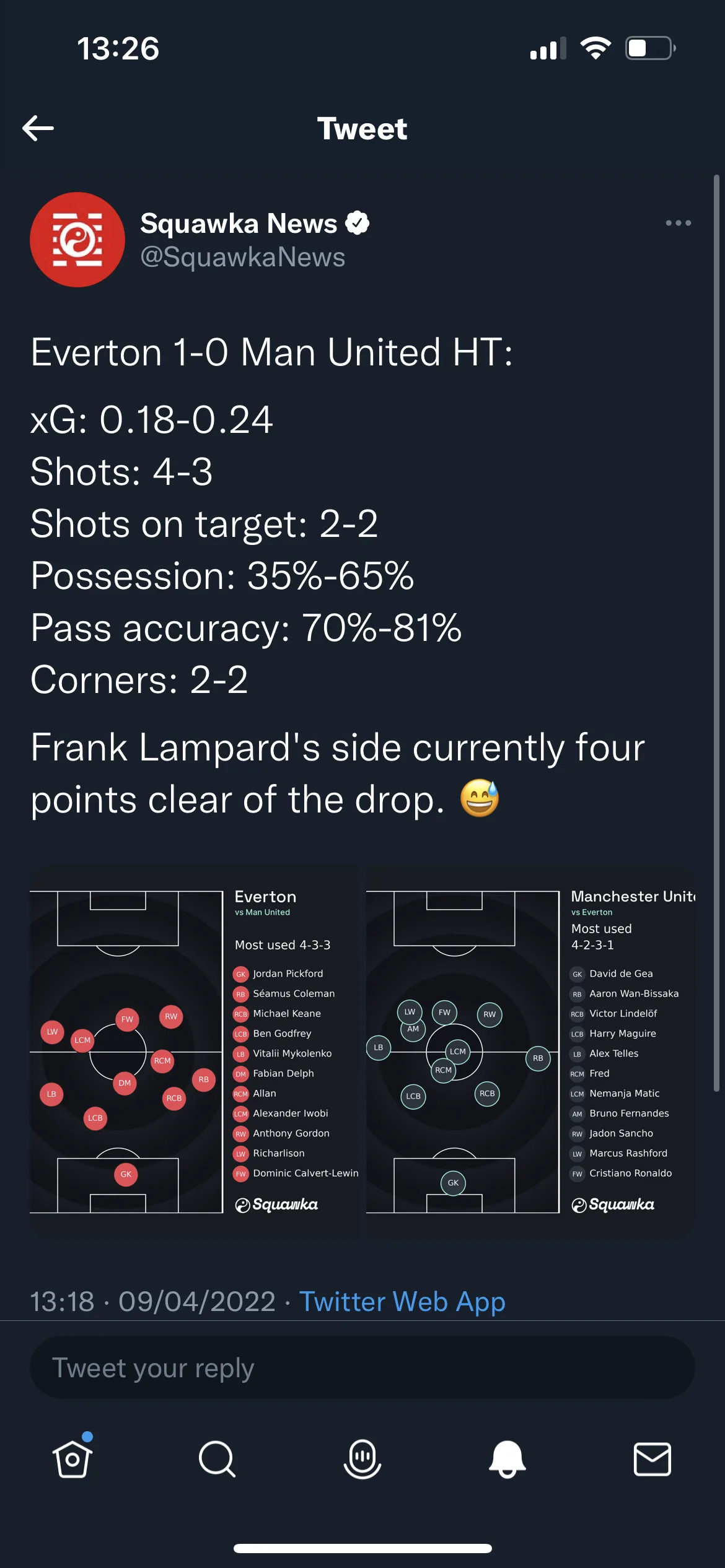
A pitch, eleven slots and whatever the week's argument is. The build that got reused most.
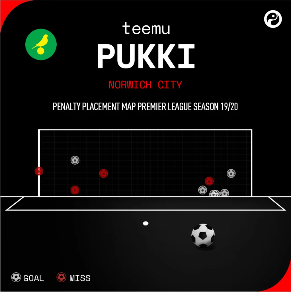
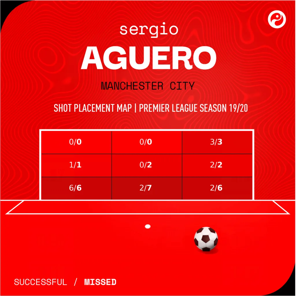
Player maps and scout cards
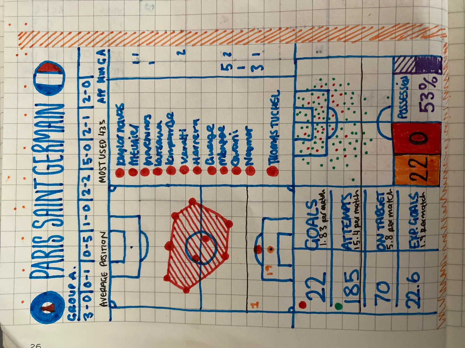
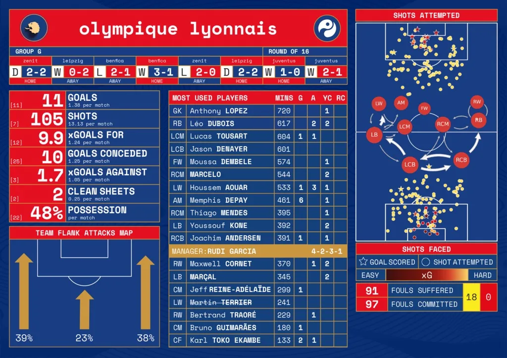
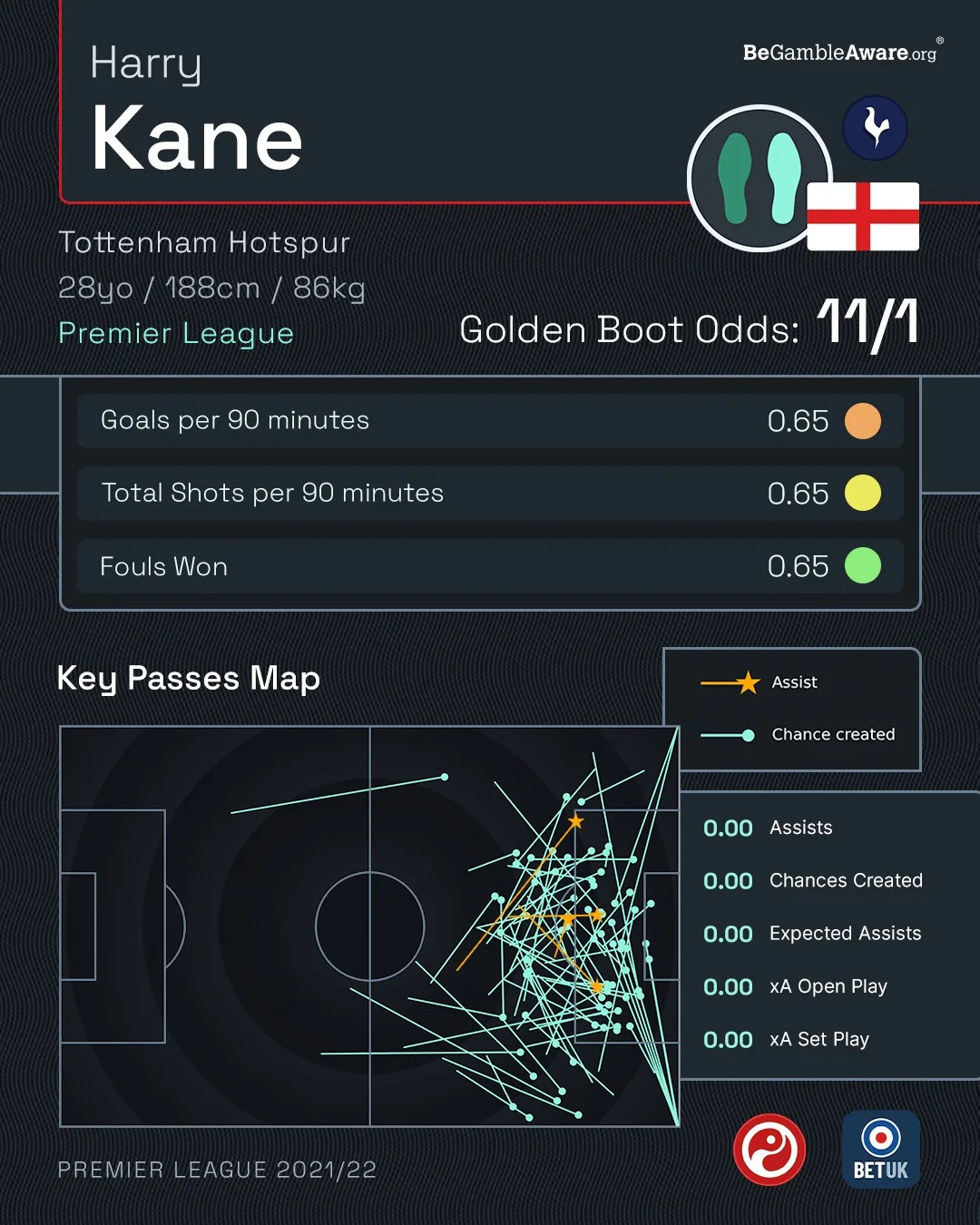
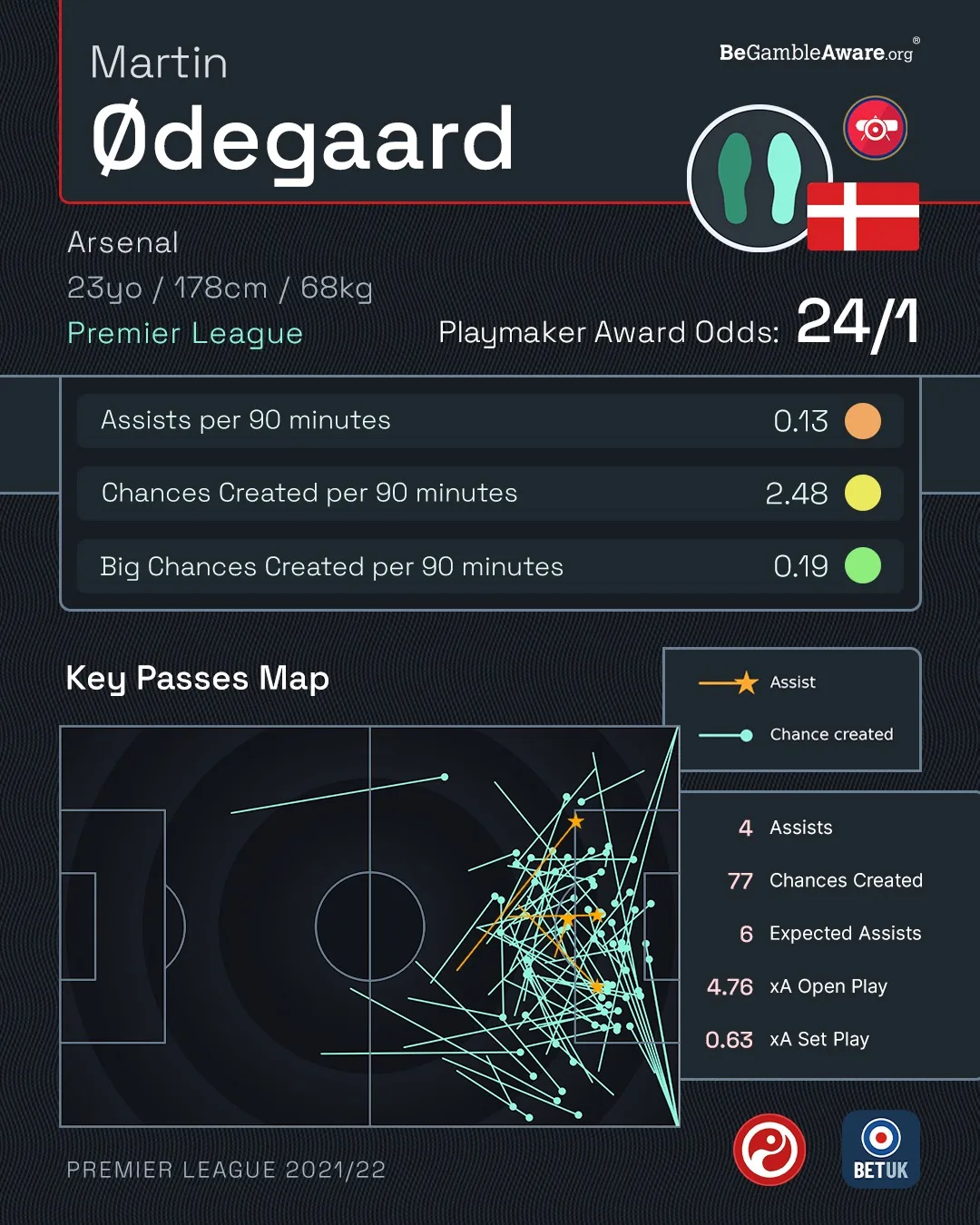
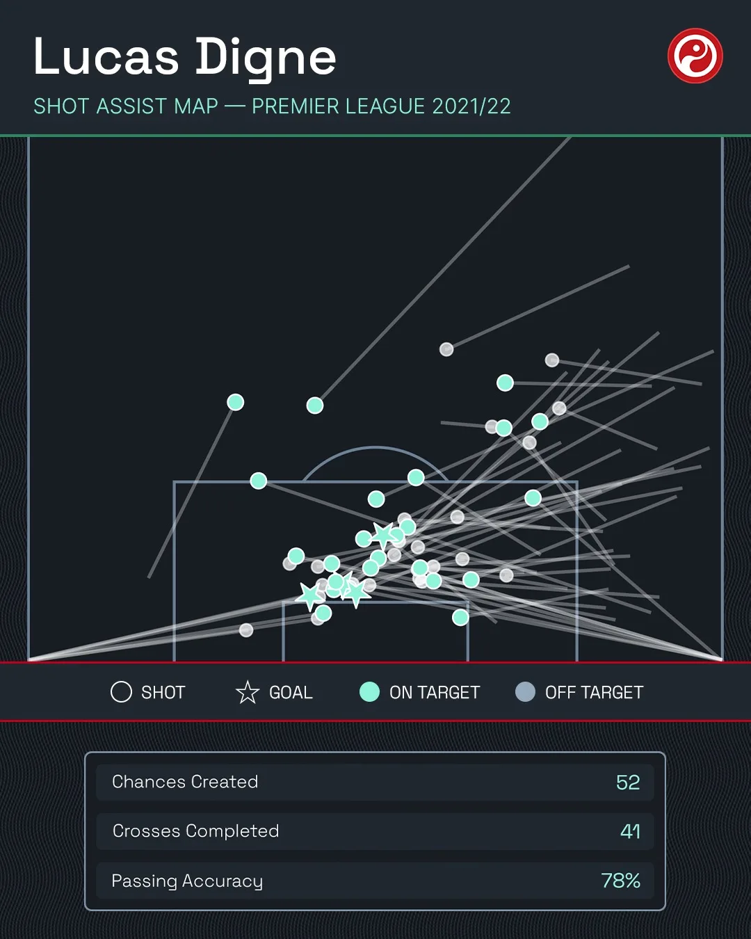
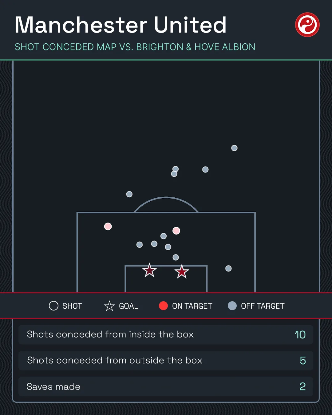
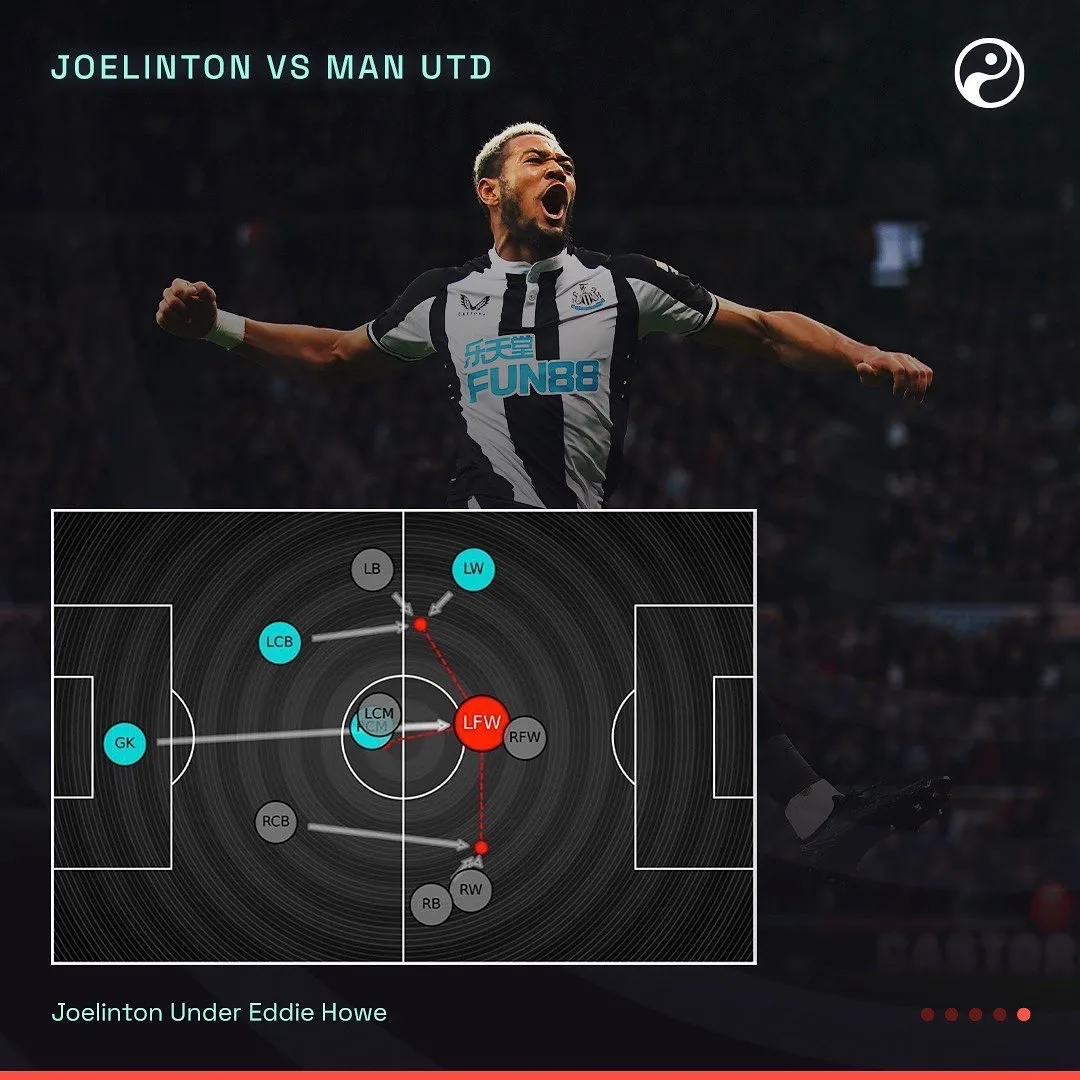
Where the data is the picture. Pass maps, shot maps and the scout card, drawn rather than listed.
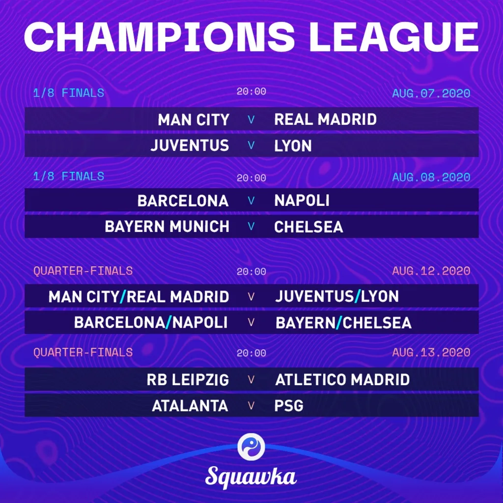
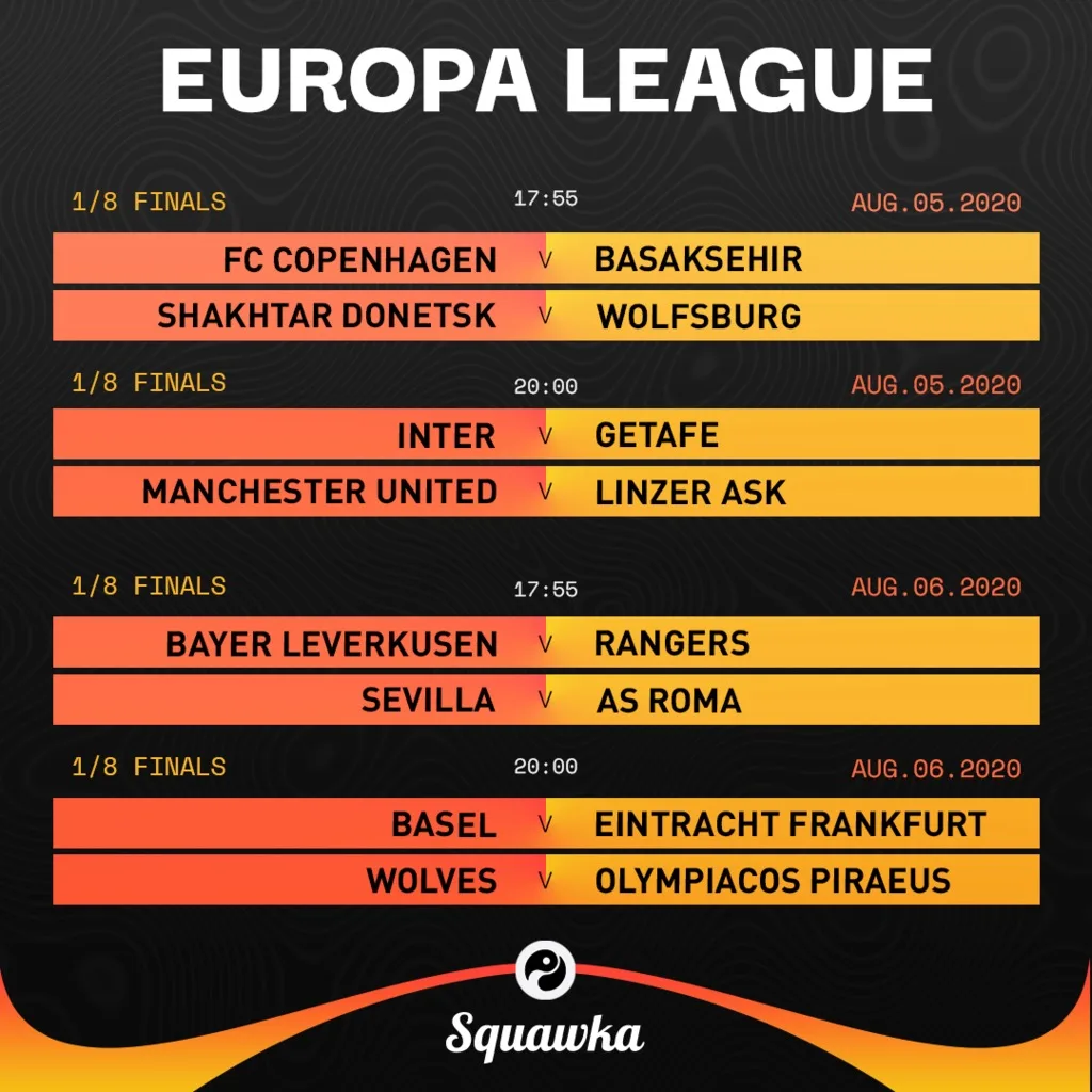
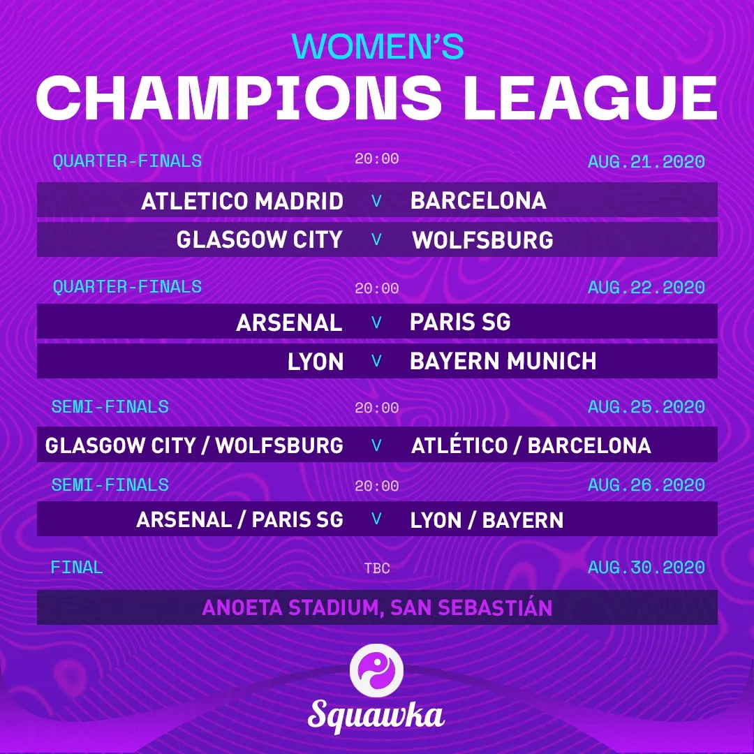
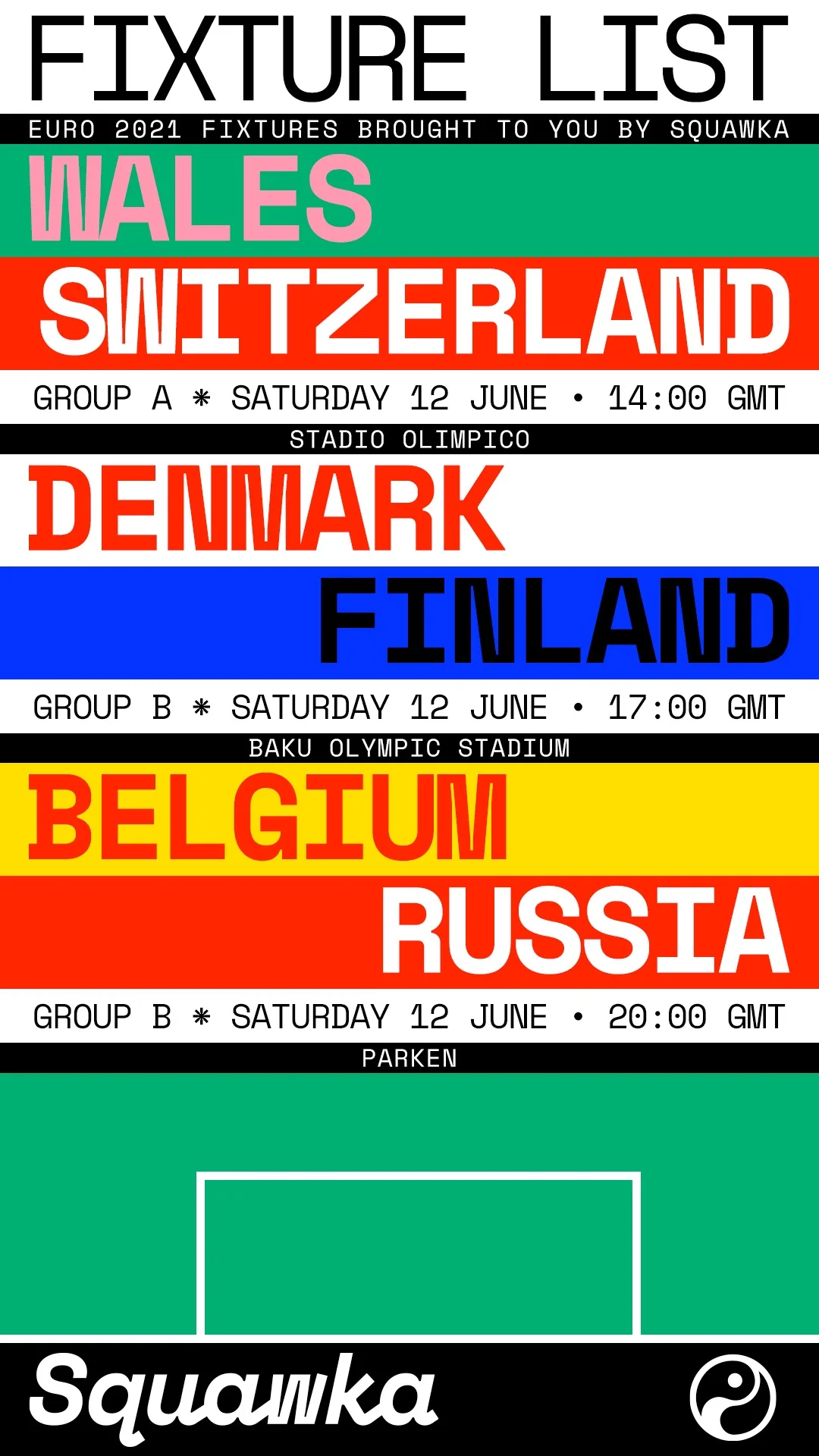
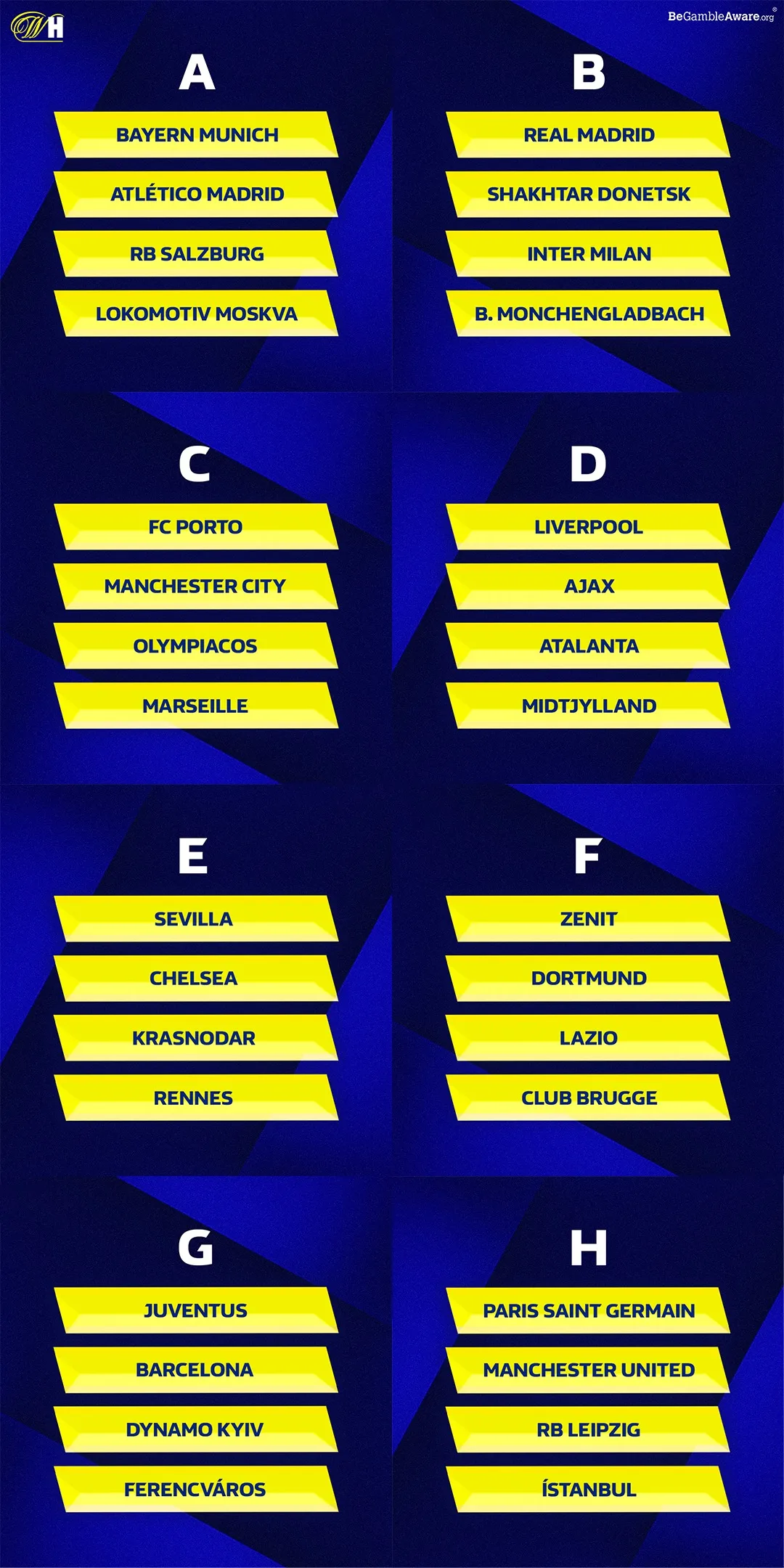
Fixtures, brackets and tables
The unglamorous half of a football publisher. A wall chart is read more often than a poster.
Editorial posters
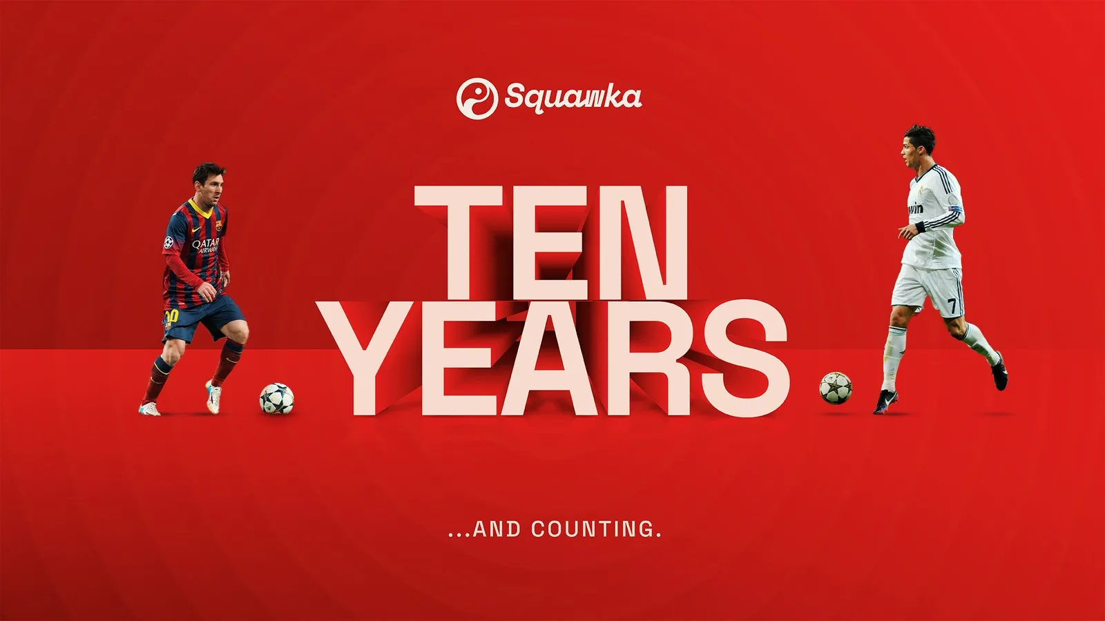
Where the system is allowed off the leash. Type led, one subject, no stat block.

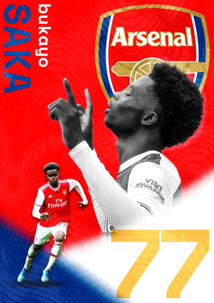
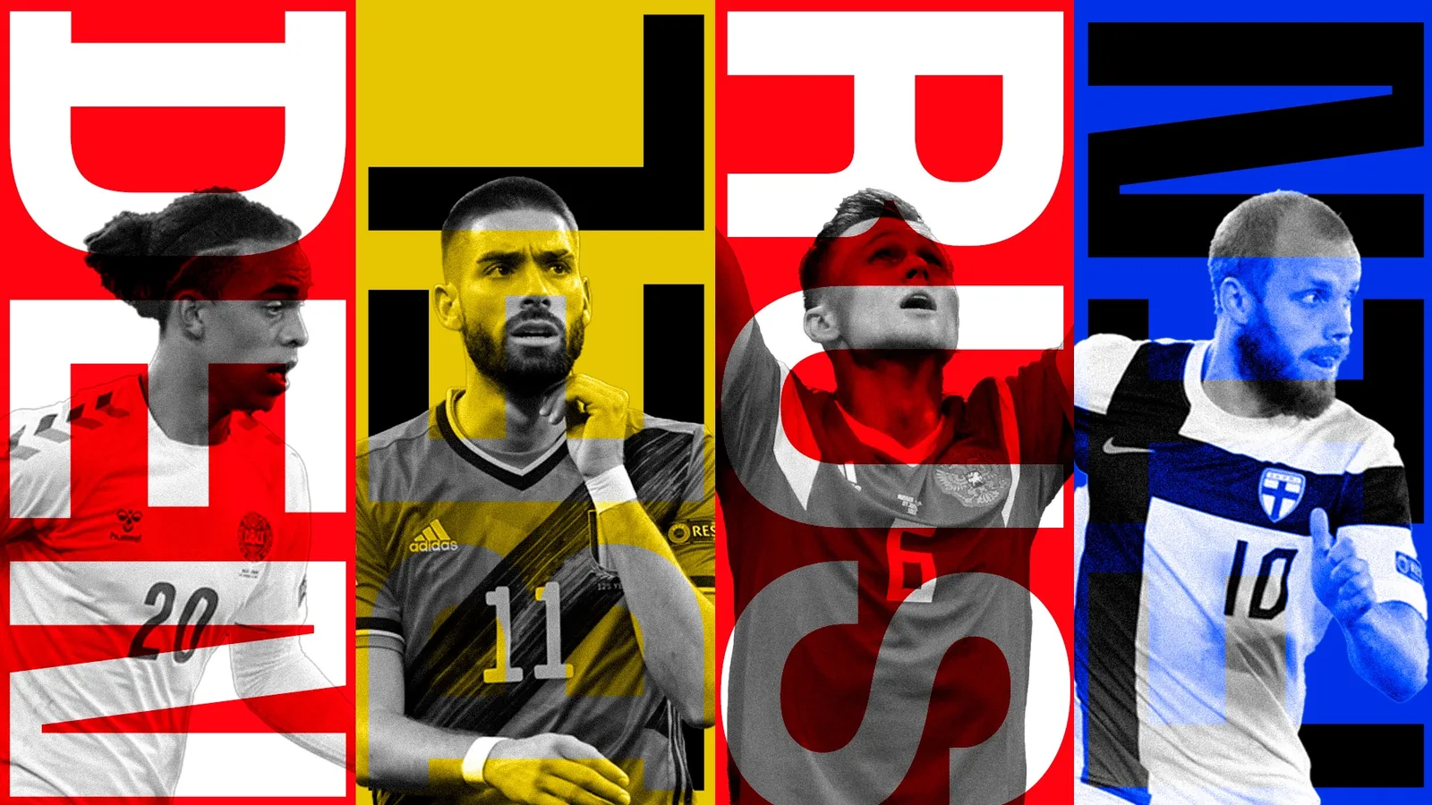
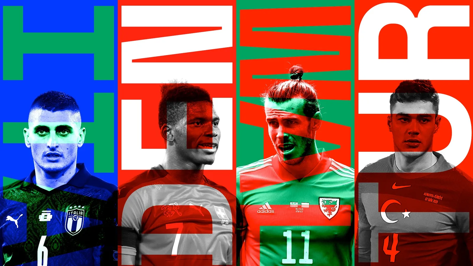

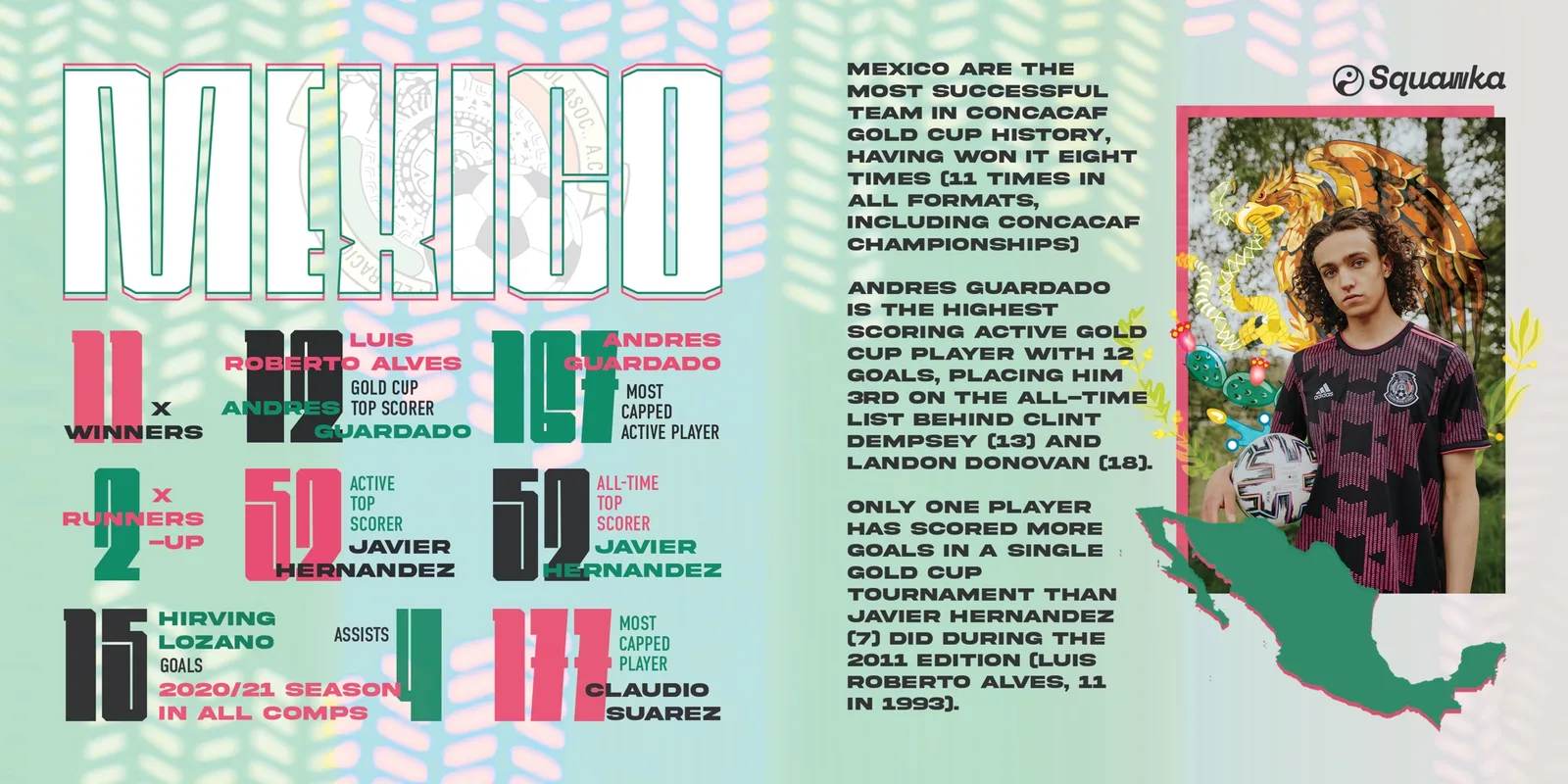
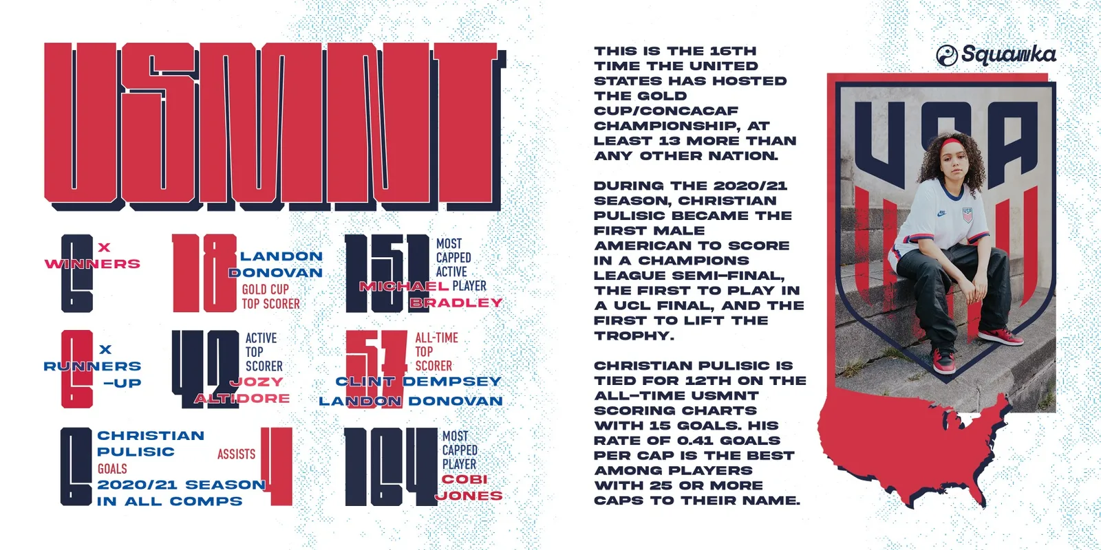
Nation features
The long build. A country, its record and its players across one wide spread, with its own illustration rather than a cut-out.
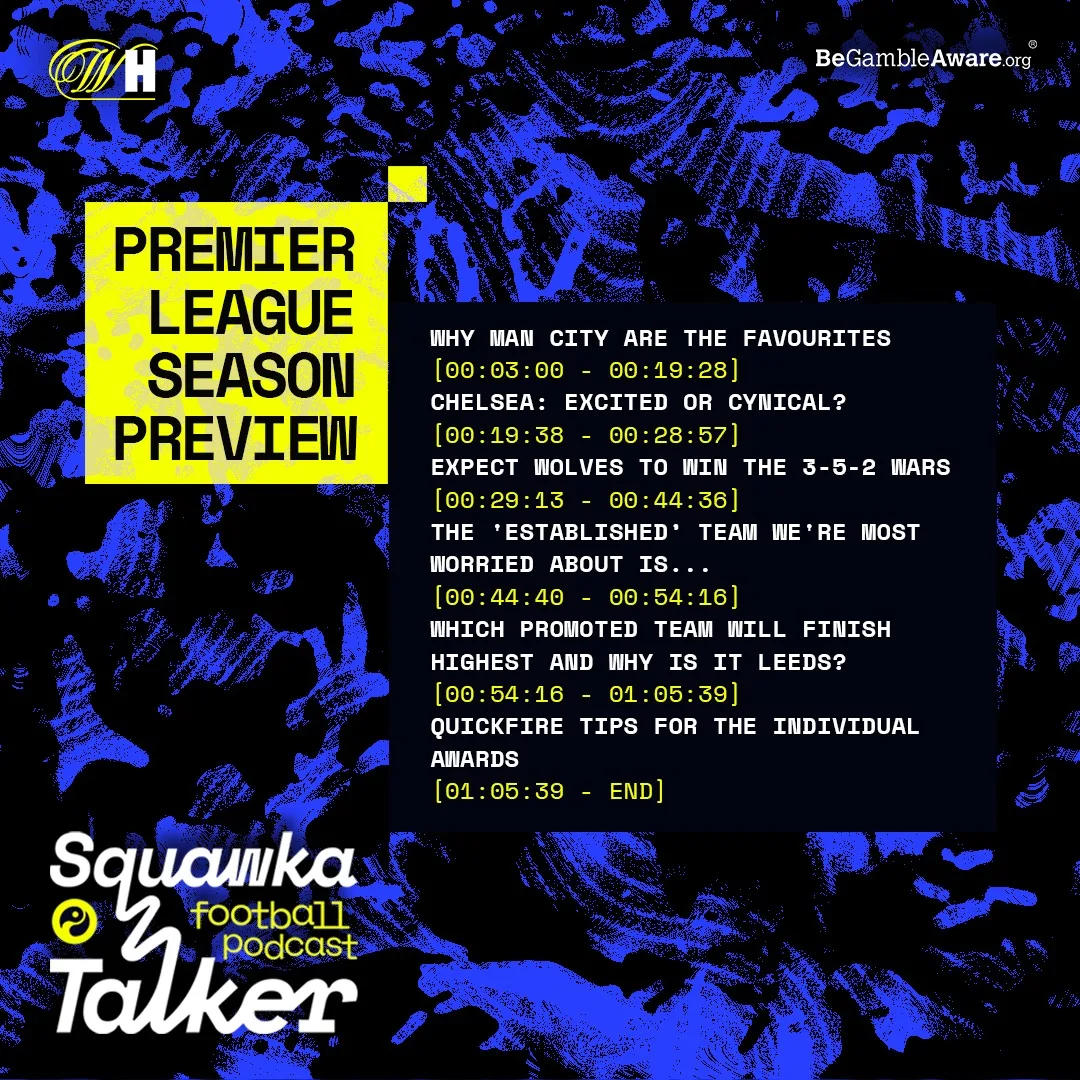
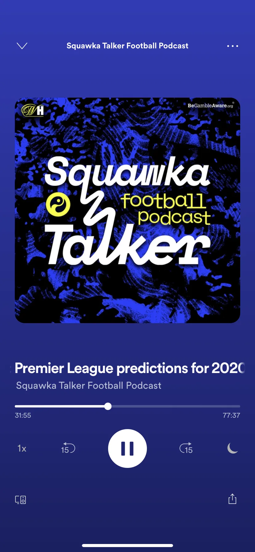
The Football Talker
Squawka's own podcast, with William Hill as its sponsor: cover, episode running order, and the thing as a listener met it.
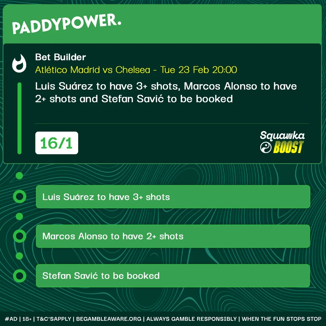
Squawka Bet
The betting surface either side of the redesign, and the offer units that paid for it.

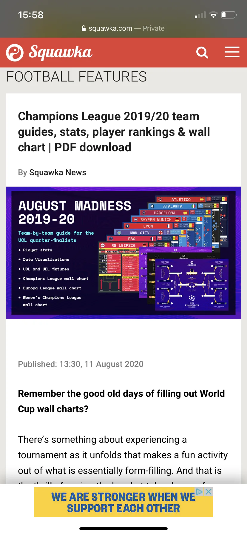
The site itself
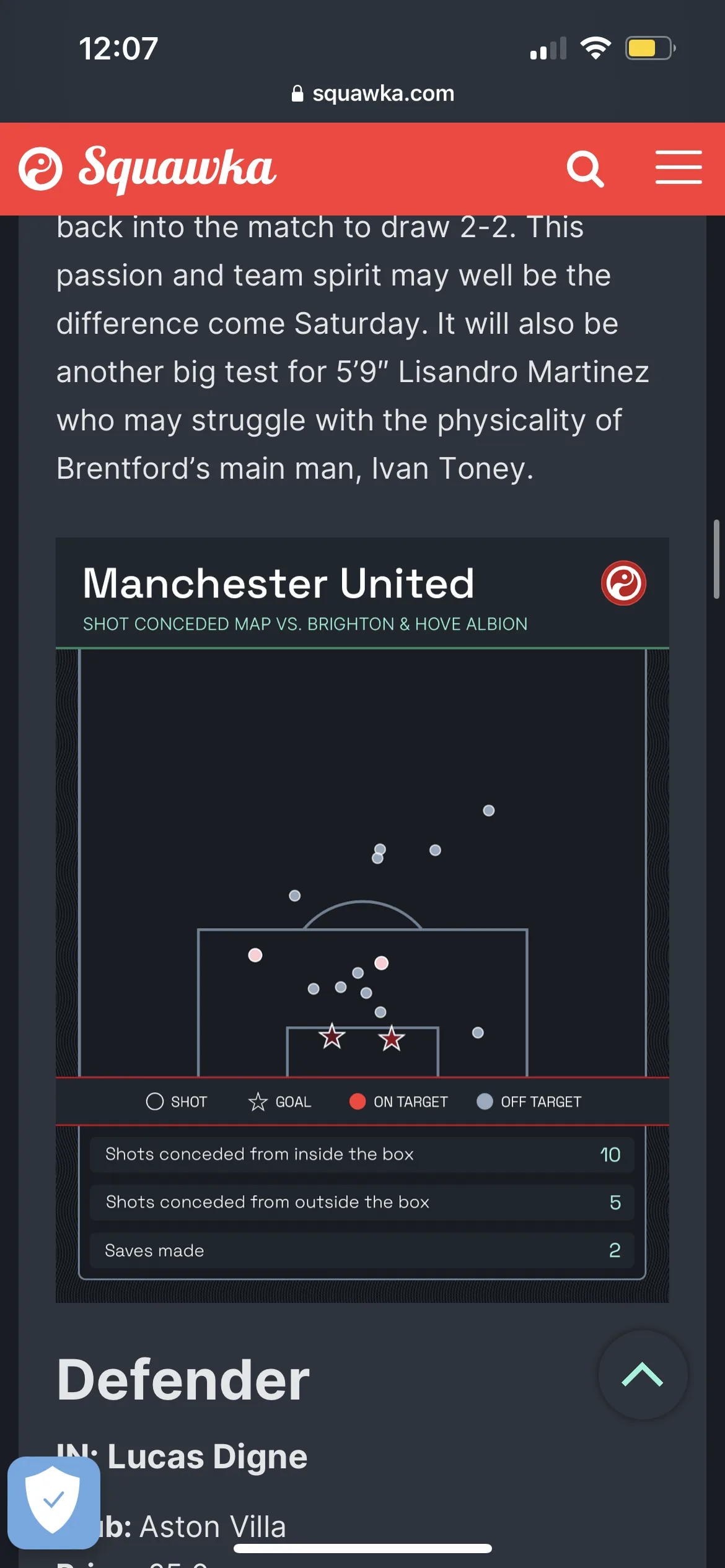
squawka.com around the work, which is the only place most of it was ever seen.
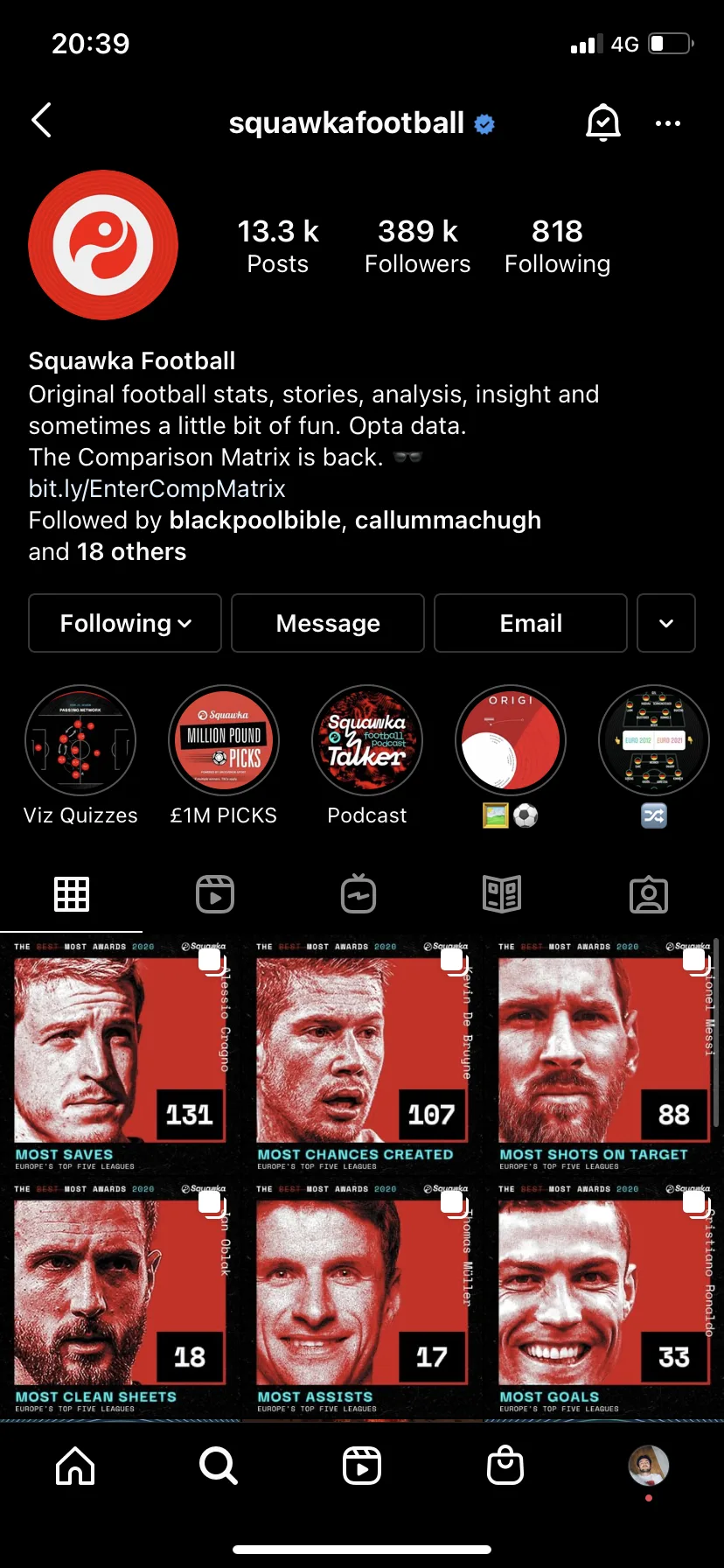
In the wild
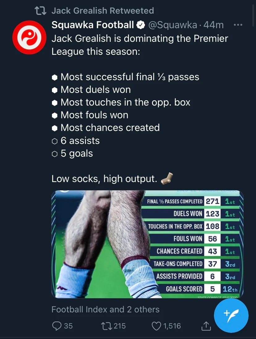
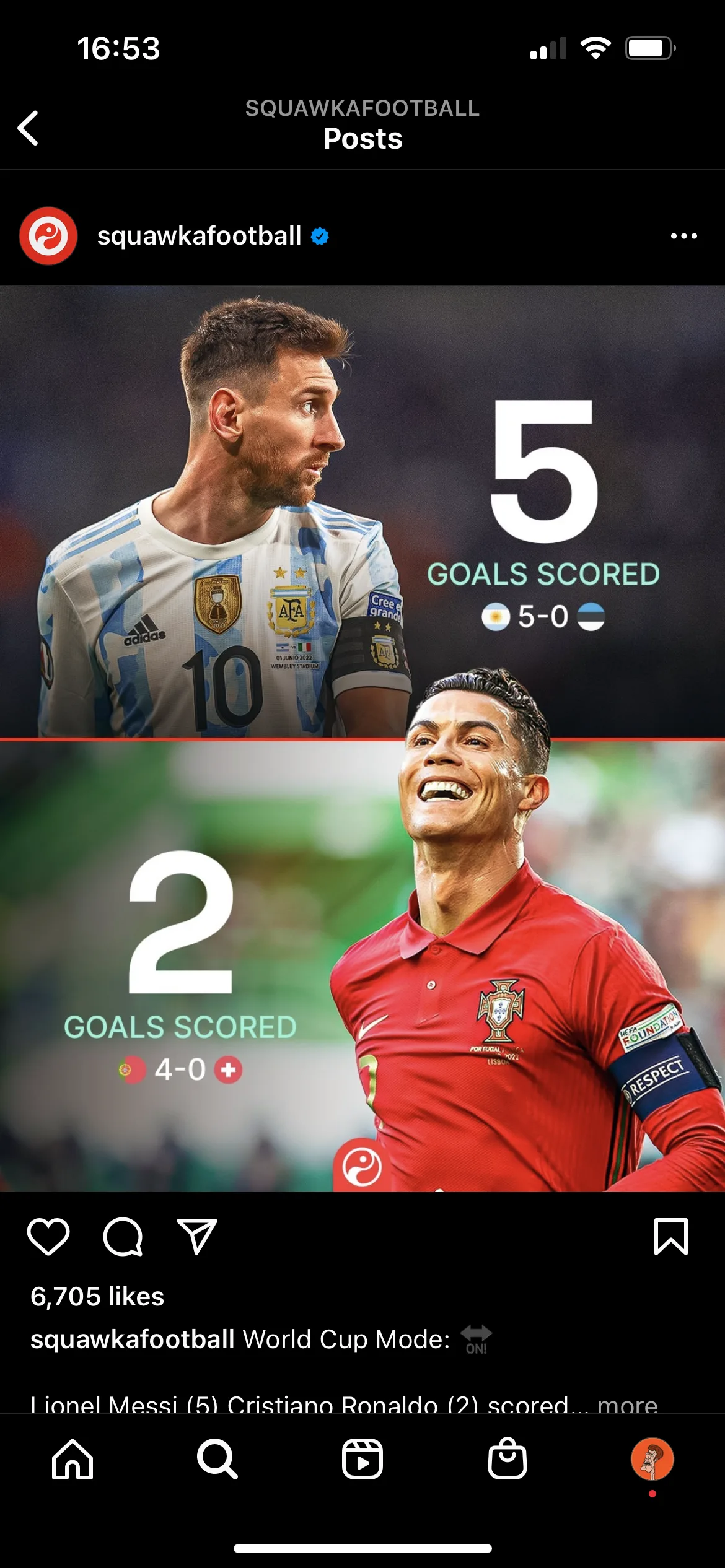
Posts as they landed, including two retweeted by the players they are about.
Where it stands
The Comparison Matrix shipped, and it is still there. It sits in squawka.com's main navigation today, between Stats and Bookmakers, checked in August 2026.
Of the four engagements that is the one with an outcome anybody can check without taking our word for it. A brand document is only as live as the team still using it. A redesign is only as live as the release that carried it. A feature still in the navigation, after everything a product does to itself over time, is a different kind of evidence.
Squawka has since moved to an identity we had no part in. The Comparison Matrix is still in the navigation, which means it has now outlasted the brand it launched under.