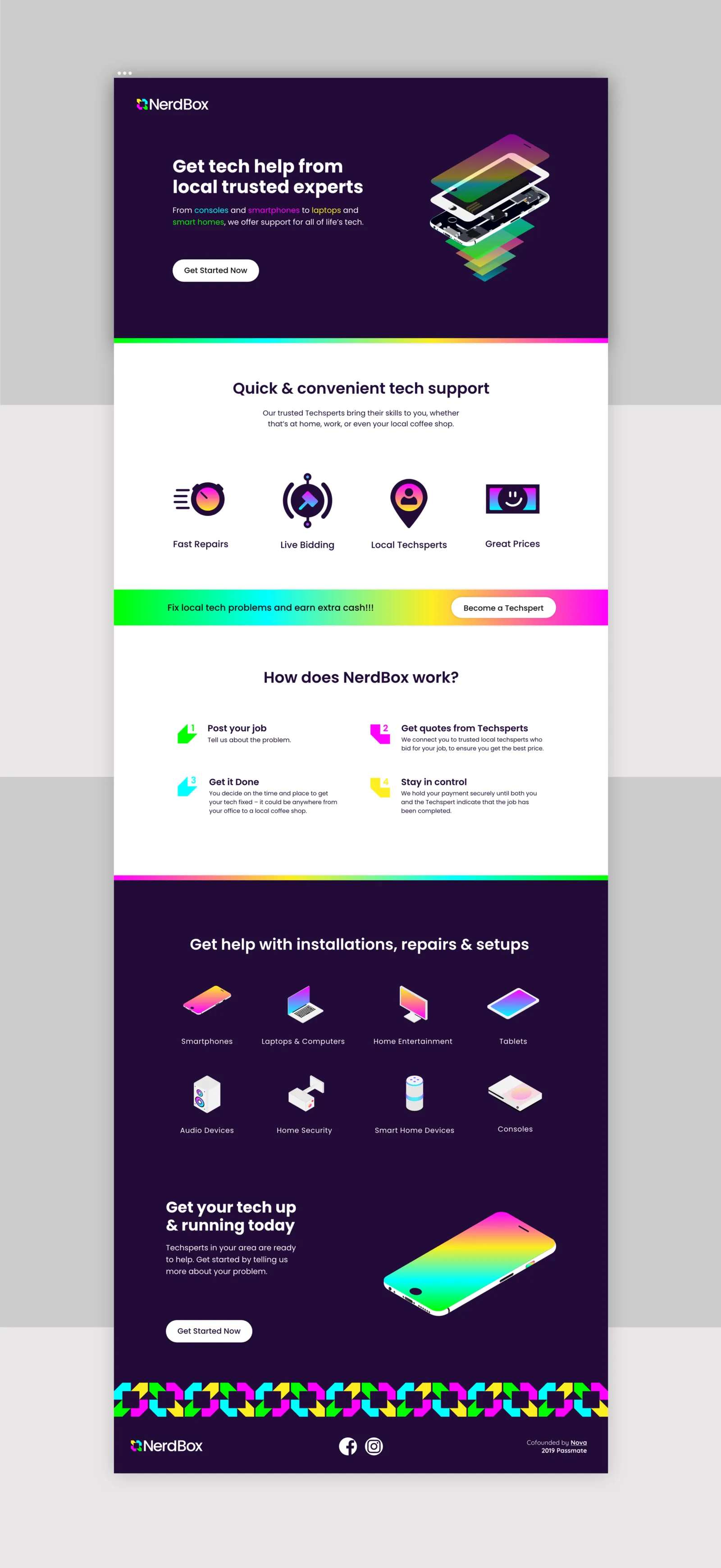
The founder wanted loud. We made loud work at every size.

Challenge
NerdBox connects people with broken technology to freelance repair specialists ('techsperts') who come to a home or office rather than the customer trekking to a high-street chain.
The founder came to us with a clear and firmly held vision: a bold, multicoloured brand and app identity that would stand out against the grey, apologetic look of high-street repair. He was right that the category is visually timid, and that was the brief we took.
We did raise one disagreement early and directly. Our read was that 'nerd' skewed the positioning toward hobbyist tinkering when the proposition was a trusted service marketplace handling people's phones, laptops and smart homes. The founder had considered it and wanted to keep the name.
That is a normal part of the work. The brief became: deliver the vivid identity he asked for, and make it carry enough authority that the name is not the first thing anyone judges.
Approach
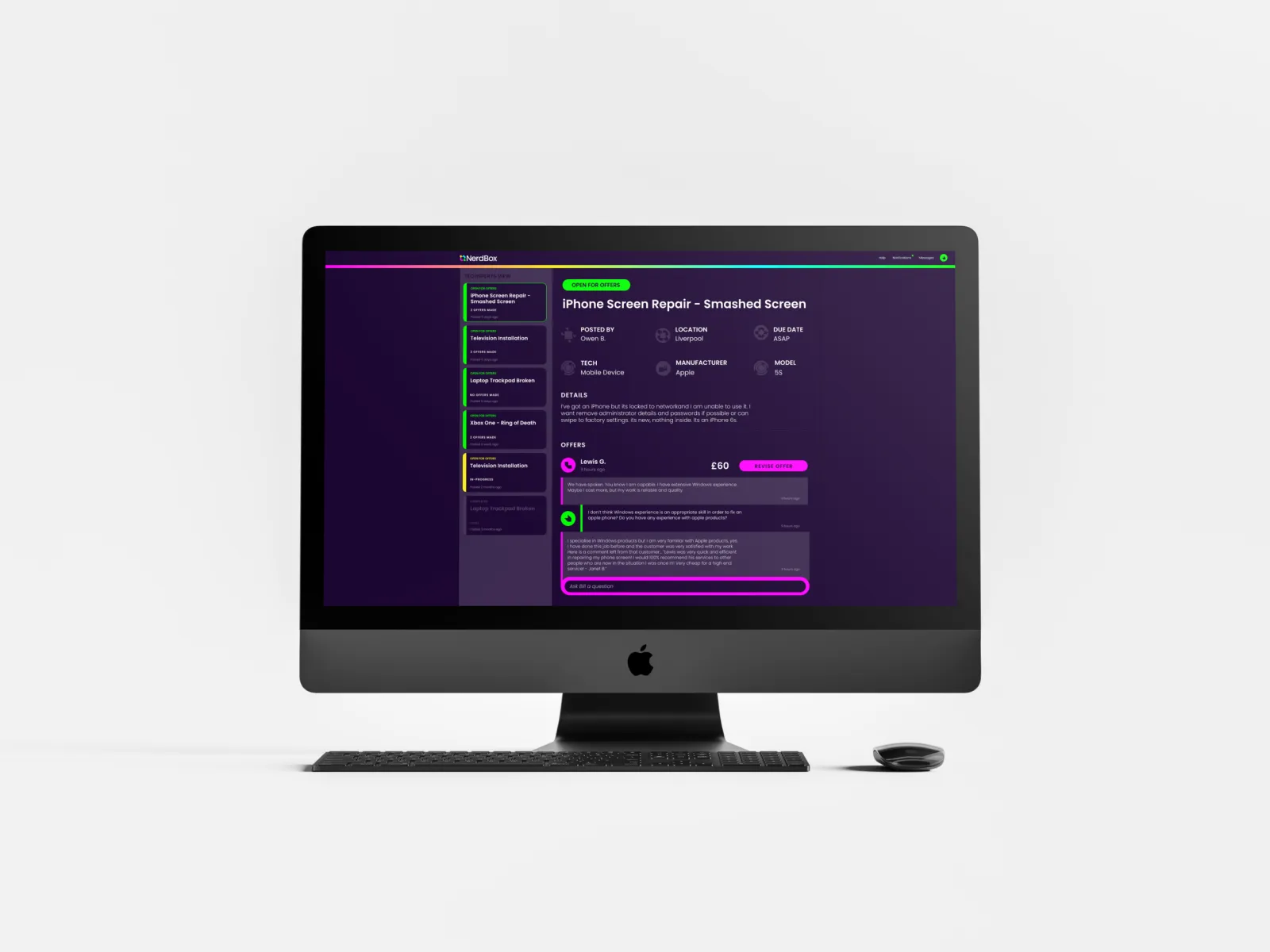
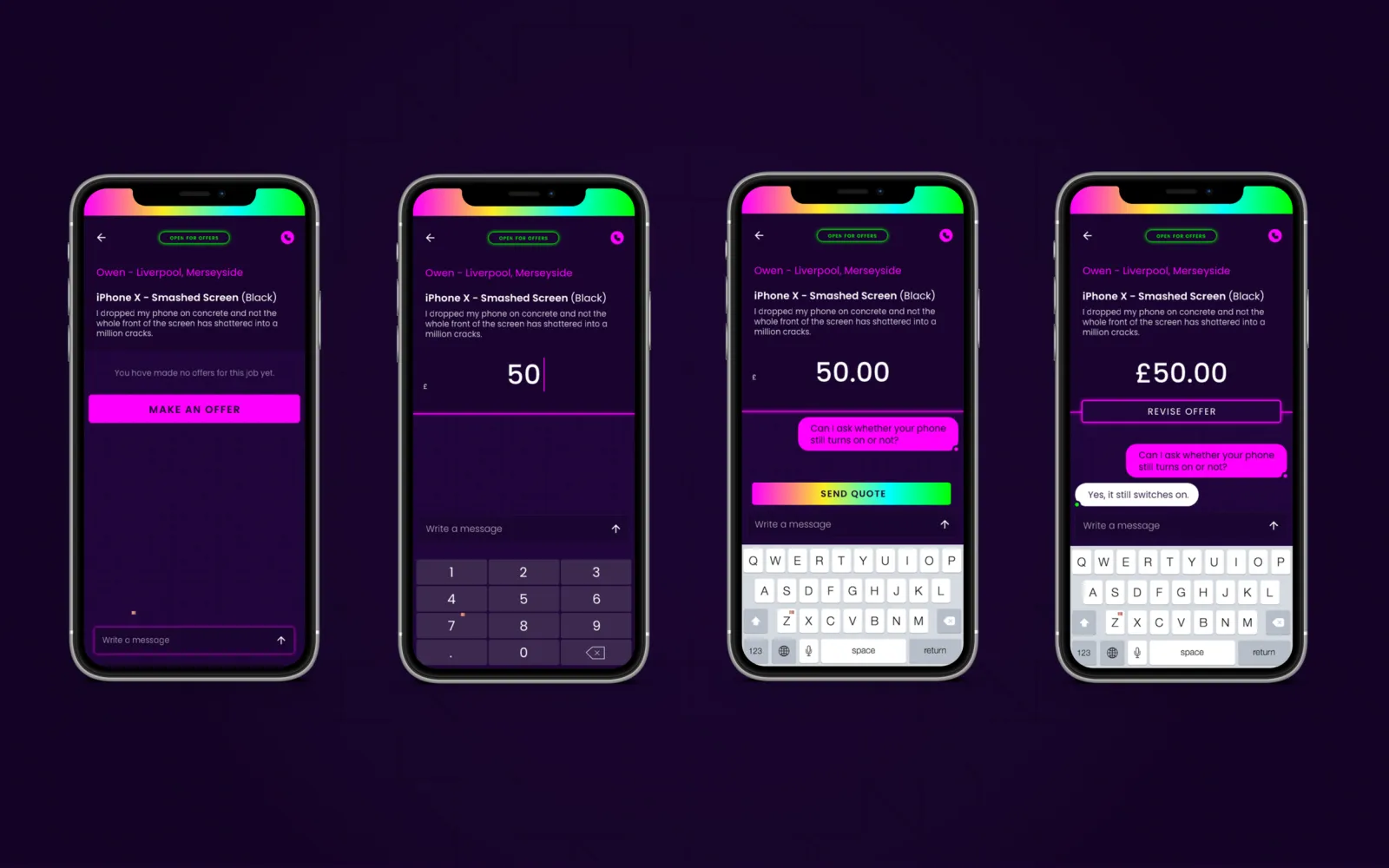
Vivid RGB against a dark interface, pushed as far as it would go before it stopped being usable: the founder's colour ambition, disciplined by contrast ratios and small-size legibility rather than reduced.
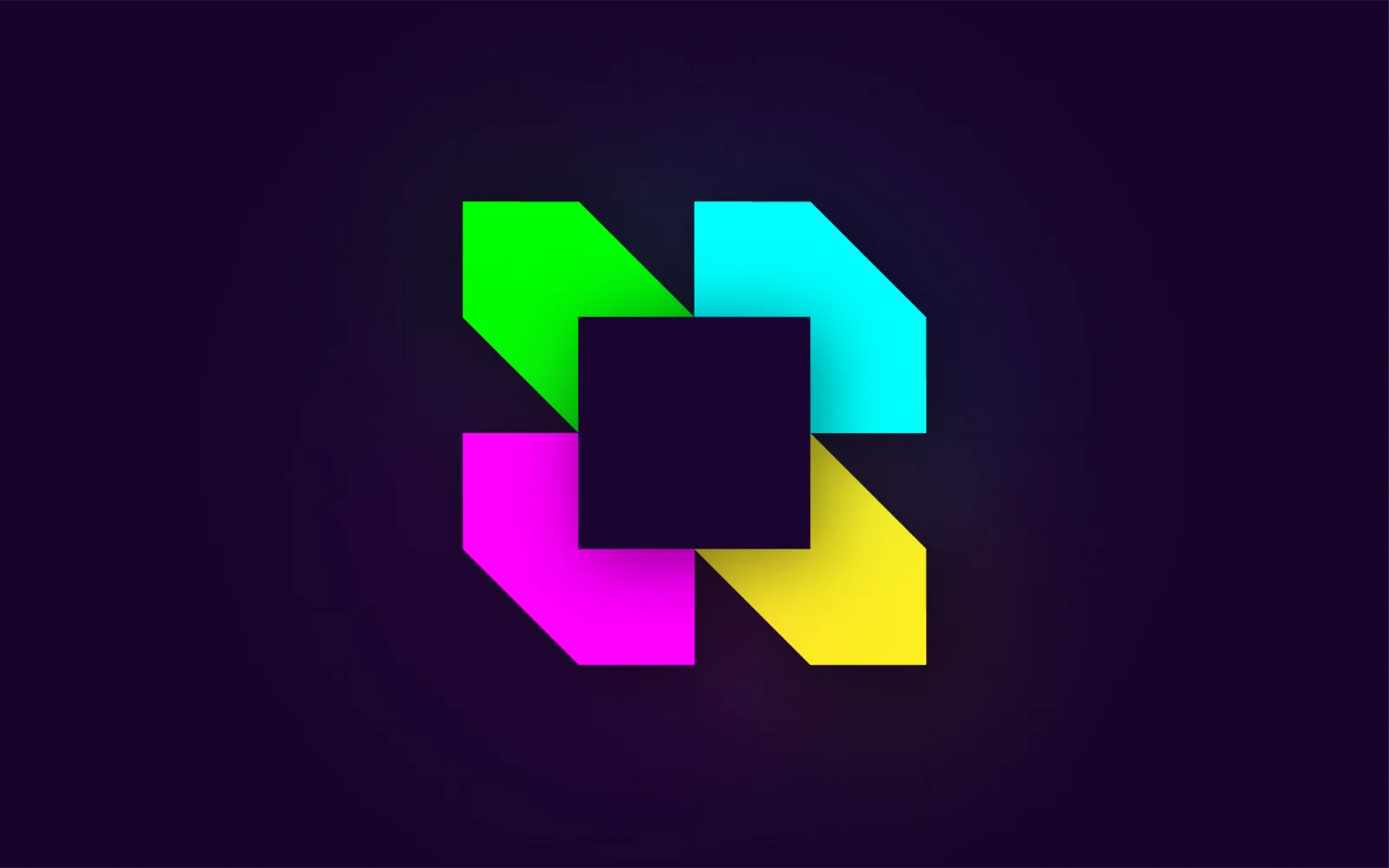
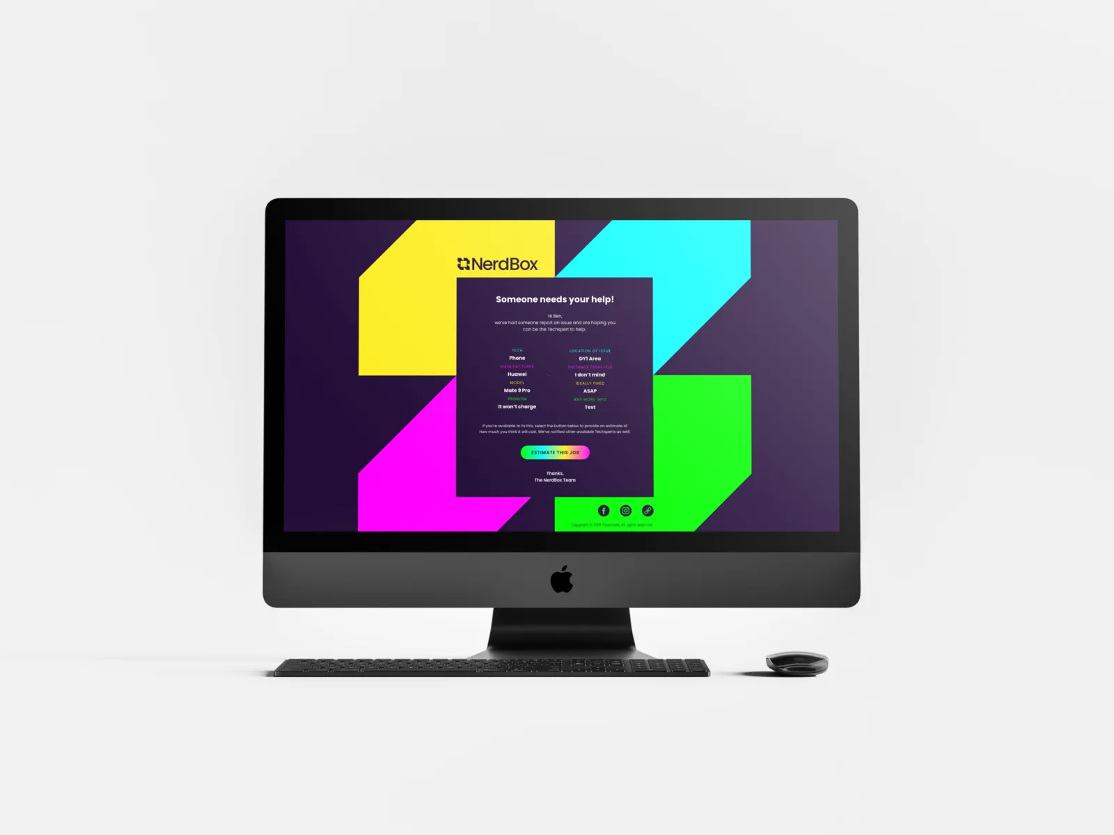
Squares and cubes carry the 'box' idea without illustrating it literally, so the mark works as an app icon at 40px and as a wall graphic. Poppins across all communications gives the rigid, geometric, modular feel of a digitally-led product.
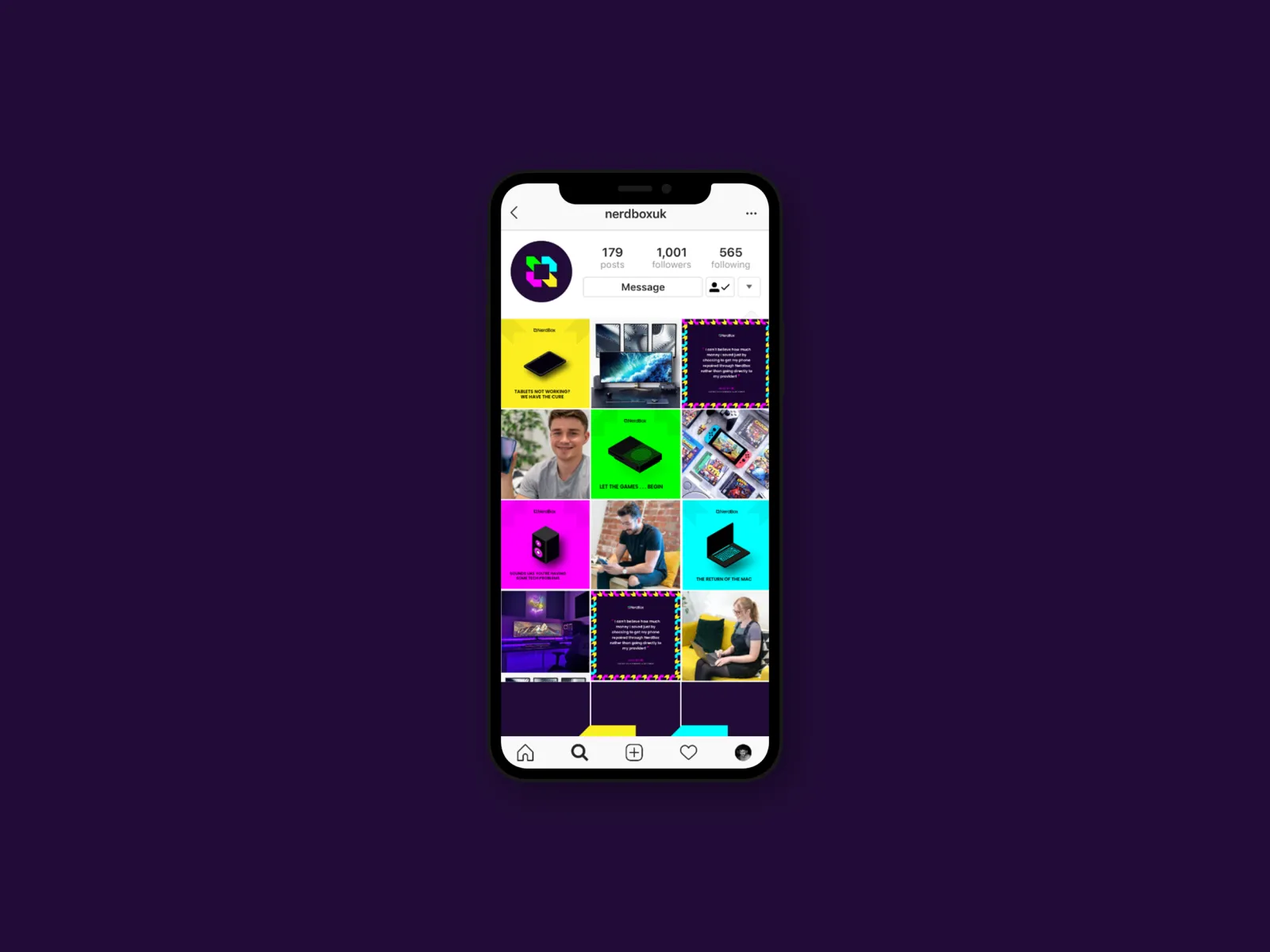
We built a library of isometric assets covering the specific technology categories NerdBox services, so the product team received a system rather than a logo, consistent across mobile, desktop, social and CRM.
Working to a strong client vision is a craft problem, not a compromise: our job was to find the version of loud that survives a dark UI, a small icon and a printed invoice.

Outcome
The guidelines let the product design team build the digital applications aligned to the brand without returning to us for every decision, which is the point of a system rather than a logo.
The identity that shipped is the one the founder asked for, executed to a standard that holds up at app-icon size and in print. Where we disagreed, we said so once, in writing, and then delivered his brief properly.