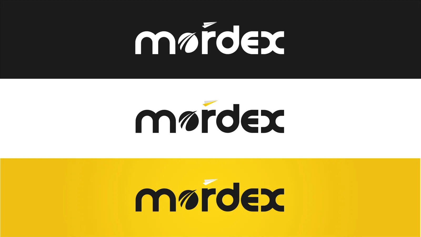
The founder and investors chose our mark.

Challenge
Mordex was early. User interviews were still running and the company hadn't settled which part of the e-sports market it belonged in.
That made the identity brief unusual: the mark had to cover a range of possible services and stay viable if the business strategy moved under it.
Approach
In a workshop with the founder and startup consultant we pulled the name apart. Mordex turned out to be a compression of 'more' and 'dexterity'.
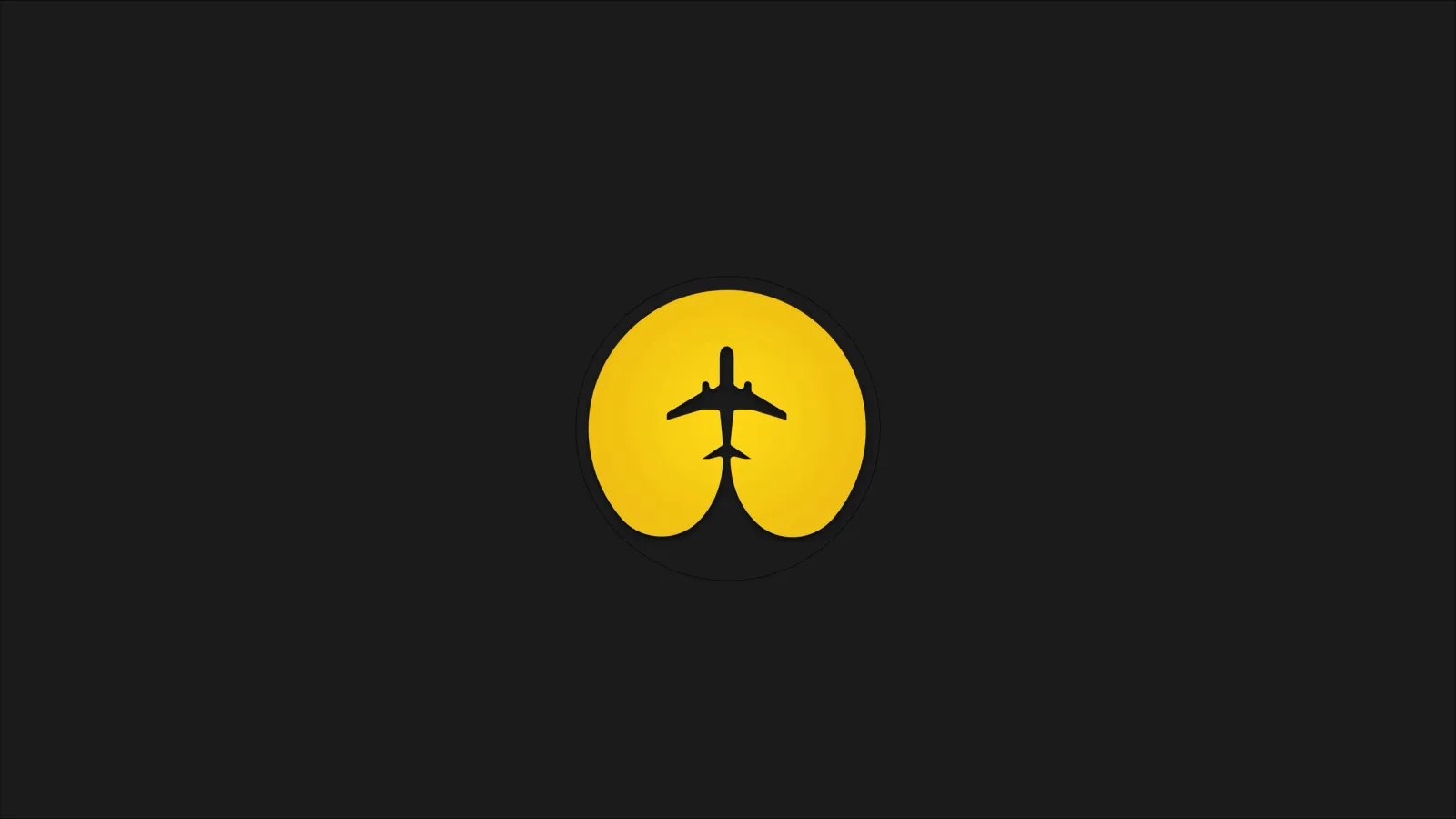
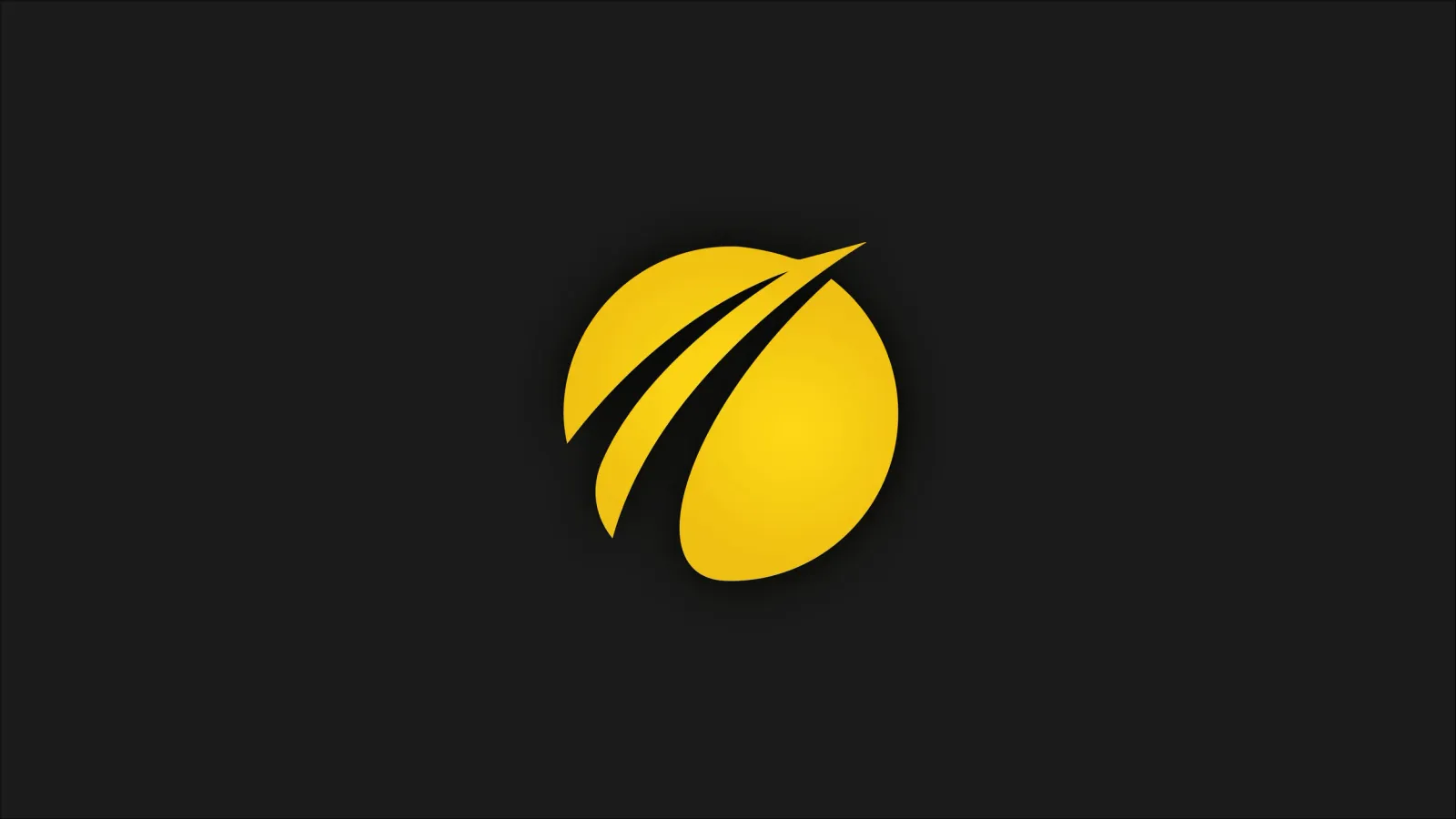
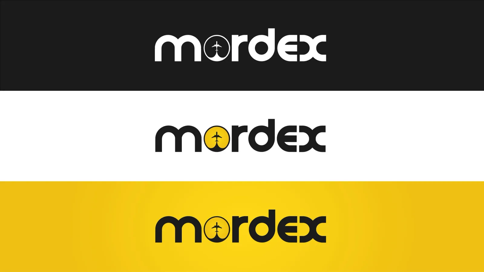
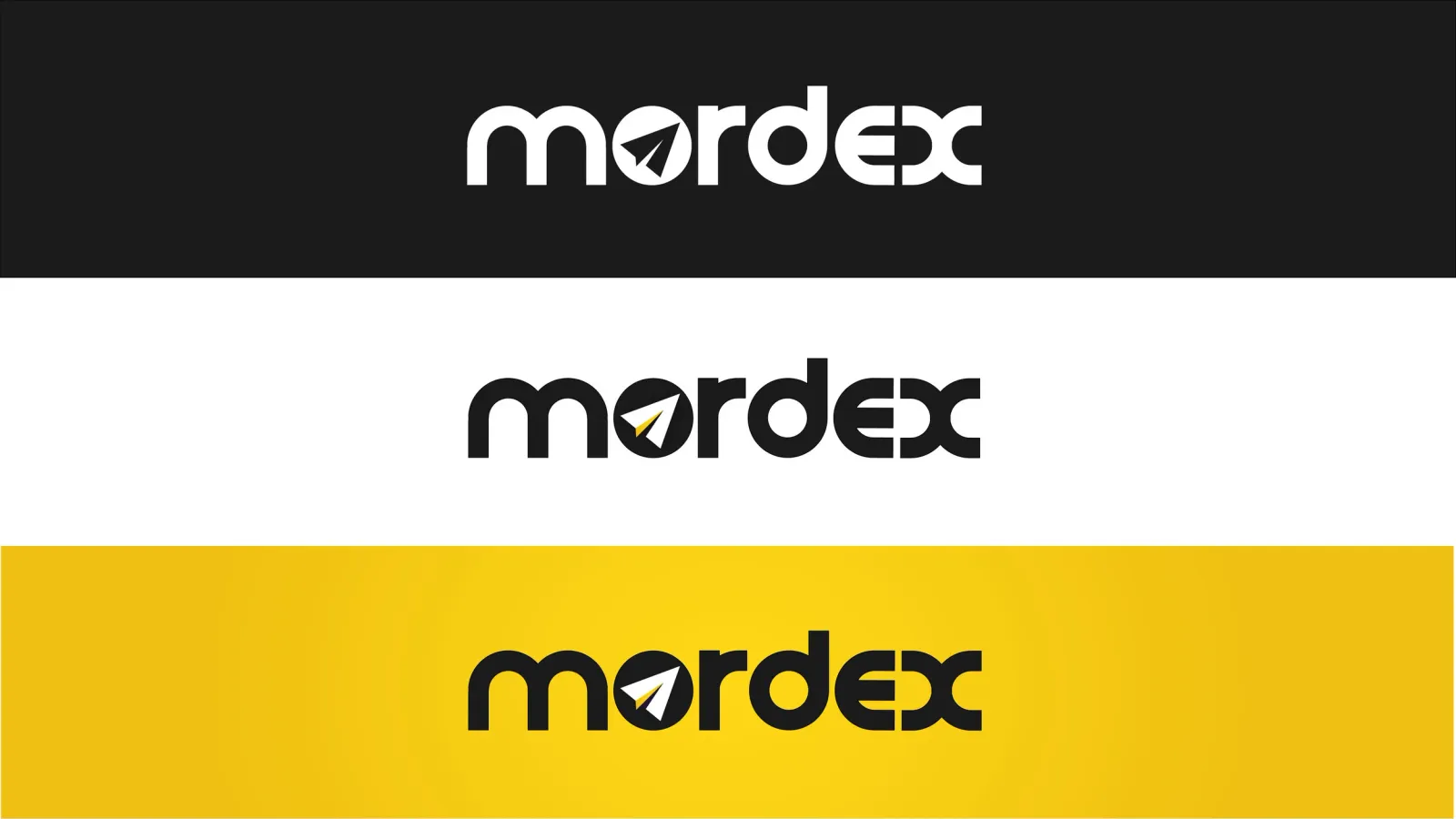
Combined with the goal of getting people to e-sports events across continents, that gave us the paper aeroplane: travel, and something made by hand, back to dexterity. The plane flies through the globe of the O, leaving a trail.
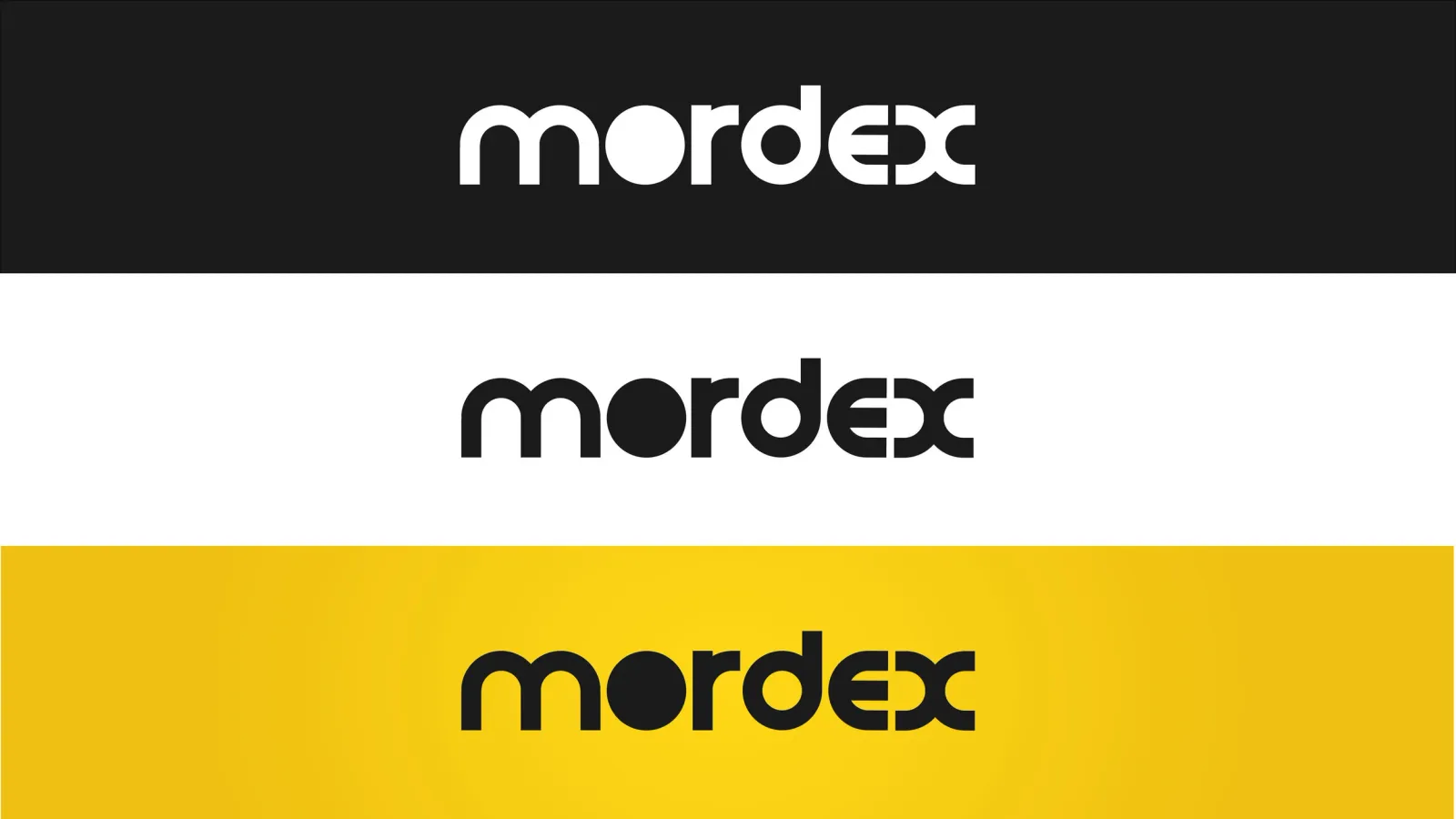
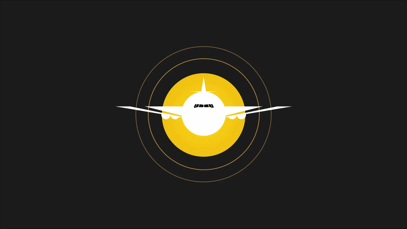
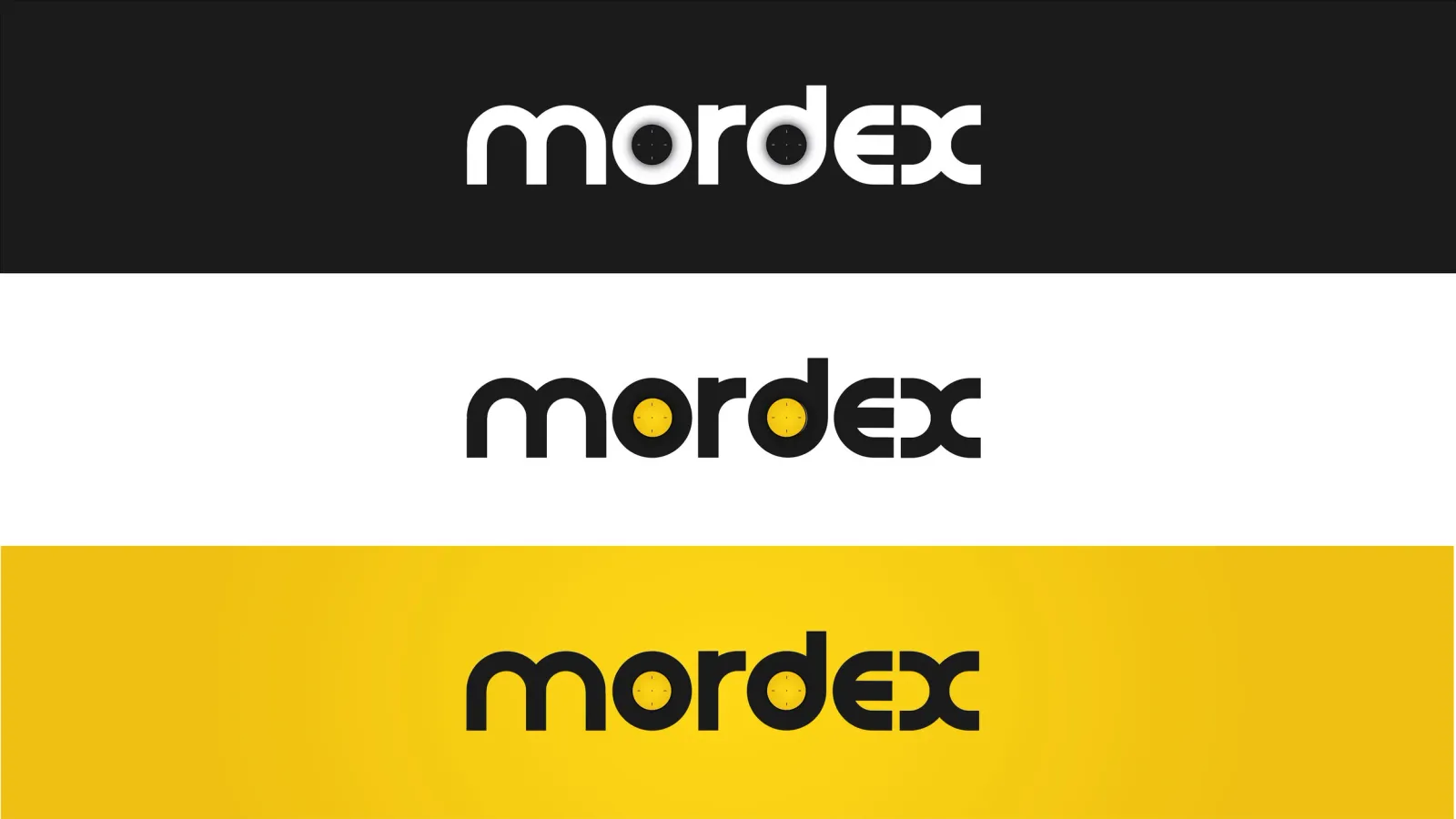
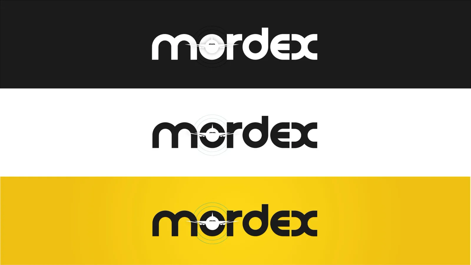
We custom-drew the typeface and explored a set of symbols that could sit inside the O, so the mark could be re-pointed later without redrawing the wordmark.
Outcome
The founder and investors selected our paper-aeroplane mark as the identity to take forward.
Because the symbol sits in the counter of the O rather than being welded to the letterforms, the mark could be re-pointed later without redrawing the wordmark, which was the whole reason for building it that way.