Most flooring fails from underneath, which is exactly the part nobody sells.

Challenge
All Project Flooring has been trading out of Royton since March 2020. Commercial contracts anywhere in the UK, domestic work within twenty miles of Oldham, fitted by the same teams either way. The domain resolves to an empty directory listing.
Two audiences with nothing in common: a facilities manager working down a procurement checklist, and somebody who wants a kitchen floor. Most flooring firms pick one and read wrong to the other: a showroom that fits, or a fitter with no showroom.
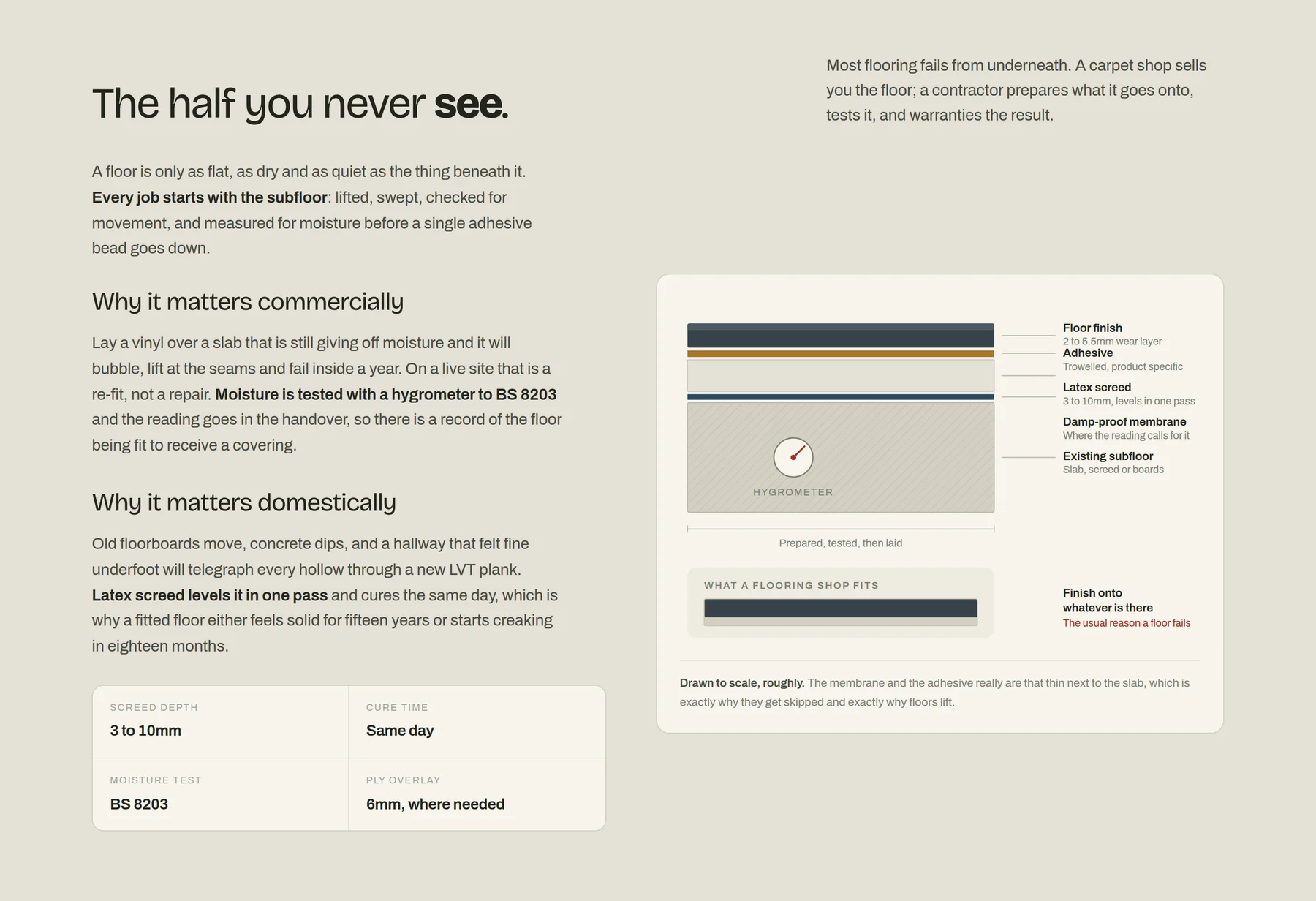
And the thing that actually separates a contractor from a carpet shop is invisible in every photograph ever taken of a finished floor. Subfloor preparation, damp-proof membrane, latex screed, moisture testing. You cannot photograph it, so nobody sells it.
Approach
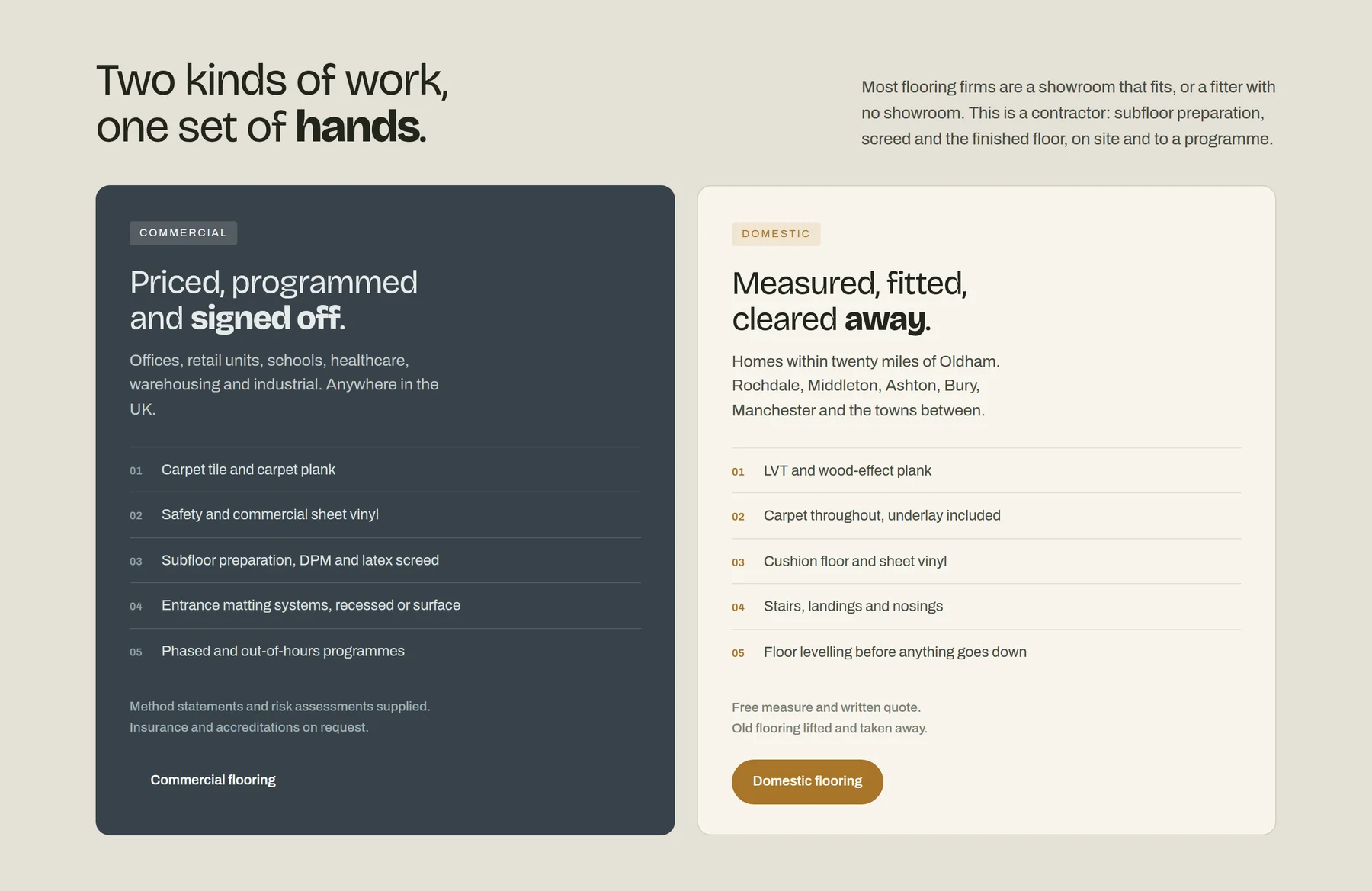
Two doors, side by side, on the same page. Commercial reads as priced, programmed and signed off, with method statements, phased and out-of-hours work, and accreditations. Domestic reads as measured, fitted, cleared away, with a free measure and the old flooring taken with them. Same company, two sets of words, no pretence that one set covers both.
The invisible half got drawn rather than described. The layer stack (slab, membrane, latex screed, adhesive, finish) is a to-scale diagram, and the scale is the argument: the membrane and the adhesive really are that thin next to the slab, which is exactly why they get skipped and exactly why floors lift. Beside it, a hygrometer reading and BS 8203 in the handover.
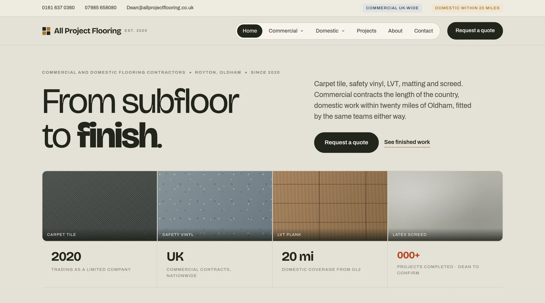
The material band under the headline is drawn, not photographed, and that was settled twice. Four evenly weighted swatches naming carpet tile, safety vinyl, LVT and latex screed. A room photograph always carries a radiator or a doorway that pulls the eye to one cell; a drawn field is even by construction. Photography carries every other slot on the page, where a single image is the subject rather than one of four repeating units.
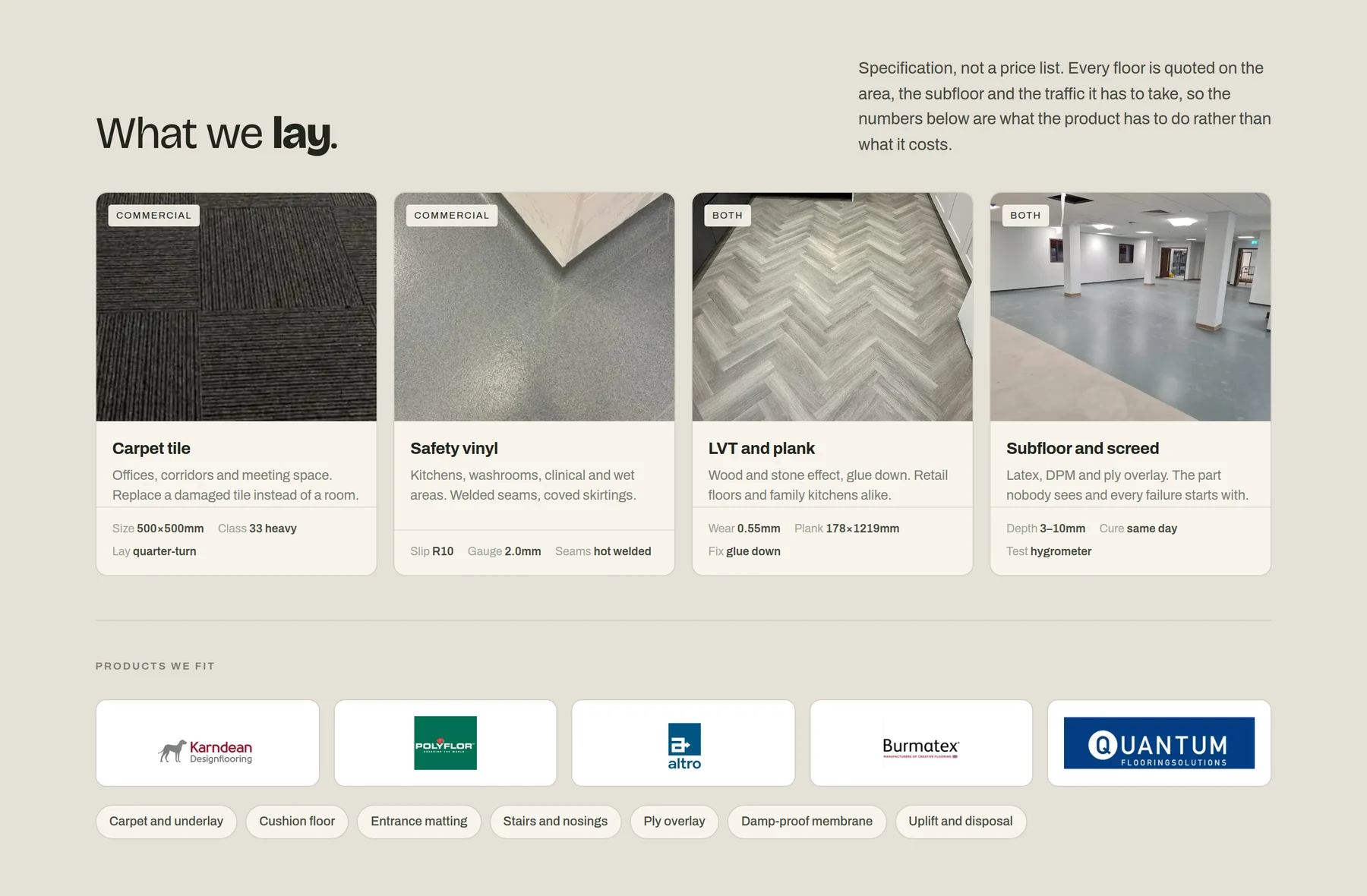
The floor cards are specification rather than a price list (tile size, wear layer, slip rating, screed depth), because every floor is quoted on area, subfloor and traffic, and a number on a page would be a number we would have to take back.
What is not claimed
Anything the business has not confirmed is marked in orange and left blank: the project count, the public liability figure, the accreditations. The line under that block says nothing here is claimed until it is confirmed.
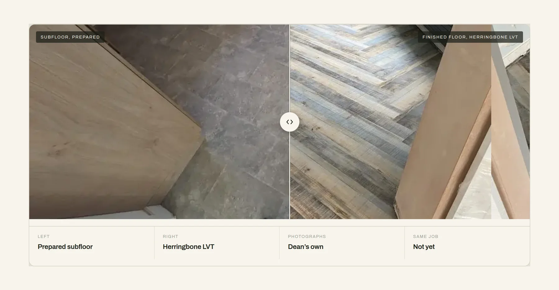
The before-and-after slider states that the two photographs are real and the client's own, but are two different jobs standing in until a matched pair from one job is picked. The interaction is real; the pairing is not yet. Saying so costs nothing and is the difference between a mockup and a misrepresentation.
The same rule runs through the projects section: three slots, each carrying sector, area, duration and access, because that is what a commercial buyer reads first, and each waiting on a real job to fill it.
Where it stands
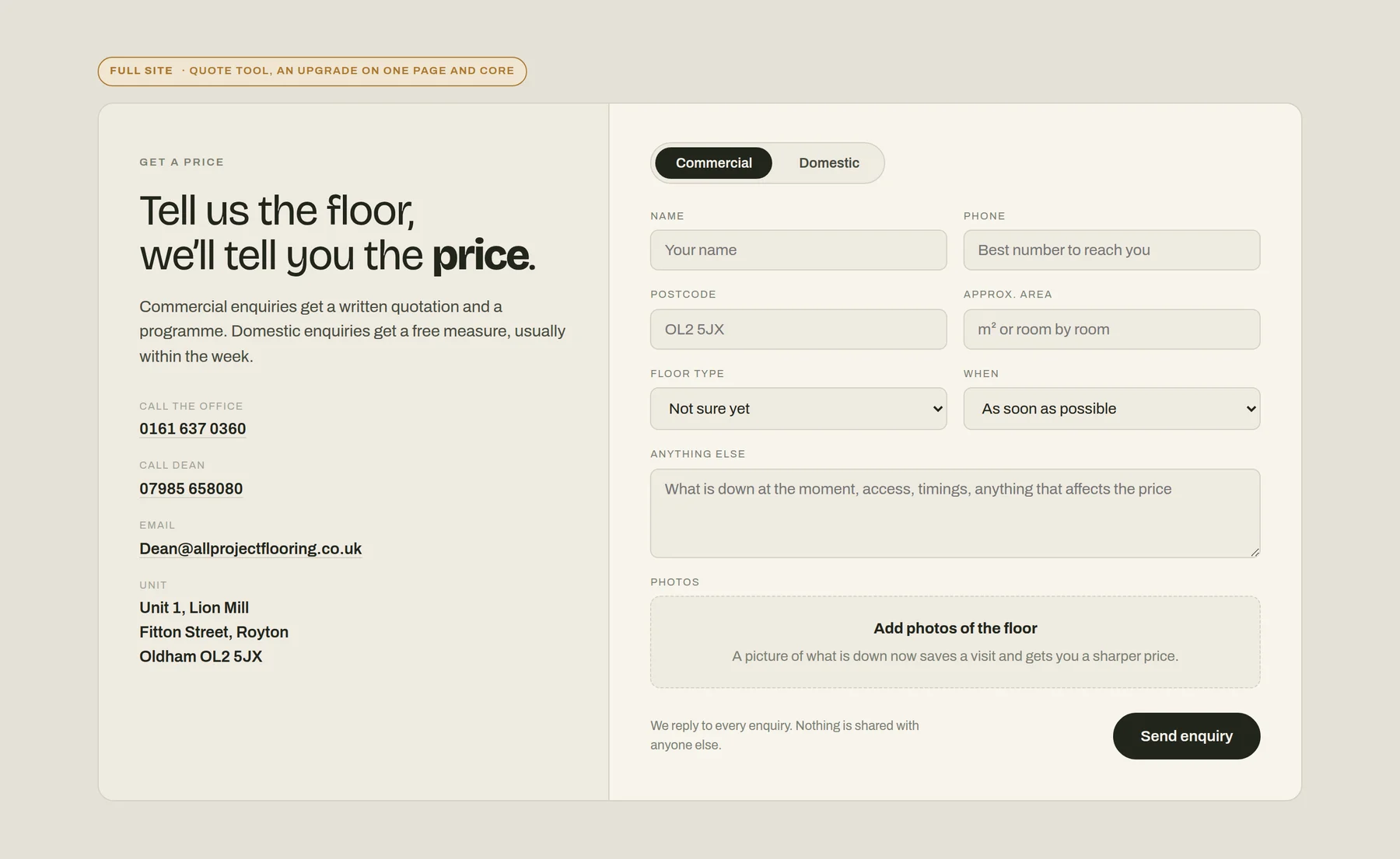
The design ships as three build sizes in one document: a single page, a core build of a few real pages, and a full sixteen-page site with an address for every floor type. You switch between them on the page itself and watch the navigation, the content and the site map change to match, so the decision is made by looking rather than by reading a proposal.
A site structure view sits behind it, listing every page, its purpose and which build it belongs to.
Sent as a concept. Not live, and whose build size it ends up being is the client's call.