Squawka
Seamlessly Merging Aesthetic Appeal with Enhanced Functionality
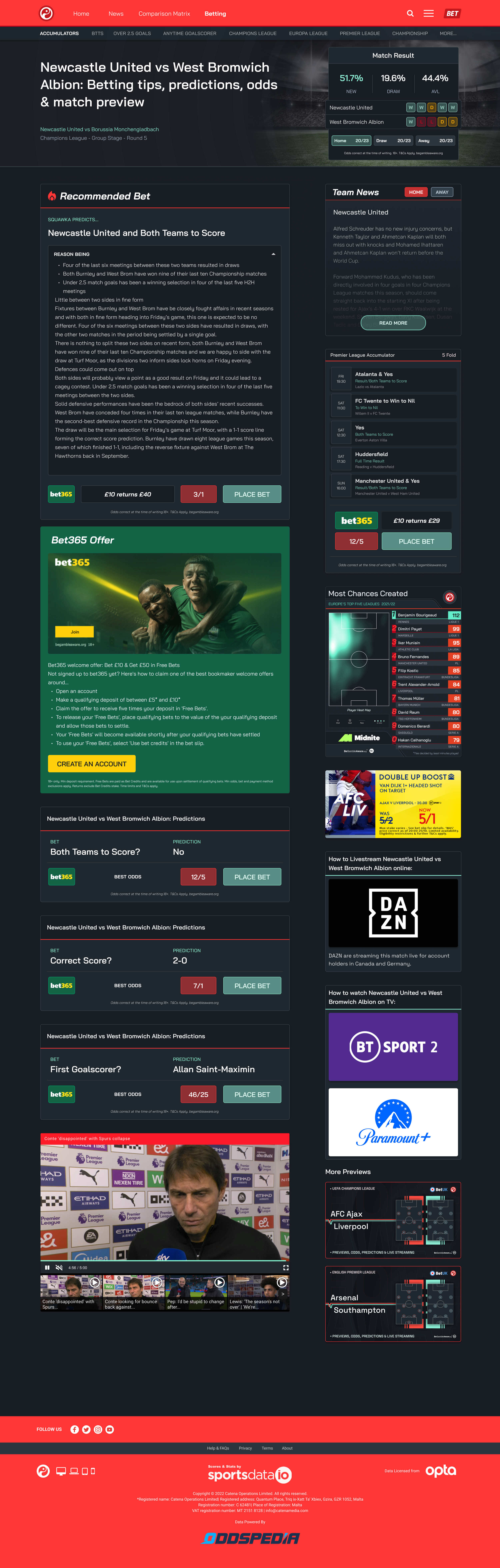
Following the successful rebranding of Squawka, which garnered a positive reception for its fresh visual identity, it became evident that the website itself should mirror this rejuvenated aesthetic. Simultaneously, the goal was to augment user-friendliness, enrich informational content, and optimize conversion potential. This was achieved through a fusion of a polished user interface and interactive elements, creating an engaging environment that facilitates numerous Call-to-Action (CTA) opportunities, all while sidestepping any intrusive marketing tactics.