Mordex
Brand strategy, visual identity and logo design.
During my time at WeAreNova, I worked on a project focused on E-Sports. As it was in it’s early stages we were still running user interviews and assessing which realm of the e-sports marketplace Mordex would be best situated. This means I had to create a logo that could encompass a variety of services and also had the flexibility to be altered in the future if the business strategy was to change.
My co-worker Lisa was the lead designer on this project and she created a variety of logos and logotypes also. This gave me the chance to take the time to custom design the typeface and explore a mixture of symbols which could rest within the circle of the O.

During the design workshop with the founder and startup consultant, we explored some of the ideas behind the name and the values of what the brand represents. The founder revealed that the name Mordex was a combination of the words ‘more’ and ‘dexterity’. So we snowballed that idea and combined the goal to supply people with intercontinental travel to e-sports events and came up with the idea to use a paper airplane. As airplanes signify travel and they are hand-made which brings it back to dexterity (having skill in performing tasks, especially with the hands).


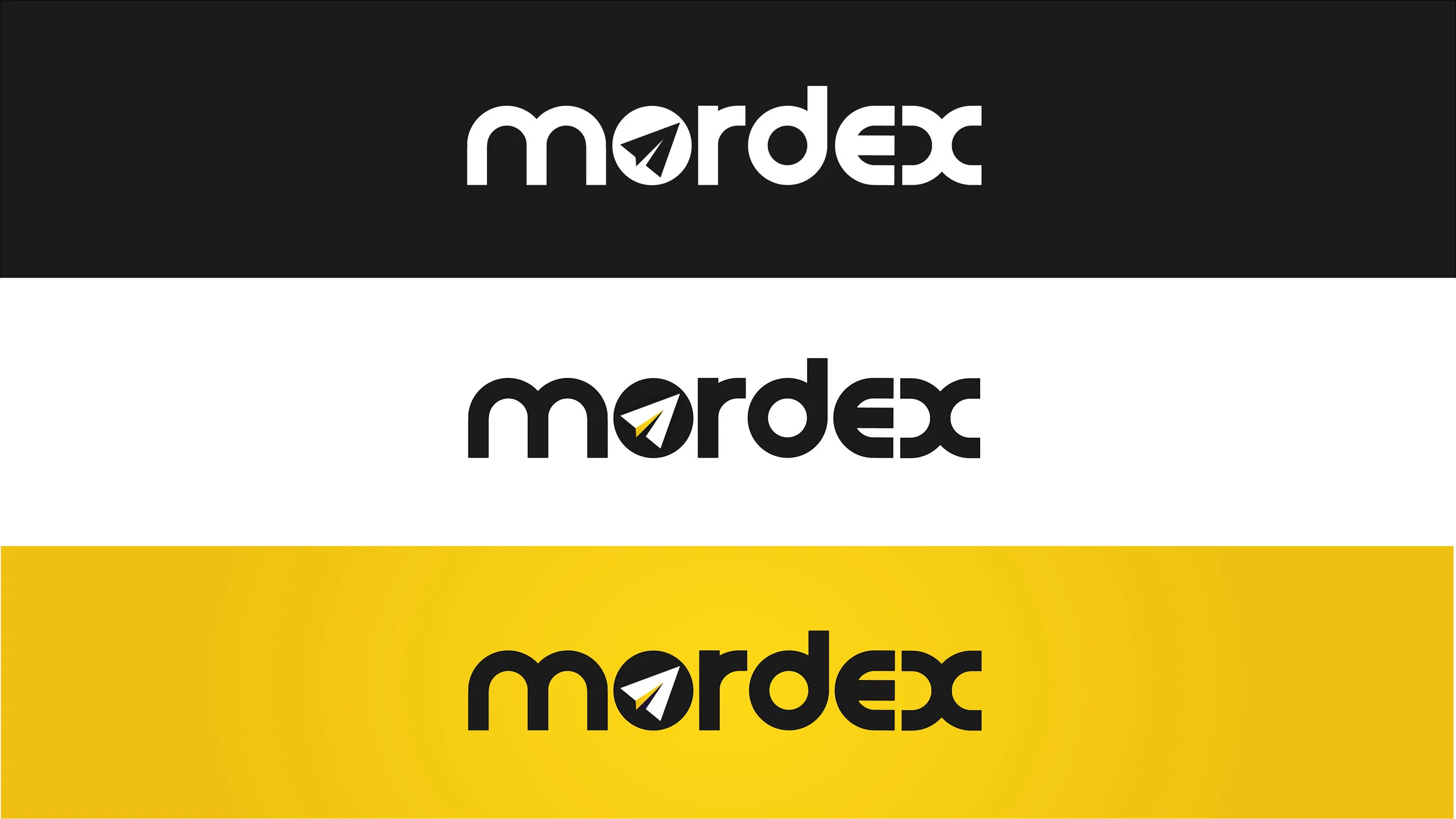


Branding this startup was the only involvement I had in this project, however the founder and investors loved the logos I had presented and finally decided that the logo with the paper airplane flying through the ‘globe’, leaving a trial through the O was the one they wanted to use going forward.
You can see my logo and brand guidelines in action on the website.